Portrait
noun
1.a painting, drawing, photograph, or engraving of a person, especially one depicting only the face or head and shoulders.
"a portrait of George III"
I decided to chose portraits because i think that out of all my choices portraits have the most amount of potential for experimenting and is able to incorporate many other contrasting themes.
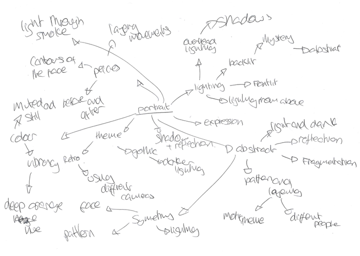
Baldwin Lee
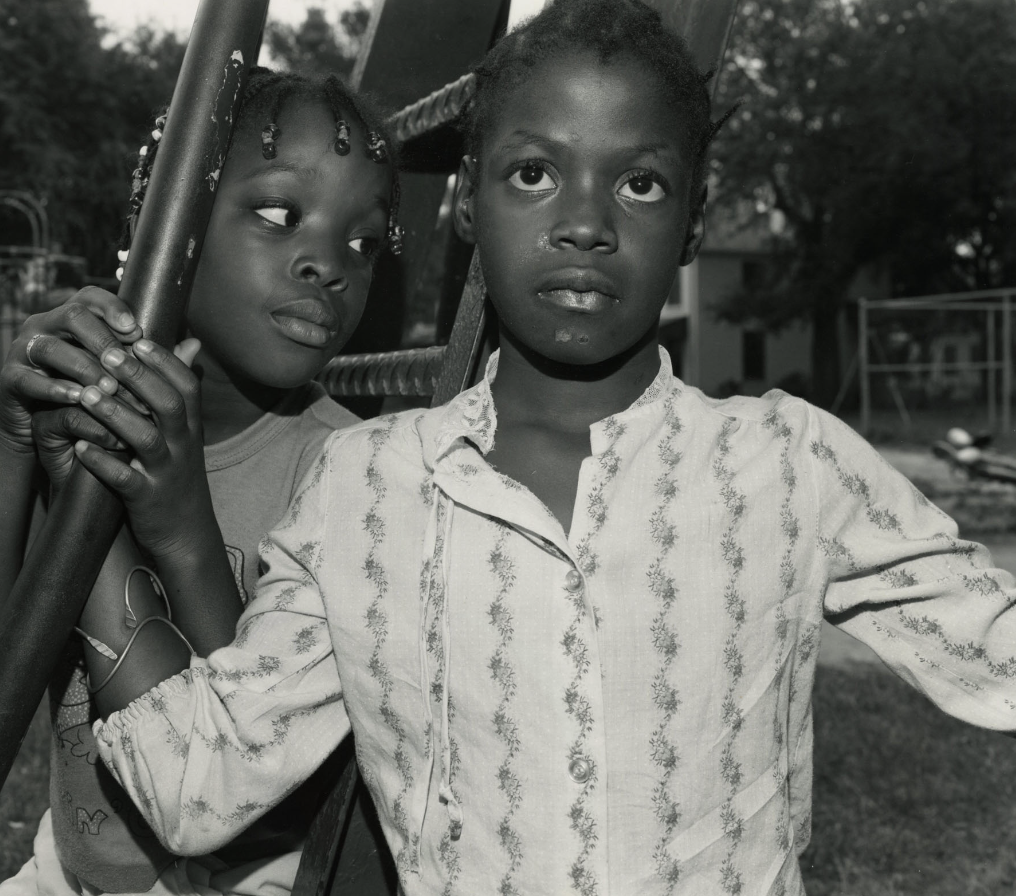
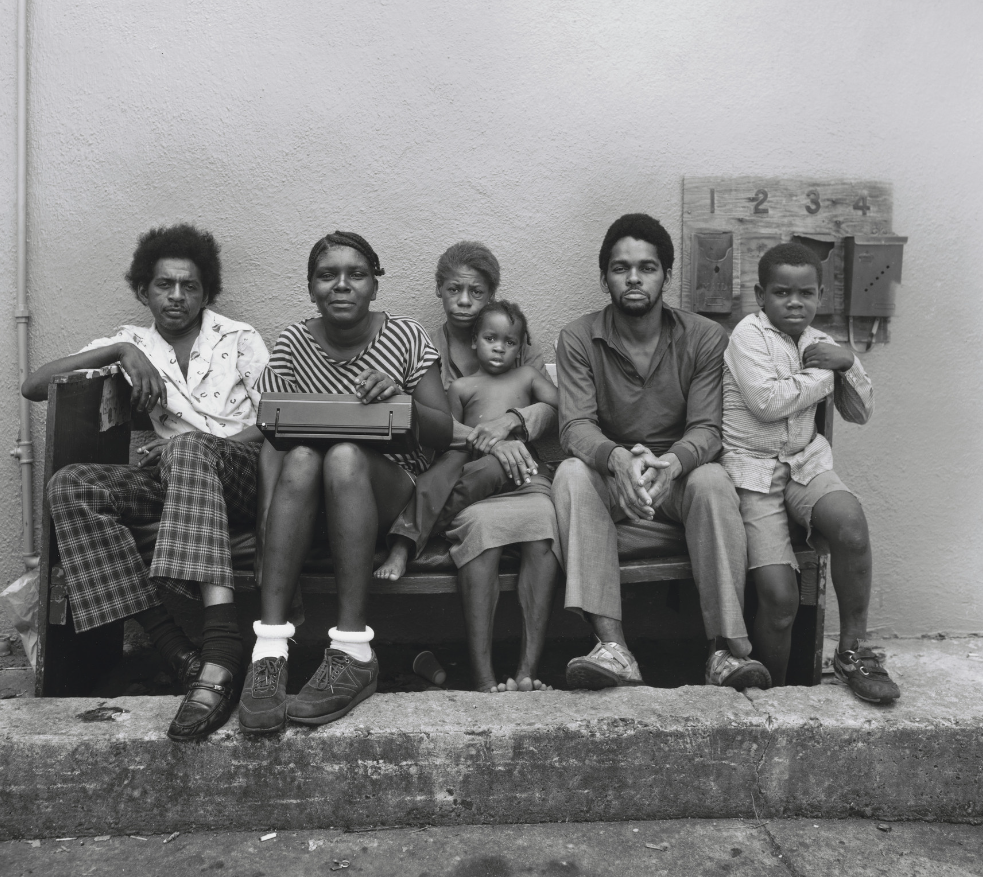

Baldwin Lees is a Chinese and American photographer, who is mainly focused on photographing African-American communities in the south , his work strives to represent and translate vibrant personalities and families that are often lost or dismissed into stereotypes and assumptions. Lee travels to towns in the south and then explores the poorer and more deprived areas, often where there is a higher concentration of back families and residents. Lee wanted to shed a light on the big personalities and individualism, and unlike the many photographers before him is aim was purely about the people and not their poverty.
Whilst visiting he found the locals astonished to see him , a-lot of them meeting Asian person for the first time , however the exchange between him and the locals was easy as he had no ulterior motives and remained a passive and friendly person.The results, shot in monochrome, are intimate and compelling in their depiction of the ordinary lives of black Americans born into, and confined by, the kind of poverty that, had remained “almost unchanged since emancipation”.
lee’s calm, measured portraits speak of a deeper engagement with his subjects. Their plight is suggested in tiny, but telling, details of their surroundings: the cramped interiors of weatherbeaten wooden shacks with holy pictures and wooden crosses pinned to the walls and torn and frayed mosquito screens stretched tight across the door frames.
People pose for his camera unease-fully or with an engagement that is direct and, at times, almost defiant. There is an atmosphere of languor throughout, the sense of time slowed down by the intense heat and humidity of the south and the weight of too much time spent killing time. Here and there, though, a few portraits seem to carry a subtle metaphorical charge: a young man in shorts and T-shirt, his hand outstretched above him to grasp a coiled rope dangling from a tree; four young children holding hands beneath an ominously towering federal courthouse that looms out of the encroaching darkness.
for all that, the experience of travelling in the deep south shook him up and sharpened his sense of injustice.
During his exhibitions Lee often uses a single camera , this simplicity is very effective in communicating the locals nonchalant and complacent attitudes towards their extreme poverty and depravity.
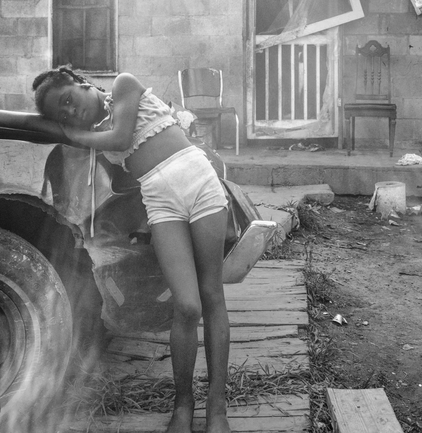
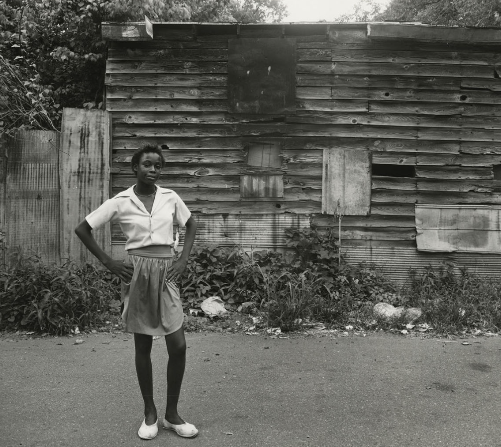
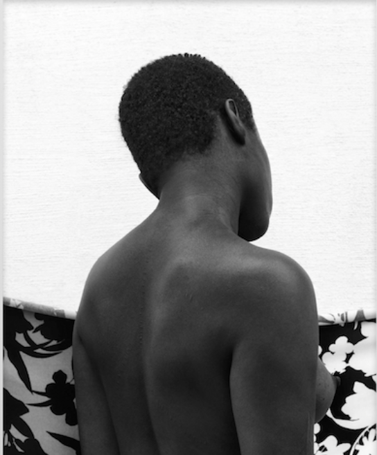
This is one of my favourite images from Lee, in my opinion this photographs captures the essence of his work and is a good example of just how moving his work is. In this photographs Lee captures a girl leaning against a truck of some sort , stood in-front of a weathered and dirty house. The contrast between the girls elegant pose , perfectly at ease and the dark and dingy living conditions show how people often fail to overlook peoples background and see the personalty in-front of them.Her model like demeanour and girly clothes show how despite her living conditions she is just a young girl , no different from the rest. The photograph highlights how. society has built borders between different races and classes of no objective other then to profit off of peoples complacency to remain in their border. The sunlight hitting the camera lens adds a blur and distortion to the photograph ,and in my opinion the light helps the viewer feel more captivated by the photograph. The more true to life elements add to the intention of showcasing a reality without being affected my peoples interpretation’s of poverty.
Responce to Baldwin Lee
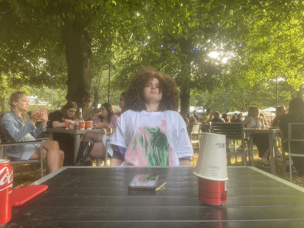
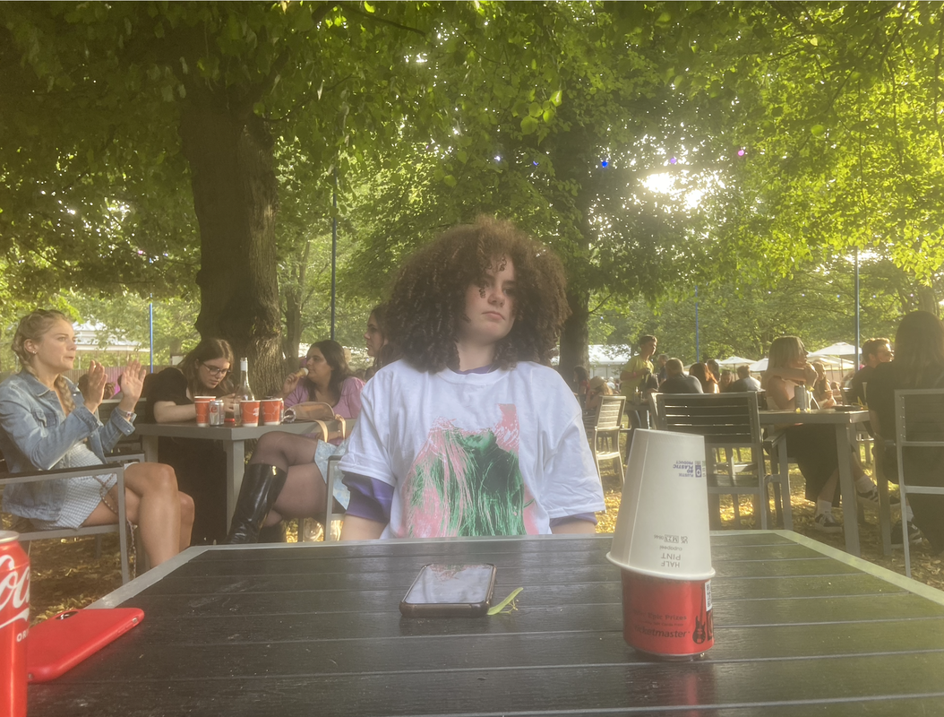
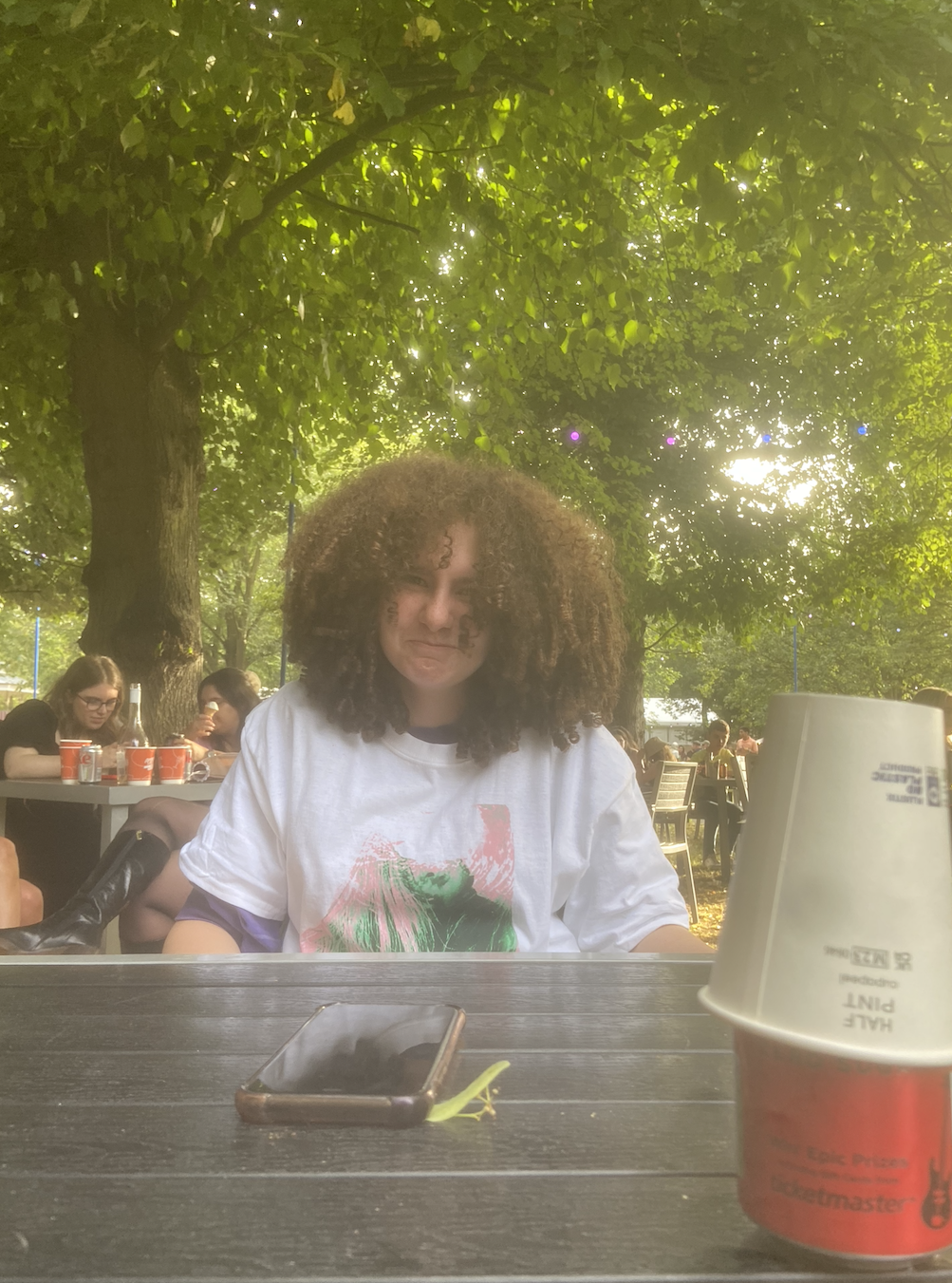
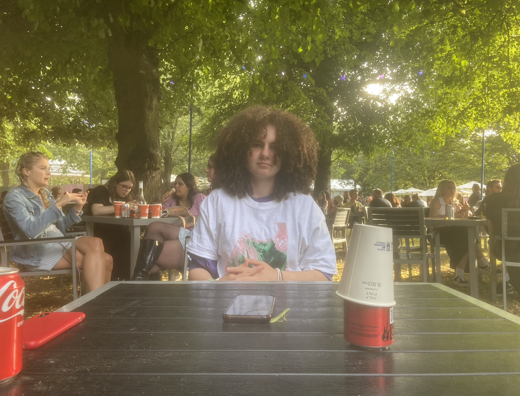
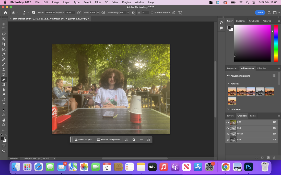
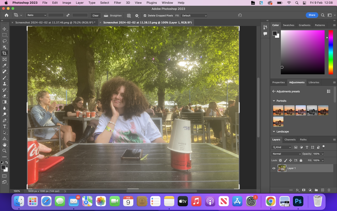
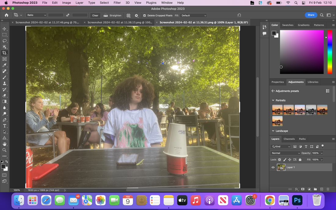
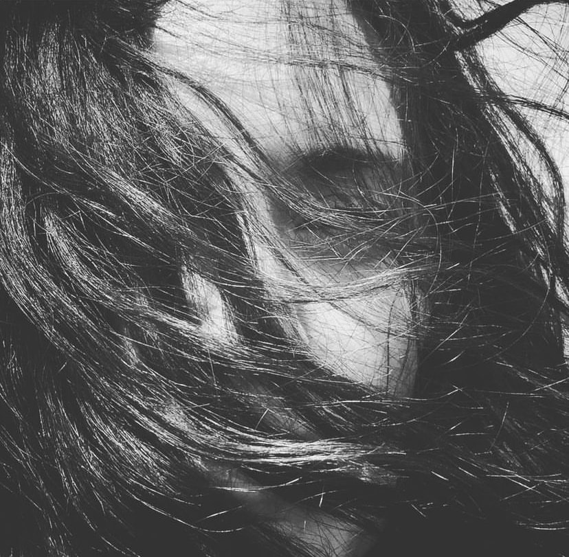
I started by taking a series of photos from a distance far away enough so that you could clearly see the background and the light behind her.My initial concept would be just mimicking Lees simple style , but i would that the images would look better in a collage form. My idea is to cut a photograph into many small rectangular shapes all about the same size, then i would stick them together keeping the rectangles in the general layout of the image. I made the photo black and white by adding a filter, i did this so that the different light intensities would stand out against each-other. For my next response i want to play with framing and black and white shades, similarly to Lee i will try zooming in and out to create what seems most cohesive. I also think that the subjects expression is a good communicator of the images and the differing textures inside the photograph , for example: the hair, the trees the metal can and the wooden table.
|
By cutting a photograph up into rectangular shapes and layering them on top of each-other i made this. If i was to recreate this process again i would have chosen to use colour and beet neater when cutting and sticking the rectangles together.I think that the background and the layout of the rectangles works very cohesively here and the black and white contrast is good.
I think that i would redo it but using a bigger skale so that understood. I do like the background because i think that it looks like the image is moving and i think that the movement adds to the photograph. I also like the black and white because it makes the different patterns and textures more vivid and it makes them stand out better. Moving forward i want to incorporate the use of movement and black and white contrast , i also want to take into my final response the subjects expression having a role in the mood and tone of the photograph and i think that her expression plays a part in how we interpret the mood of the image. |
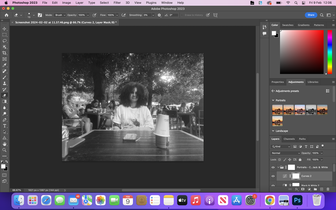
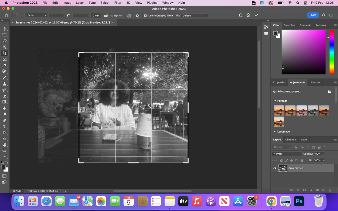
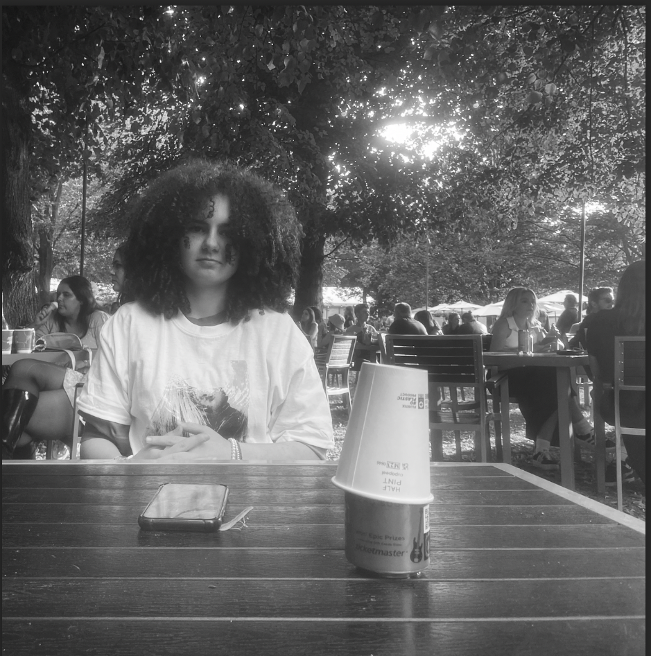
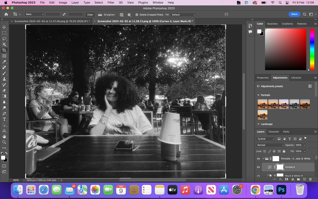
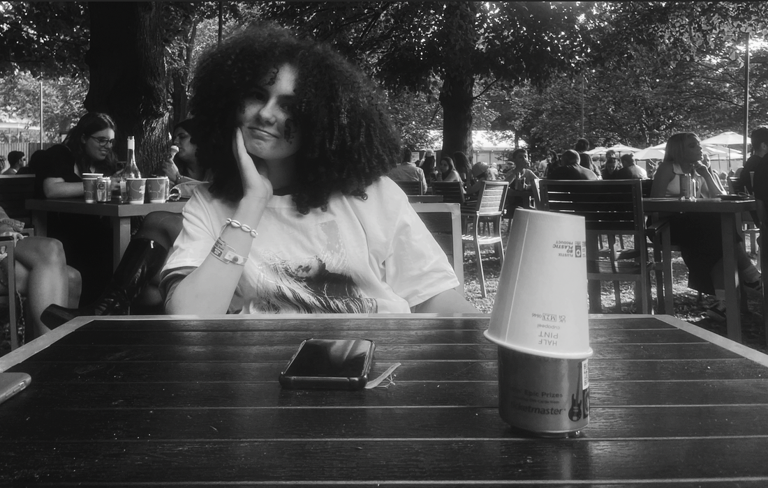

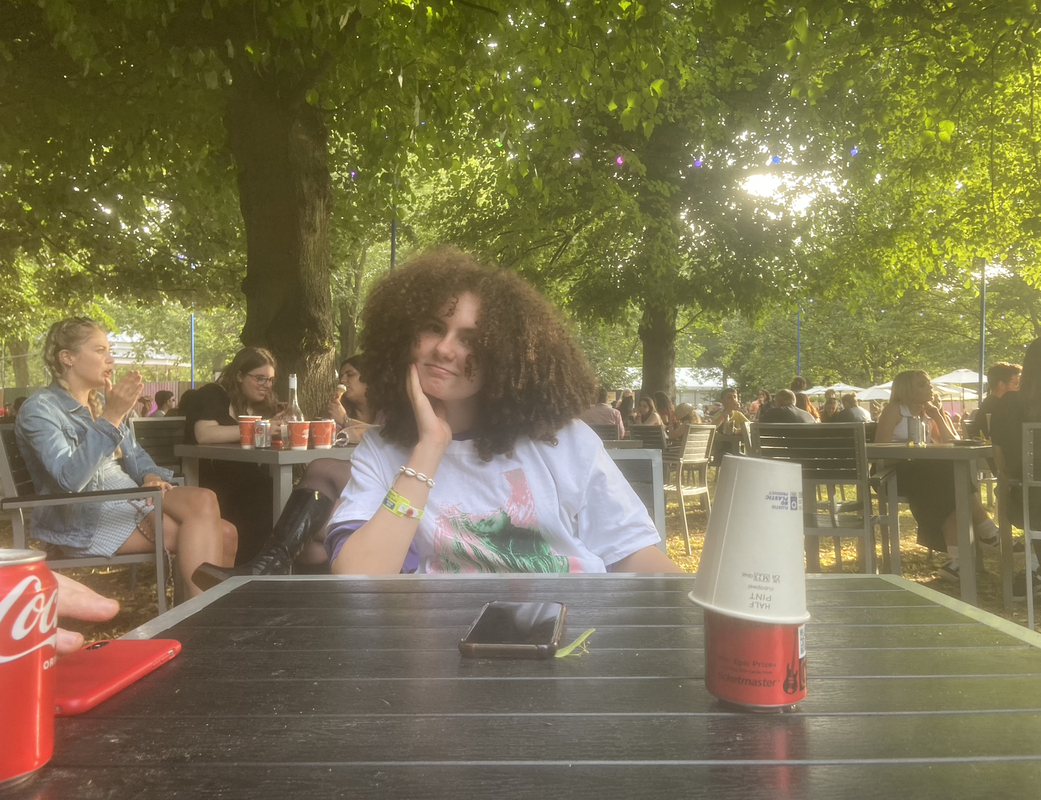
I worked with photoshop, i altered the framing and the light intensity, i found that when the framing complimented the position of the subject, the photograph looked more cohesive.And i found that the black and white filter made the light stand out more and added deeper shadows , allowing for more contrast. I used a feature to alter the light exposure and build contrast, then i experimented with cropping and framing the image, i did this until i decided that the photograph looked good enough.
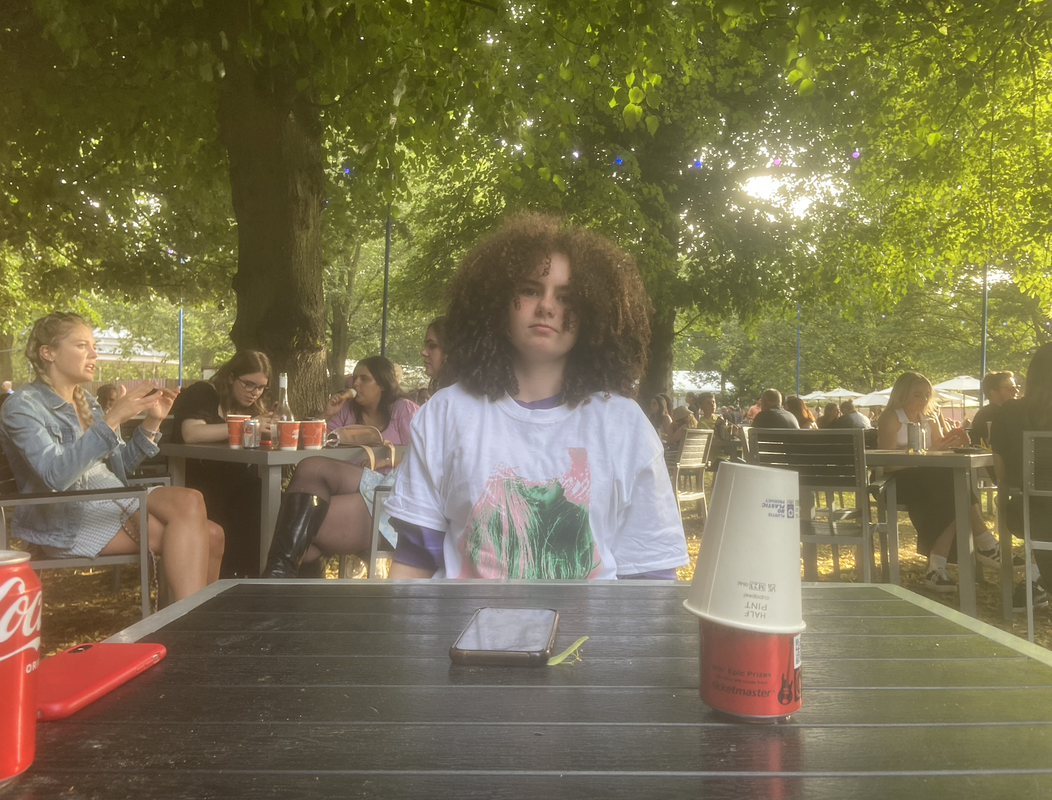
I think that in future when recreating my method i would chose to take photos that have more focus on the background as opposed to the foreground in these pictures. I would do this to add focus to the subject and get more of a full body shot. I like the middle photograph the best because i think that the use of shadows is the best suited to the image , however i still feel that the foreground takes up too much space and takes too much away from the subject. I think that the photograph on the left is too out of focus and i think the lines and shadows are not crisp enough and make the photo hard to see because the light becomes too intense.If i was to redo a similar responce i would have chosen to take images with more interest based on the background like Lee, additionally i think that more of a full body shop would have looked better with the black and white because i feel the table creates a big portion of negative space and i it would be good if the textures of the clothes had more of a focus in the image.
Keisha Scarville
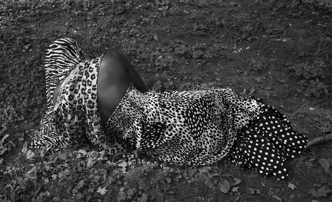
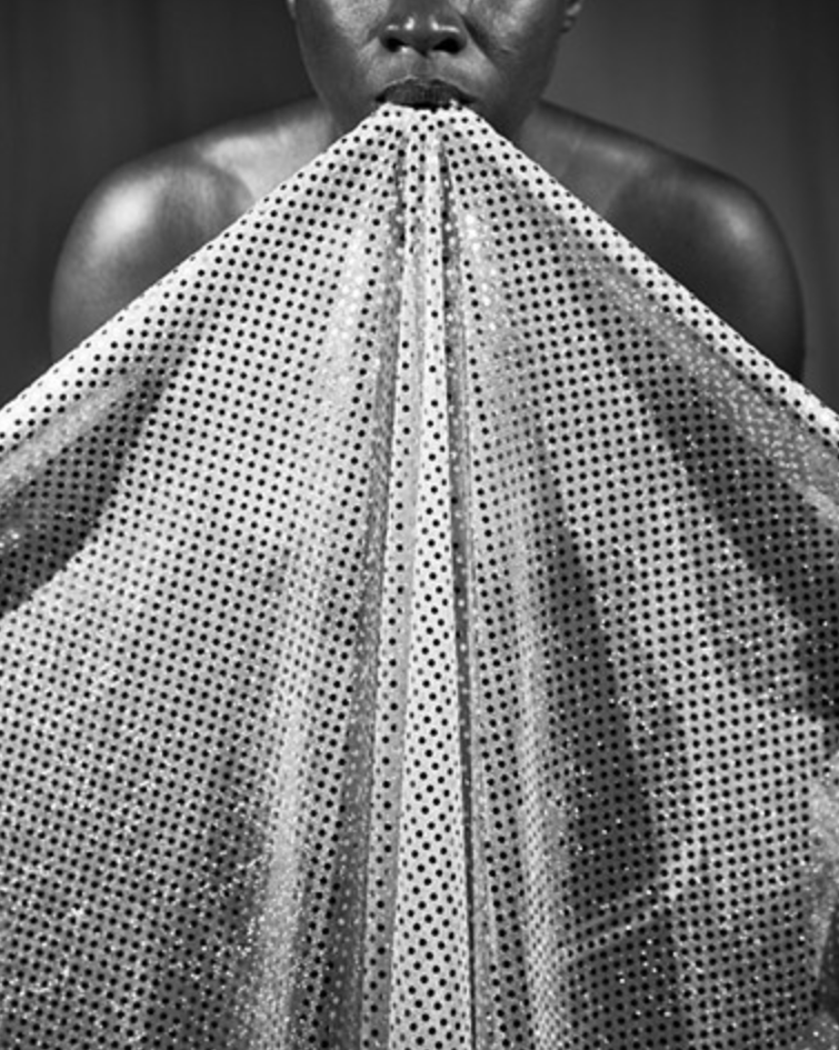
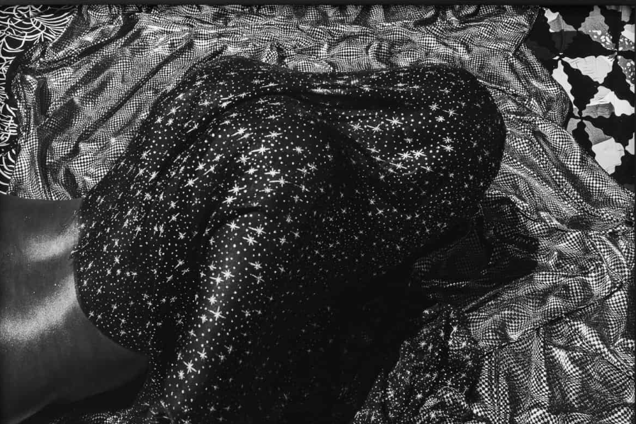
Keisha Scarville weaves together themes dealing with transformation, place, and thresholds. Scarville earned her BS from the Rochester Institute of Technology and studied at Parsons School of Design/The New School. Her work aims to express the beauty and opulence of African culture, by utilising African prints and using luxurious materials and capturing their layering and how they appear in the sun when placed alongside dark skin. Her work also aims to show the struggle black people face as a result of systemic oppression, Scarvilles work captures black models surrounded by their culture seemingly at peace and leasure. Almost all her photographs are in black and white , this show cases the beauty of bark skin and also shows the vibrancy of African culture despite their being no colour. In my personal response i will aim to use different types and textures of fabrics similar to Scarville, however i want to focus on the effect of fabric through light and using contrasting colours. Unlike other artists, Scarvilles use of lighting is very intentionally confusing, the strong sunlight and shine of the fabrics is heavily muted by a thick filter, the effect of this is that the contrast rather than relying on colour and shades, is shown through the materials effect of light. For example in the photograph below the colours of the materials are impossible to determine, but their response to light is what makes the contrast clear.Additionally Scarvilles use of texture and material makes their work very intriguing and unique, for example in the photograph on the far right, there is an complete absence of colour or background, the position of the subject is the focus of the image. The texture of the subjects hair and skin and the simple background and lack of colours allows the viewer to pay complete attention to the subject.
Personal response |
This photo is a great example of one of Scravilles work, the opposing and contrasting colours and patterns all work cohesively with each-other and the effect of the bight light of the sun making the subjects skin and the fabrics shine. Additionally the pose of the subject and its strangeness help illuminate a sense of struggle and pain. Scravilles use of black and white colours mute the brightness of the sun and add a strange and liminality to the photograph. The closeness the the subject helps highlight fine details like the wrinkled fabric and the points that shine brightest from the sun. In my personal response i want to recreate the wrinkling of the fabric and the bright lights , but contrasting i would want to focus mainly on the effect of light through fabric and moonshine.
|
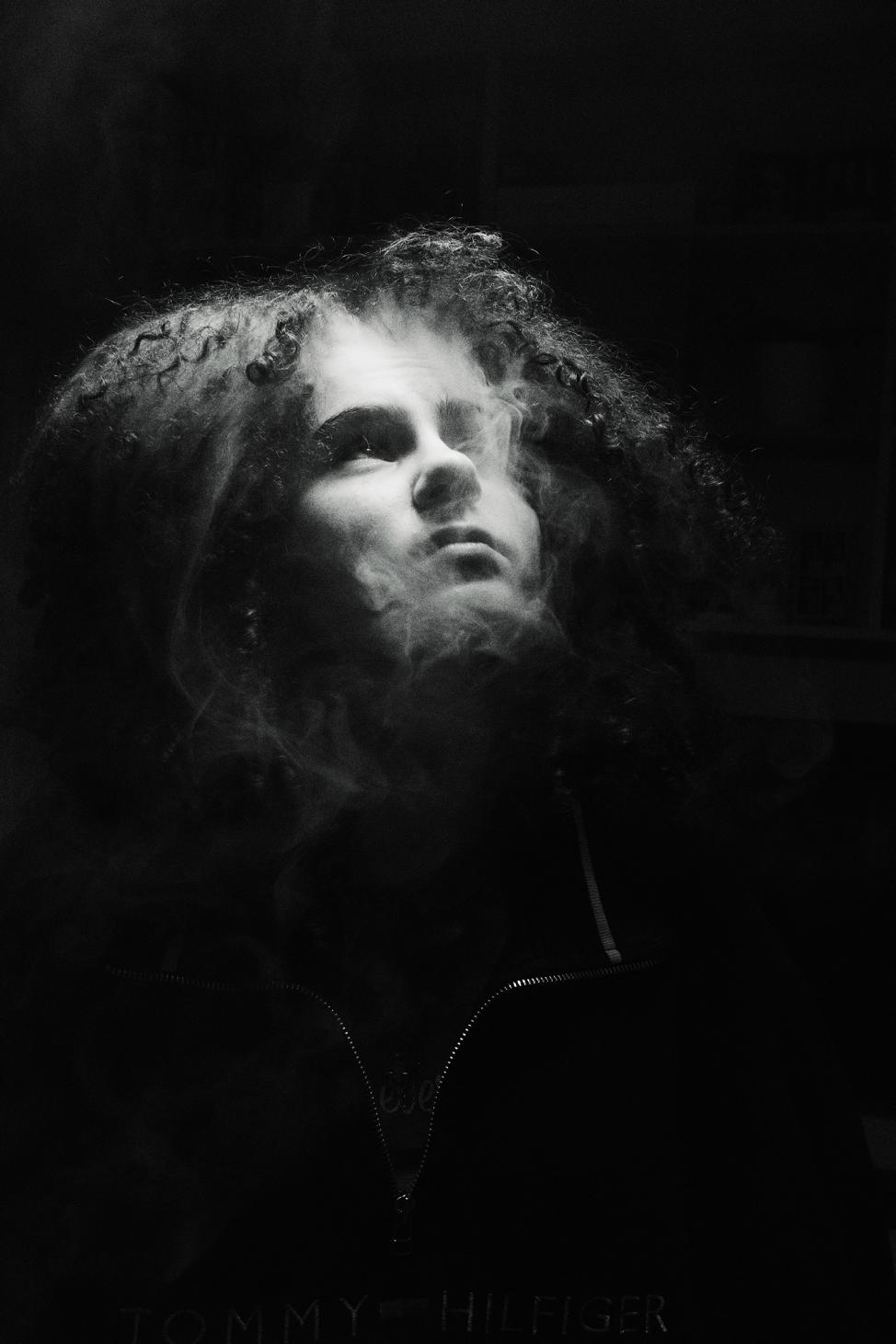
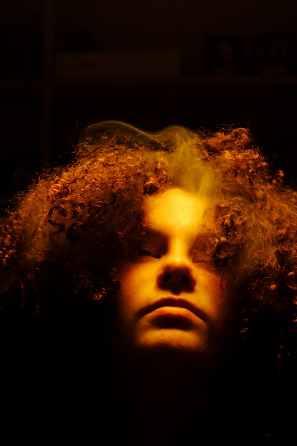
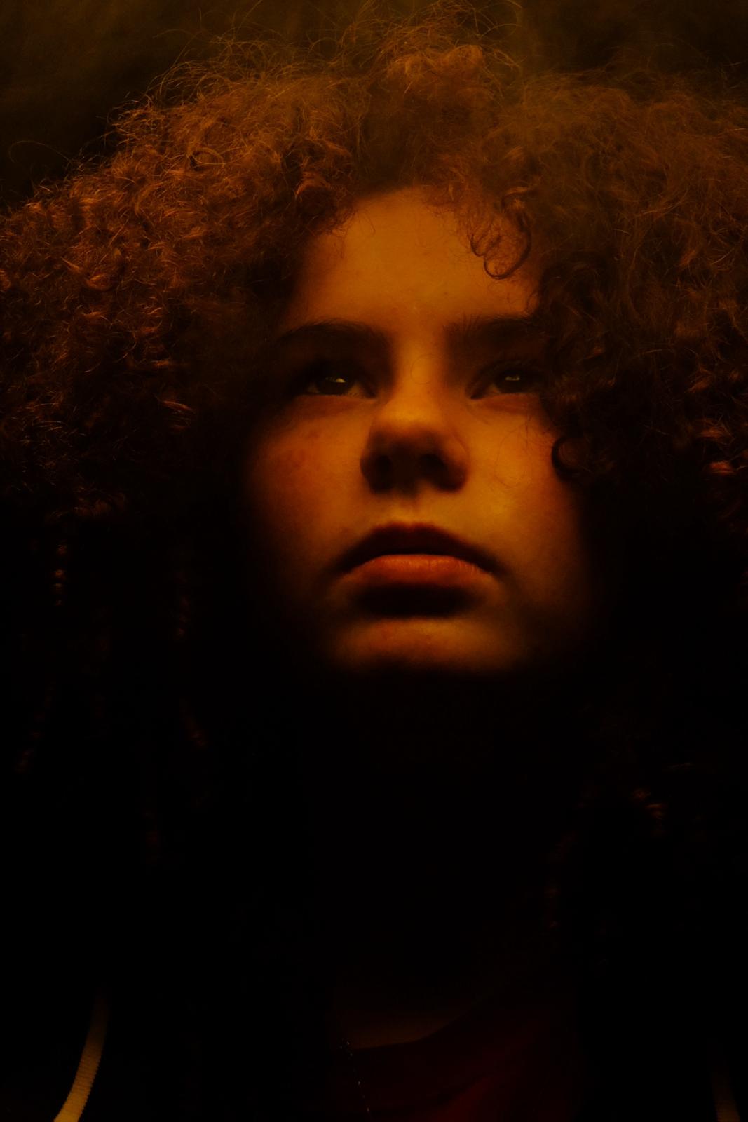
For my personal response to Scarvilles work i want to replicate their approach to texture and contrast, particularly in relation to the sun and light.So for my response i will use large see-through fabrics , that are able to transfer shadows and figures. Additionally i want to play with the image of smoke through light and its effect on the form/subject of a portrait.
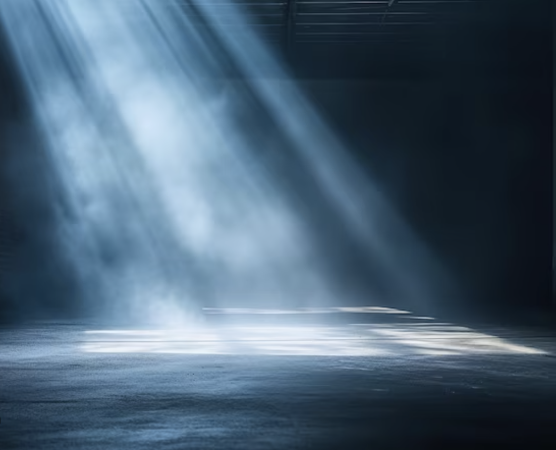
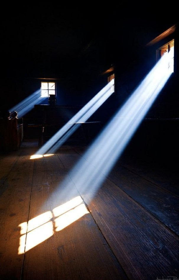
I found these images of light travelling through dust and smoke, and what i think is most interesting about them is how the light makes the movement of the particles in the air visible and this creates a mysterious and mystic effect.I want to play with how this alters portraits and blurs images slightly, additionally this same effect occurs when light hits water and as rainbow is achieved , so i might incorporate that into my experimentation. What i am really interested in conveying is the effect weather and the natural environment can have on the way we perceive and judge people , for example a dusty and blurry environment can connote a sense of fear and the unknown, whereas a rainbow cutting through a portrait might connote a sense of beauty and happiness, and even if the subject them-self doesn’t change the infliction of light can completely change an image independently.
I also want to play with fabrics and how they communicate light how figures are translated through a material , and how a figure is lost with light. Additionally i will be adapting Scarvilles black and white colour scheme so that the essence of the image is communicated clearly, i think that making the image black and white will make it more striking and the contrast is better translated. Scravilles work often focuses on the shine of skin and different textures, and so i think that highlighting the skin as a texture in a luxurious in Scravilles style.
I also want to play with fabrics and how they communicate light how figures are translated through a material , and how a figure is lost with light. Additionally i will be adapting Scarvilles black and white colour scheme so that the essence of the image is communicated clearly, i think that making the image black and white will make it more striking and the contrast is better translated. Scravilles work often focuses on the shine of skin and different textures, and so i think that highlighting the skin as a texture in a luxurious in Scravilles style.
My method
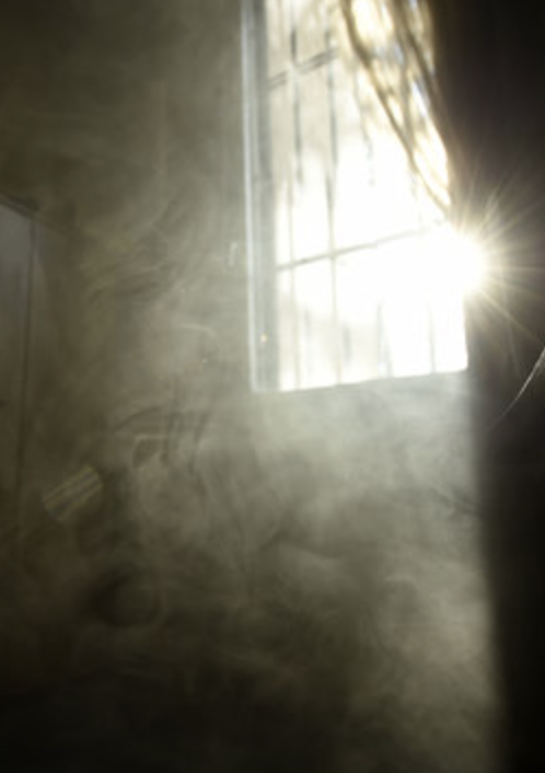
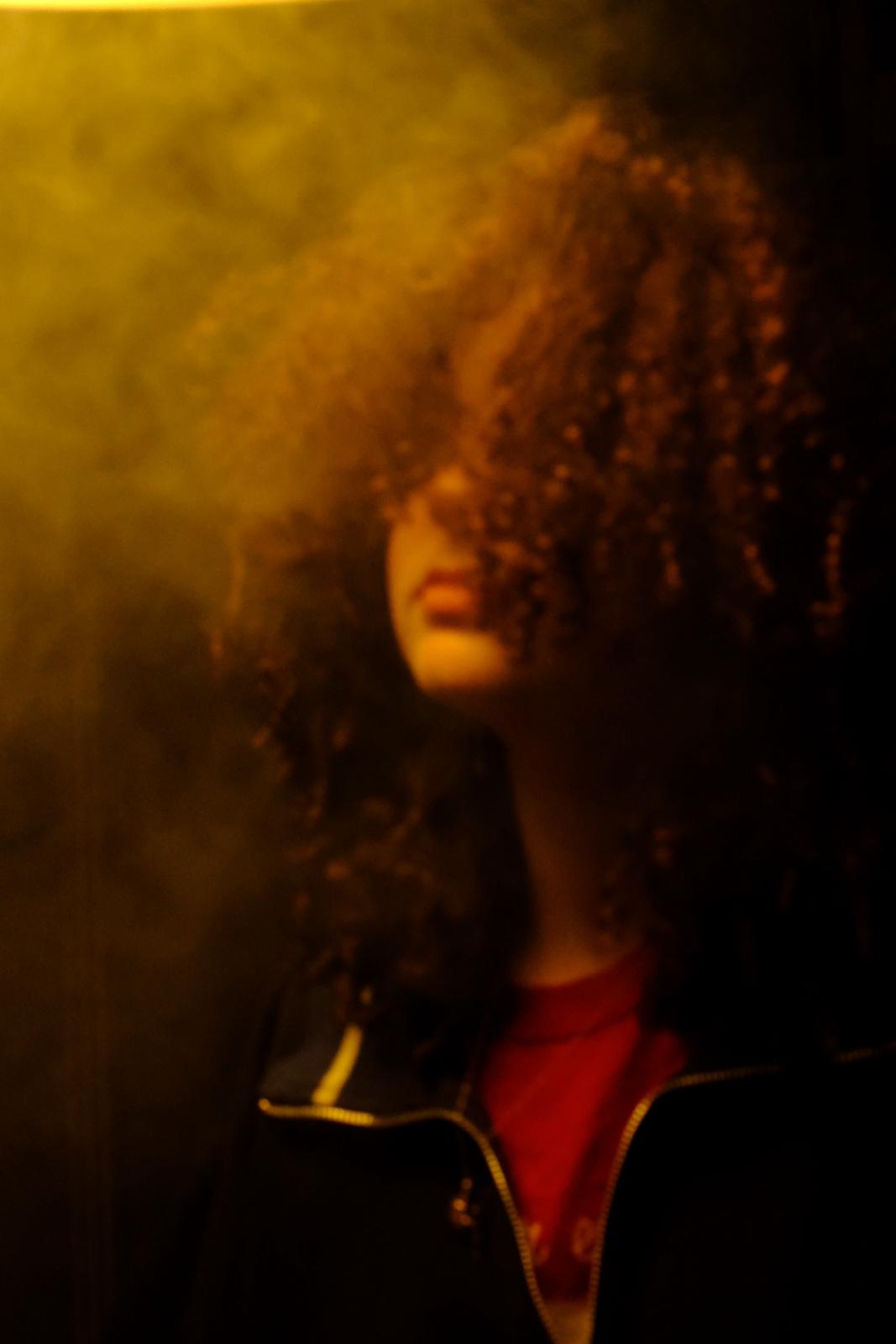
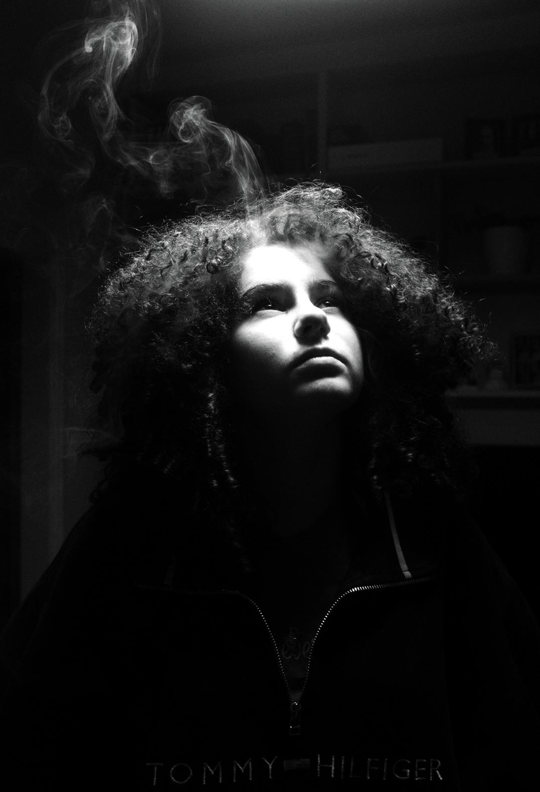
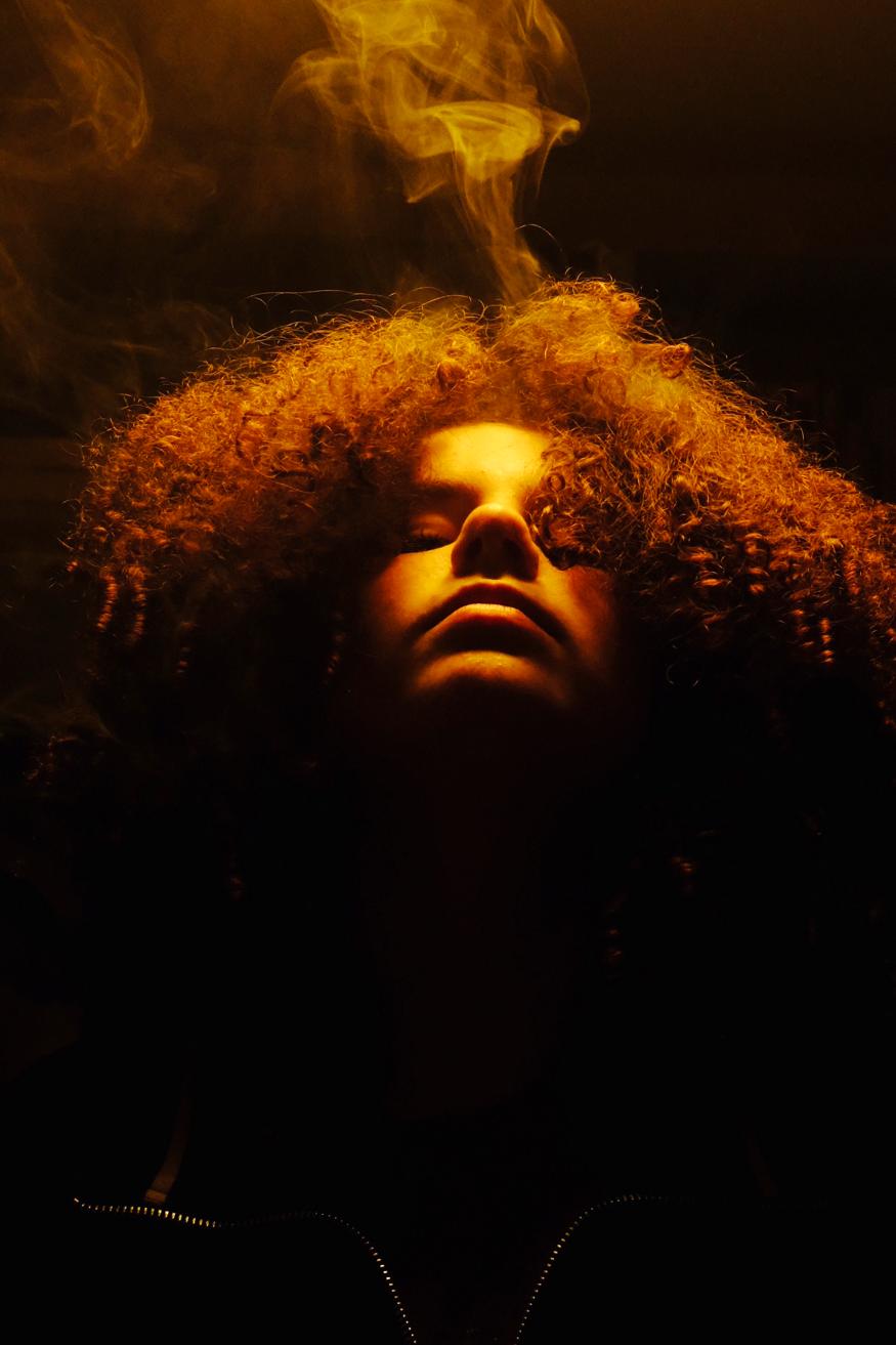
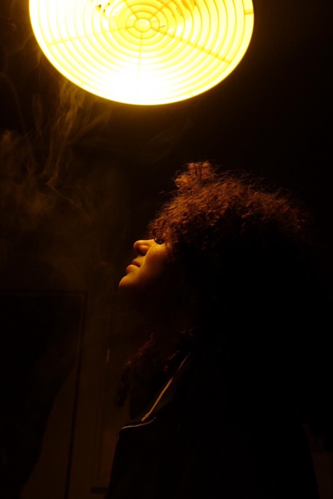
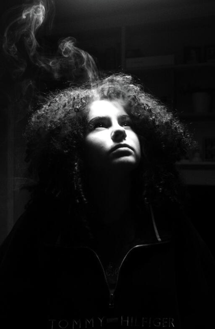
For my personal response to Scarvilles work i used a Fuji-film X100F camera and a tripod. I used a essential oil diffuser to create the smoke and dragged it around her hair to that the hair could hold the smoke and have a more entangled effect, i then foucsed the camera and took photo after photo trying ti capture the movement of the smoke it through light.I altered the camera settings to get some black and white photographs to get some variation. I raised the saturation slightly through my camera settings, this made the image appear slightly warmer in hue and it made the light shining of her face brighter.
If i was to try this again i would have taken more consecutive photographs and i would have experimented more with fabrics and different amounts of light, i would also like to try again, playing with differently light direction and intensities , maybe i could incorporate alternative themes and hues , i could also use different colours of light too communicate moods and atmospheres. I think that my use of the above head lighting was good at illuminating shadows and eliminating the distractions of the background, and I think that my use of warm lighting created a fiery effect , as if she was looking at the sun.
I chose to use the X100F because i find that it is particularly good at photographing skin and textures and since the content of the image is quite simple i wanted texture to stand out to reduce that simplicity.
Experiment 1
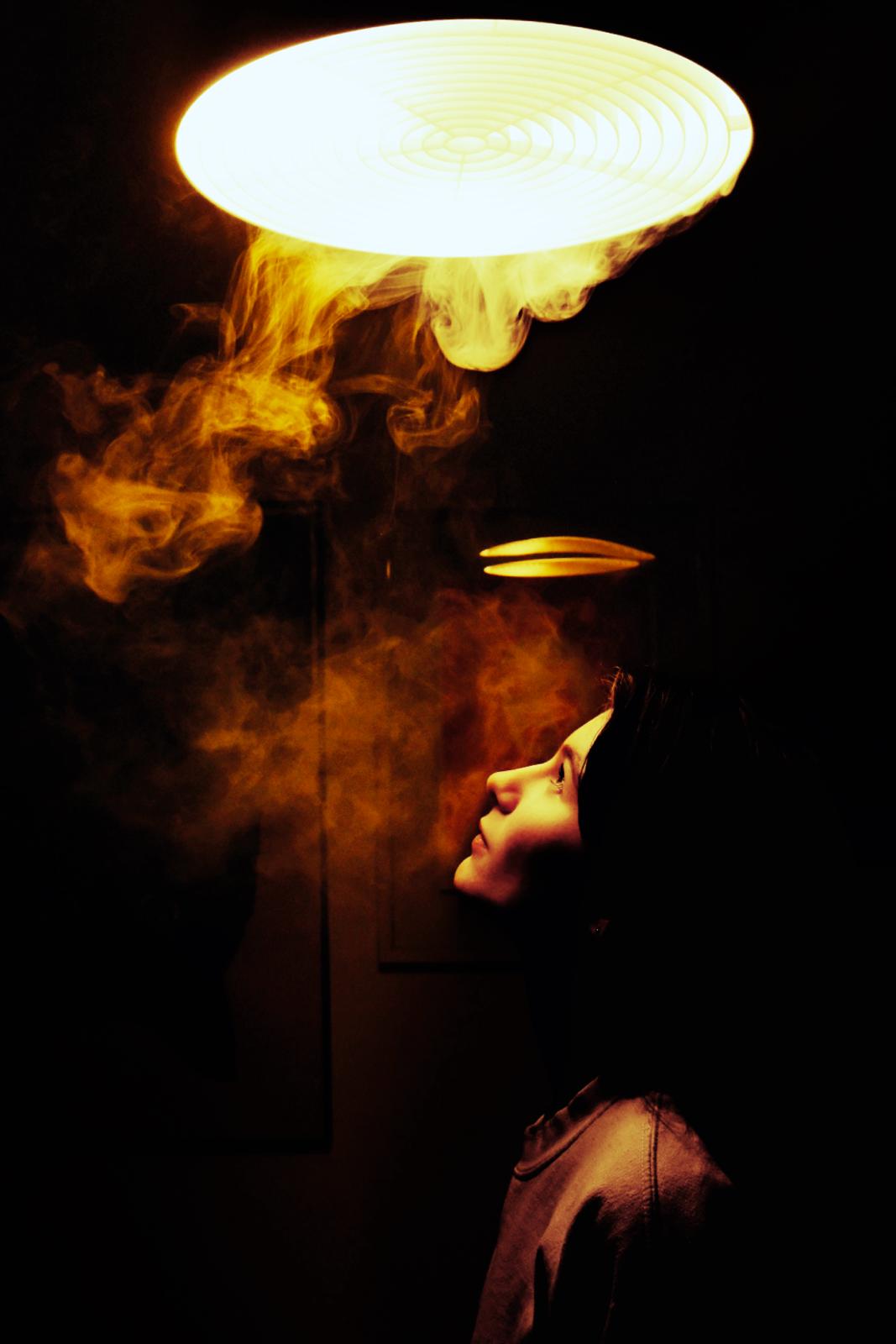
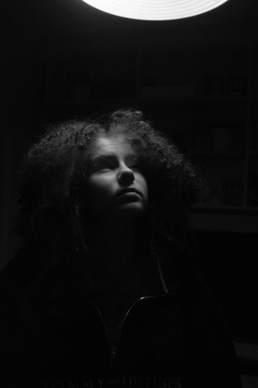
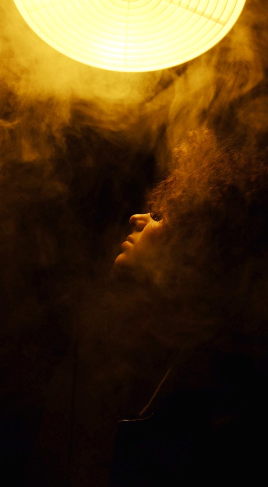
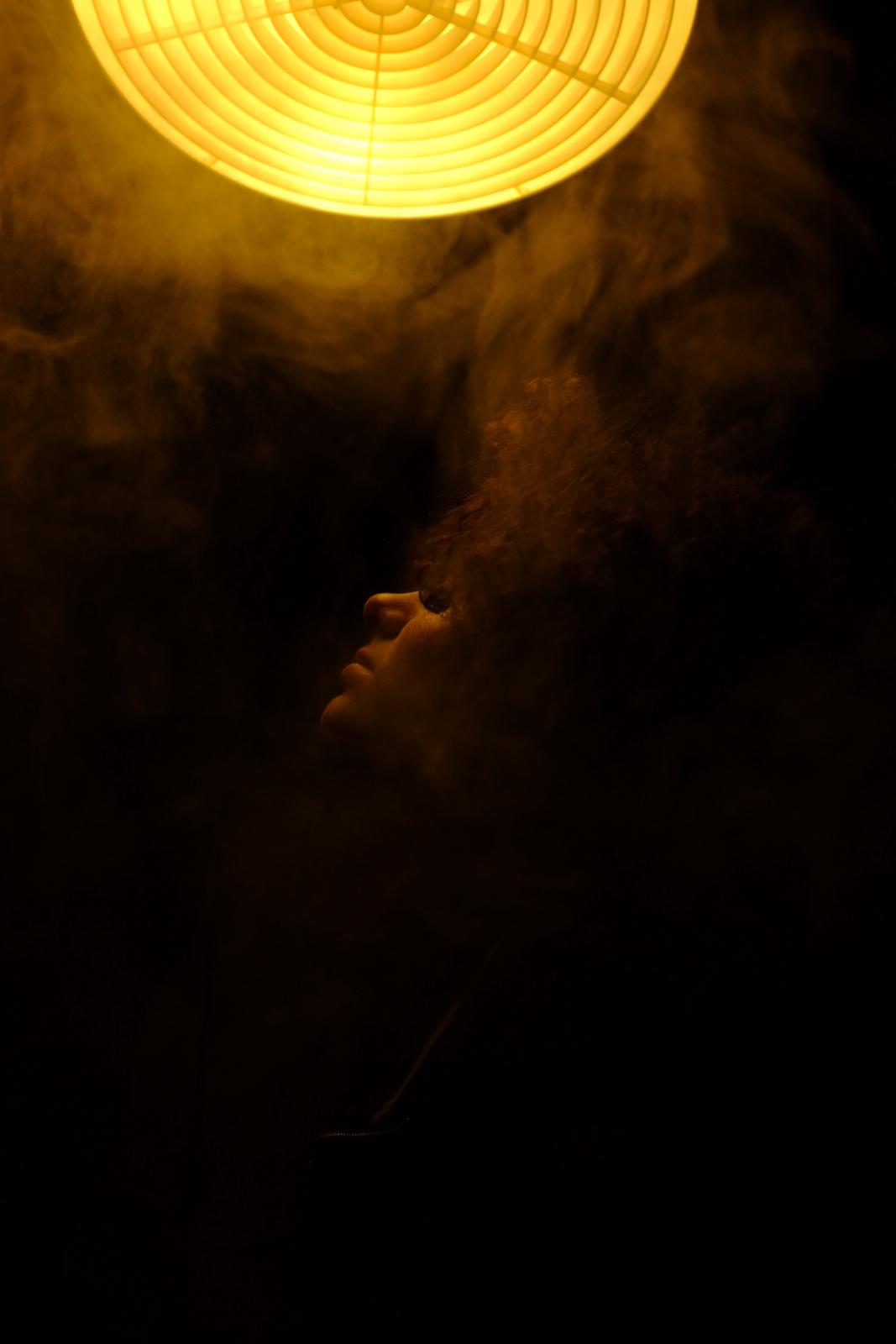
These are my least successful photographs , for the first one I feel that the smoke is too opaque and as a result it just adds too much negative space and distracts from the subject and the theme of light through smoke. If i was to improve the photograph i would have focused the image better and timed it so that the smoke had dissipated more and become more translucent.Additionally i would have framed the image lower do that the red at the bottom would stand out more as a focal point, to counteract the soft hue of the light.
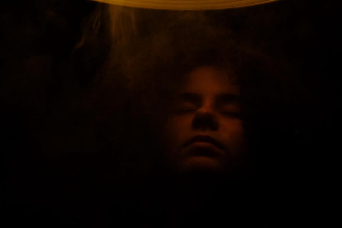
For the second one i feel that the image looks too over saturated and the lines aren't crisp enough, i also think that the shadows are too harsh and take away from the finer details such as; the texture of the skin and the layering of the light through the smoke.So if i was to improve it would have darkened the highlights and reduced the saturation , i also would have framed the photograph slightly higher so that more of the lights was in fame so the darkness of the bottom is reduced in order for the light points to have a more delicate effect.
Finally, for the last image i think is too blurry and out of focus, i think that the movement of the subject takes yout of the image slightly because put cannot pick up on the fine details it adds a barrier.Furthermore there is a strong lack of smoke in the image which contradicts my aim for these images. If i was to improve the image i would have added the smoke more and tried to focused the camera better , but if i was to keep the movement i would have framed the camera closer to the subjects face to make the image be closer and more intimate to compensate for the lack of finer details.
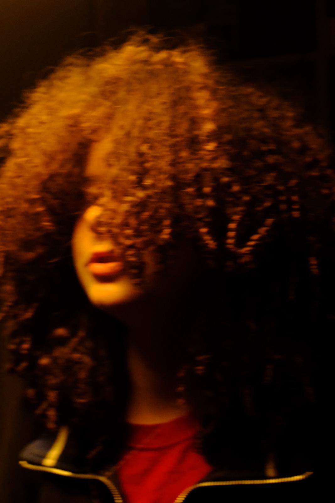
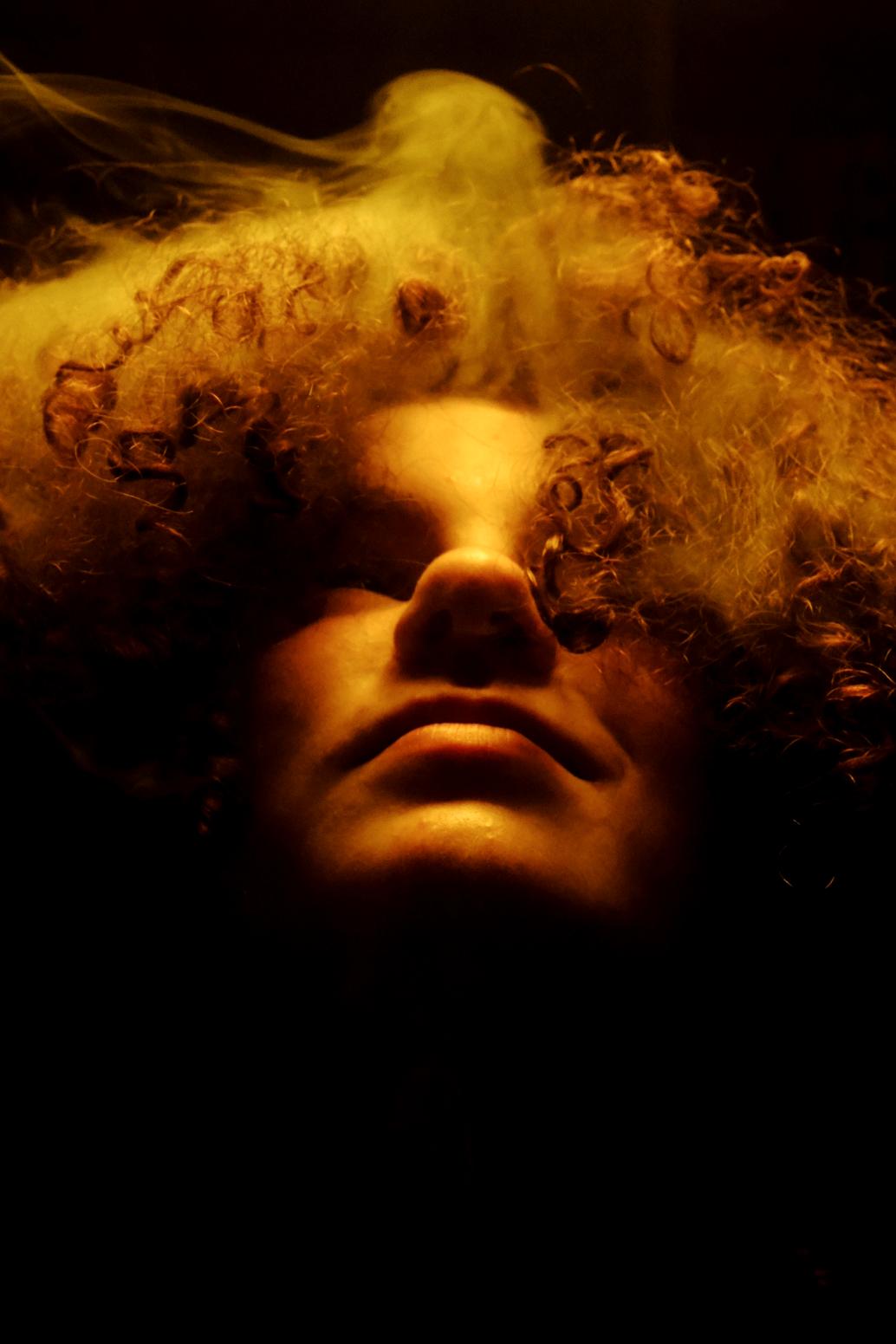
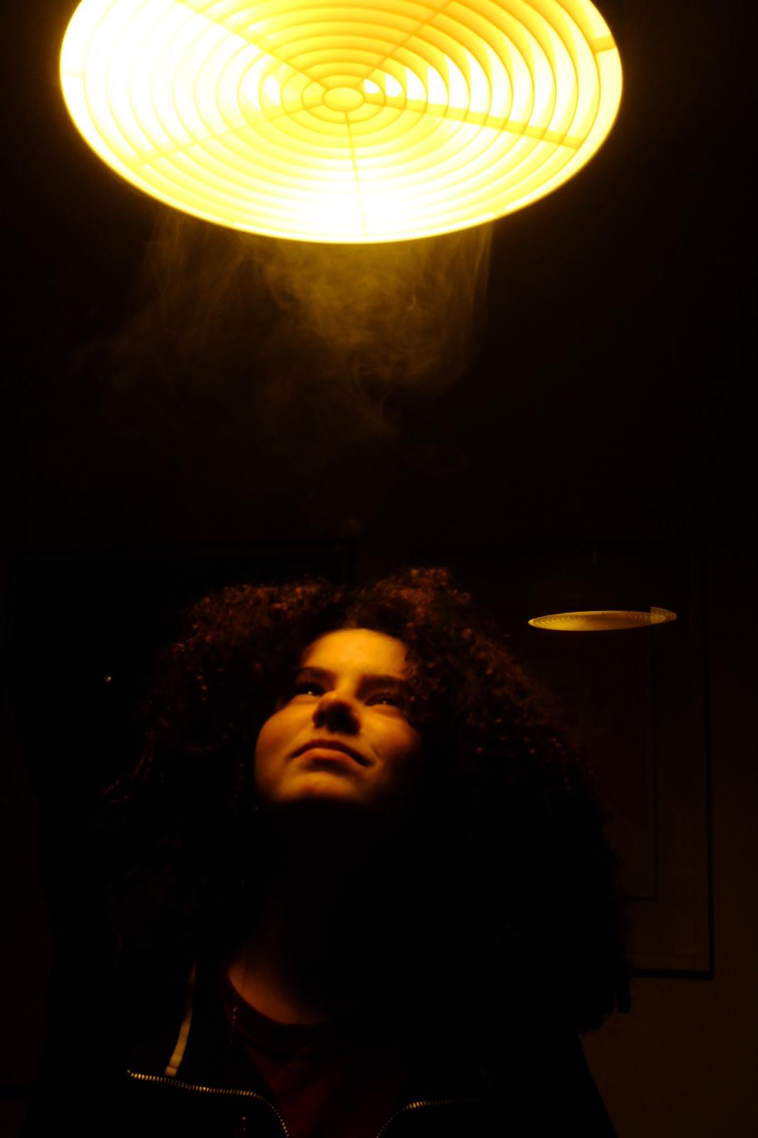
These images i chose to do in black and white, i think that the contrast looks good , however the only colours being black ansd white mean some if the finer details like the colour of the light through the smoke is lost. My favourite of these photographs is the one in the middle because i think the framing captures the light on the subjects face and the smoke well, but if i was to improve it would have made the contrast slightly less intense and darkened the shadows, hopefully this would enhance the smoke and bring out the highlighted points more. For the photograph at the end i think that the slightly grey hue is quite unique and captures the smoke in her hair well, but if i was to improve this photograph i would have placed the subject slightly closer towards the light source , this would make the darkness in the background contrast better as make the contours of the subjects face and hair stand out better.
These are the rest of my images , i think that if i was to redo this method i would experiment with different light sources from different directions and with differing colours and hues , i think that this would create more variation and diversity. In addition i would want to try adding more than one subject per image and experimenting with fabrics or objects and how they would appear.
In my opinion i successfully used light and experimented with shadow and smoke through light, if i was to take anything away from this trial i would say that i think that the camera that i used is very good at capturing skin and hair and picking up on finer textures, i also think that i enjoyed playing with different colours and their appearances on the face, particularly with these images i think that the warm orange tones work well and create a strong sense of atmosphere that i want to take with me in my final work.
In my opinion i successfully used light and experimented with shadow and smoke through light, if i was to take anything away from this trial i would say that i think that the camera that i used is very good at capturing skin and hair and picking up on finer textures, i also think that i enjoyed playing with different colours and their appearances on the face, particularly with these images i think that the warm orange tones work well and create a strong sense of atmosphere that i want to take with me in my final work.
My twenty photographs
I can use these images as a starting point for my work. I took these trying to have as much variation in colour as well as texture and contrast.
Sub themes
For my sub theme i was evaluating using the themes of contrast and nature for my portrait , i think that i like a more organised and monochromatic layout similar to Lee .In addition i was considering using a more traditional approach , by having the subject in the centre and in focus, and surrounding them with a relating background. And i want to experiment with focus and the textures of hair and skin , more specifically wet and dry hair as well as opposing skin and clothe textures.
One of the aims that i am interested in and have in mind is highlighting the wastefulness of overconsumption and the importance of surrounding yourself with elements of nature and their positive effect on your mental health.
I want to try and take images highlighting the important and damaged relationship humans have with nature and how far removed some people are removed from the past.I like the idea of using a better camera and incorporating an element of shadow and light .
Texture and contrast photographs
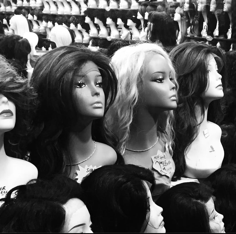
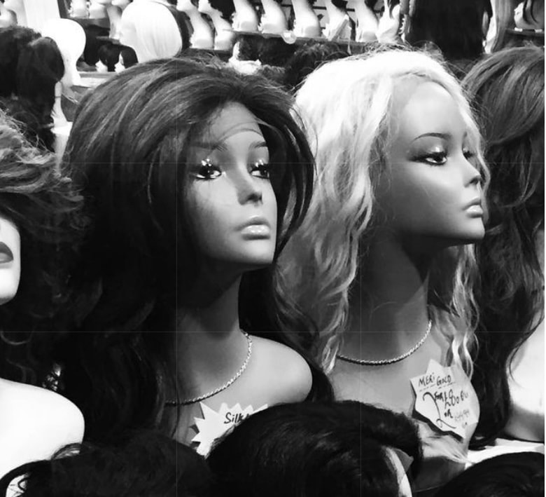
For these photographs my aim was to capture images that highlighted either contrast or texture. For the first one i chose to take a photograph in a wig shop, i think that the rows being uniform and in neat rows but having contrasting wig textures and skin colours work well in both ways, but i don’t t feel as though their are enough images being photographed to show the pattern and contrast as purposeful and obvious . If i was to improve the first image i would have also edited it so that the contrast was stronger and the fine lines are clearer so that the image looks better composed .
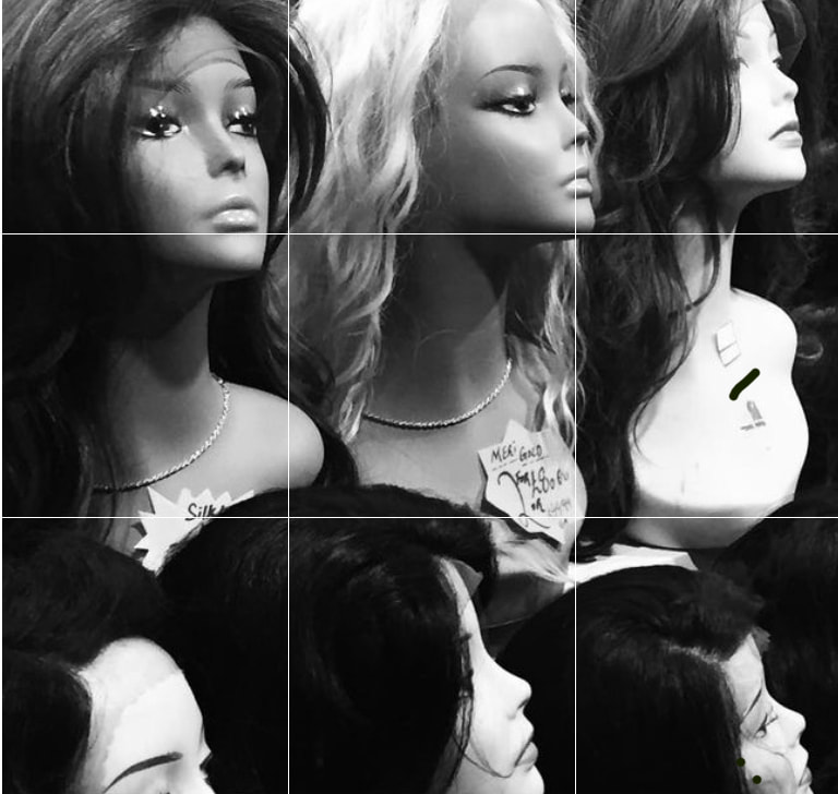
For the second one i think that i sucessfully incorporated both contrast and texture, i also think that the strong dark and light values are good and the straight lines create a clean and simplistic elements. But the framing makes the imgage limited and takes away from the rest of the image
For the second one i think that i sucessfully incorporated both contrast and texture, i also think that the strong dark and light values are good and the straight lines create a clean and simplistic elements. But the framing makes the imgage limited and takes away from the rest of the image
chose a location with flattering natural light and set up artificial lighting when indoors. I selected a suitable lensand chose a wide aperture (low f-stop number) to achieve a shallow depth of field, which helped to isolate the subject from the background.composed my shot, ensuring the subject was the main focus and there was enough space around themAfter capturing the images, I reviewed them on my camera's display or transferred them to a computer for a closer look. I selected the best shots and considered post-processing techniques like adjusting exposure, contrast, and color balance to enhance final results. I used photoshop to alter the framing and contrast :
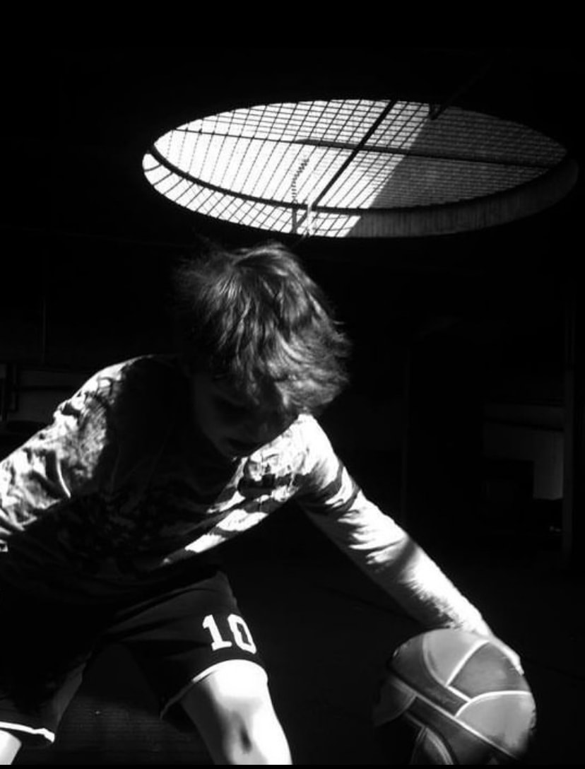
After I chose and experimented with framing , I altered the contrast , i wanted the shadow to be strong and stand out , so i made the dark points dark and i enhanced the bright, more highlighted areas.
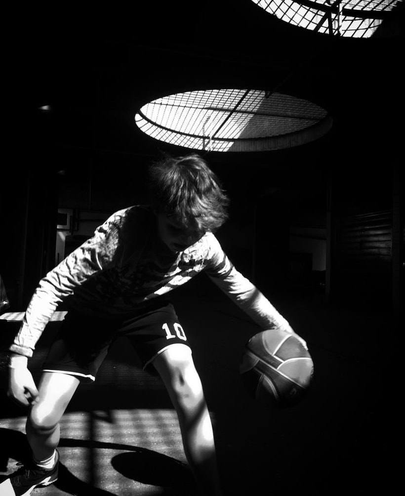
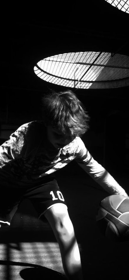
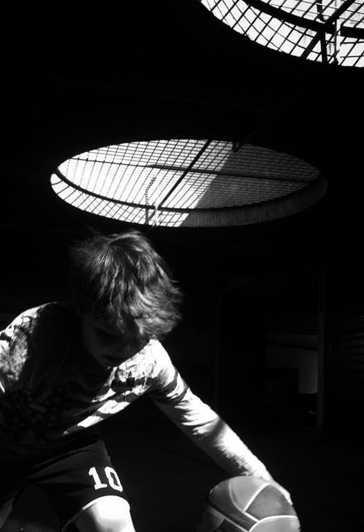
These were the final results. I think that if I was to try to do this again I would want to experiment with layering and putting different things in the foreground and the background, just to add dimension and make the photographs be more immersive and effective. But i thick that the black and white makes the contrast more obvious and clear. I think that the photograph if the boy playing basketball is the best image because in has both elements of texture and contrast ,it also is very cohesive and the shadows in the background . I liked the variety and diversity of the images and how different they are from each-other , but next time i think that it would be smarter is i took more images and chose a couple form each place.
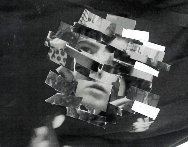
Altering photographs using cutting: experimentation 1
I used a photograph form my responce to Lees work , i chose it because their is a strong contrast and a main subject which means that i am able to alter it alot without the result looking too crowded or disorganised to the point where you cannot see what the image is depicting. I also think hatit beinng in black and white will mean that if the lines are not that straight then it will be harder to notice and the lines will blend better . Additionally i think that the strong contrast and shadow is optimal for my method because it means that you will be able to see where the orgder has been switched
I cut the image into many small strips , both horizontally and vertically.
Then i placed the horizontal and vertical strips across the edge of the paper in a random order , but i took into account the position of the head i i tried to keep the subject as a central focus . then i layered different strips on-top of eachother in a random order and i did this multiple times scanning the image in in between alterations
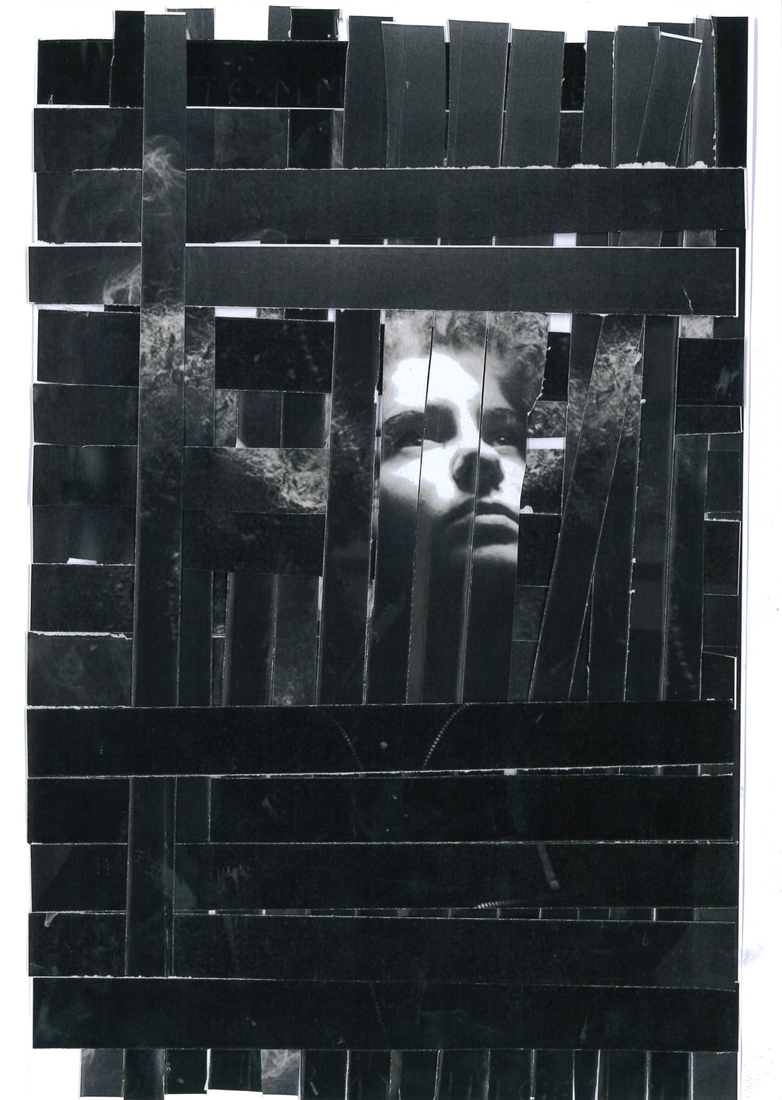
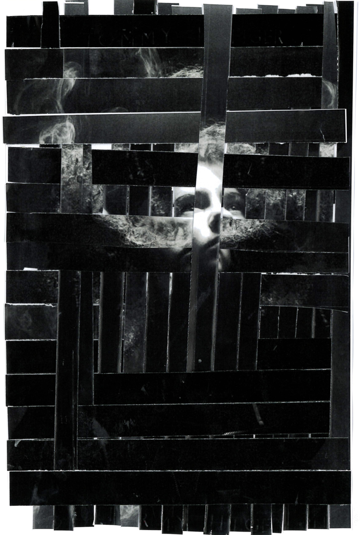
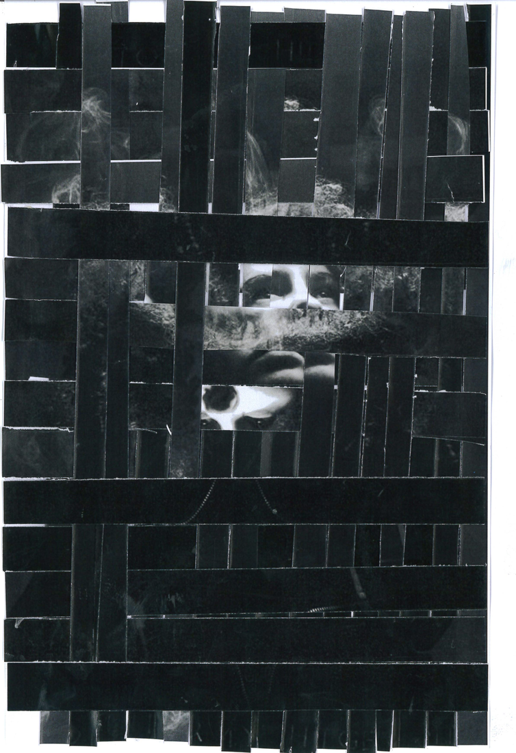
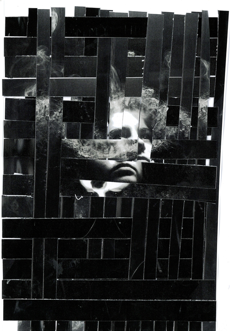
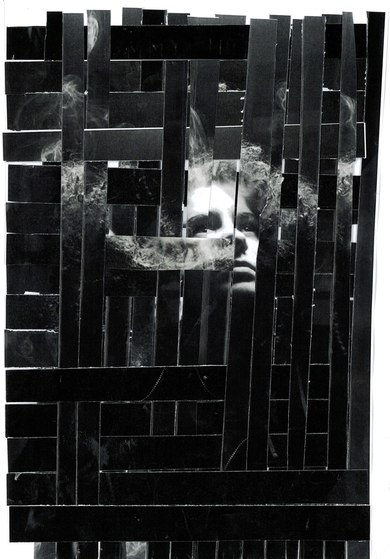
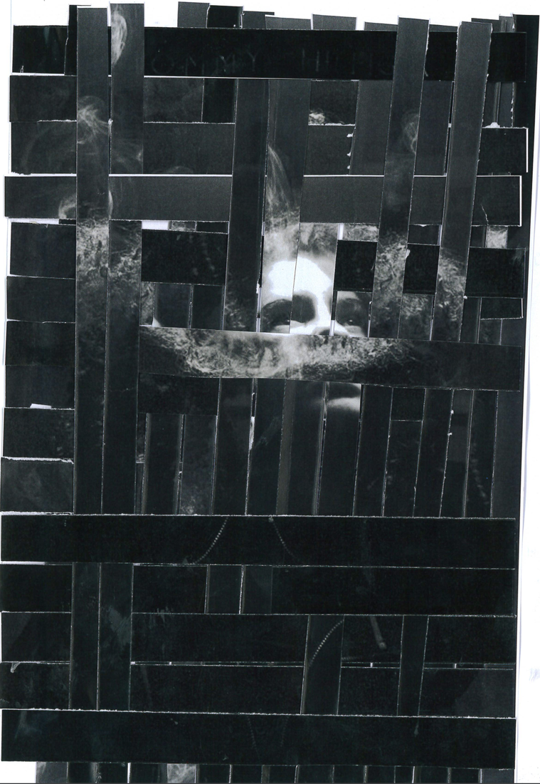
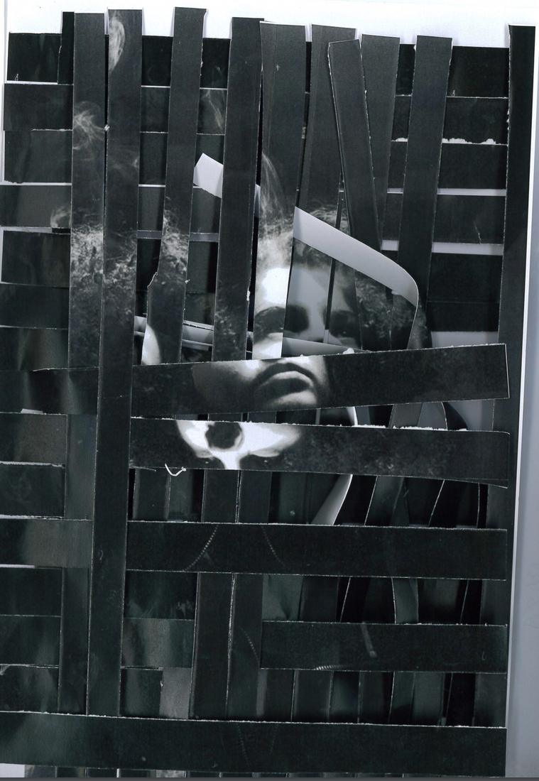
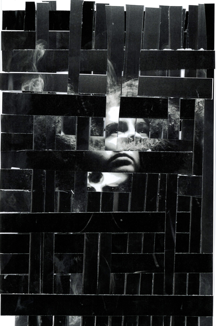
These are all my images, I scanned each photograph individually , between each scan, altering the layers and the dimensions .
I wanted to play with dimension so i decided to flip the paper up in some places and flatten the bended paper against the printer so that it would hold firmly and the result would turn out more crisp and the finer details of the photograph would turn out clearer
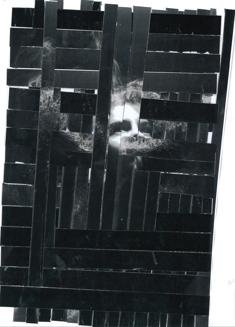
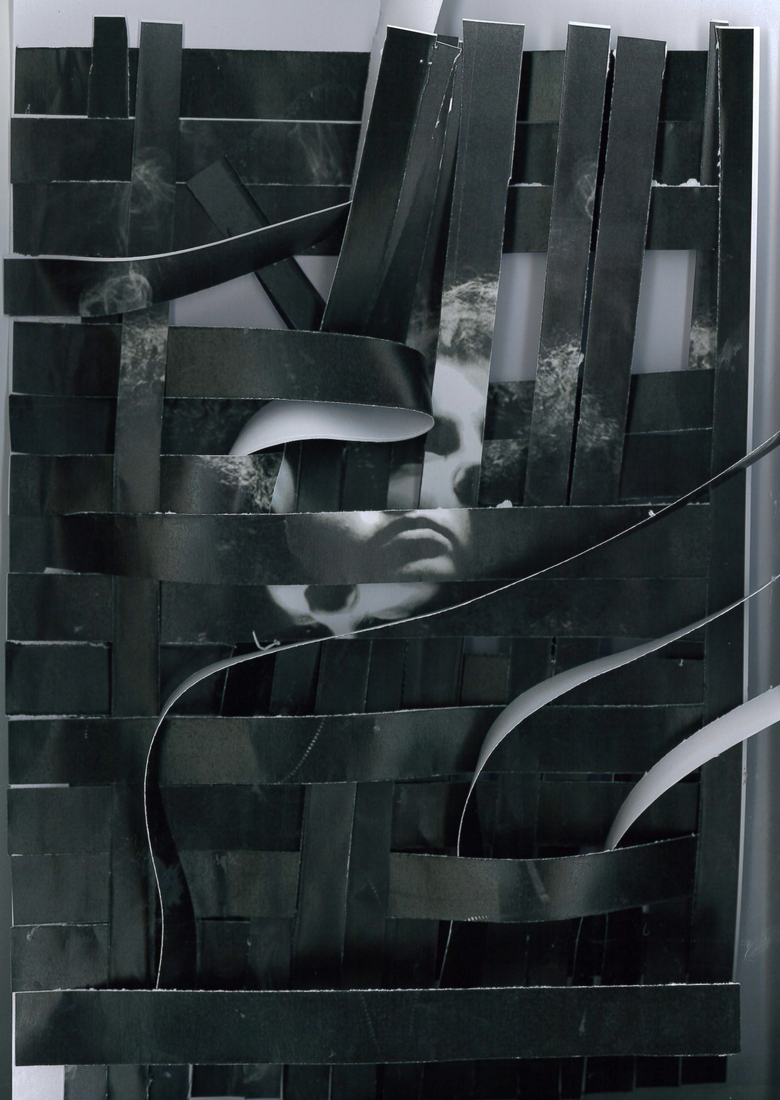
Experimentation 2 , distortion and curves.
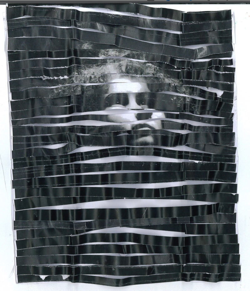
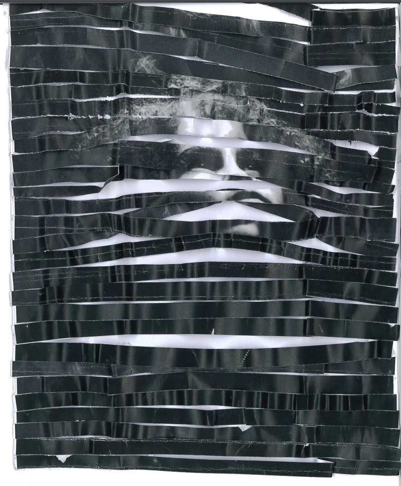
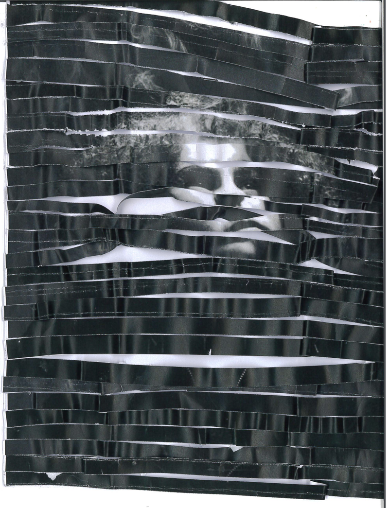
To make these images i cut the same image into many horizontal strips , thin i curled the strips using a ruler and then i stuck the strips in , keeping them in the same order . Then i scanned the images in , squashing the curled strips down , which created the ripples . I think that the image would have been more successful if i had a darker background or made the strips slightly thicker . However i think that the highlights that were created are interesting and the ripples add an interesting texture to the image. For my personal project i want to incorporate the idea of texture and a 3D element, however i want to use colour and incorporate a larger scale of colours and vibrancy.For my final project I would like to use multiple photographs , and play with light and contrast , similar to these
Final piece , ideas and consolidation
I would like to keep my consistent use of black and white for my final piece , in addition I have taken great inspiration from my exploration or Dionne lees work and I want to keep the contrast I used when experimenting with their style . My work with collage and cutting and distortion I would like to play around with shared lines and contrast , I think that using multiple photographs with altering light sources will be good moving forward. In terms of displaying them , I think one cohesive peice as opposed to a book will be better , and I might print them onto acetate
