Constructed Landscapes Mind-map
My theme
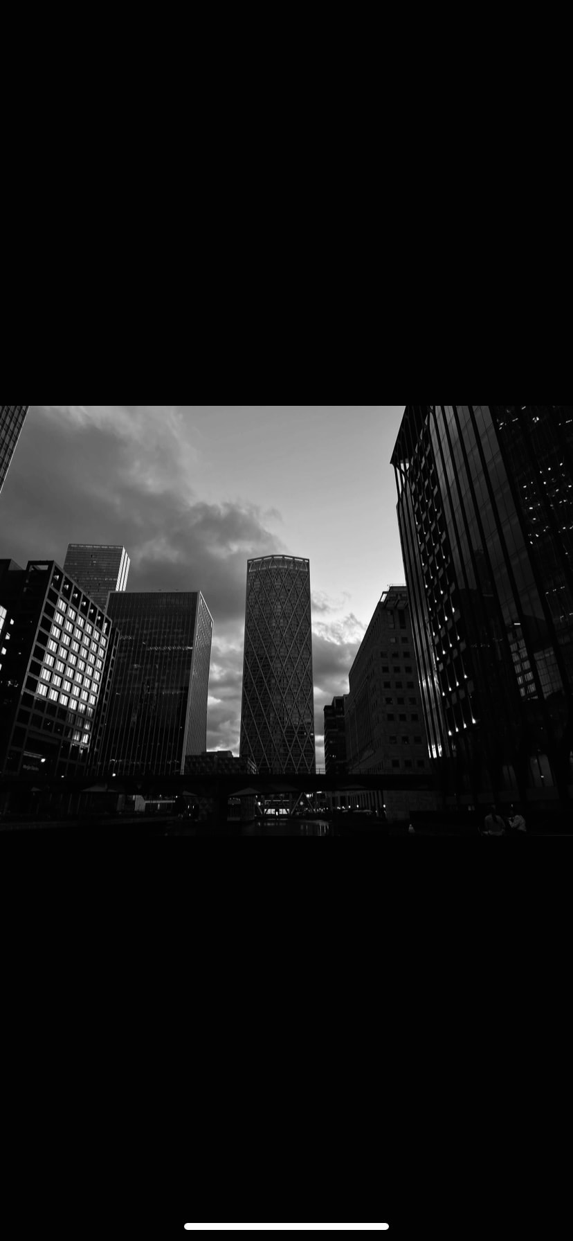
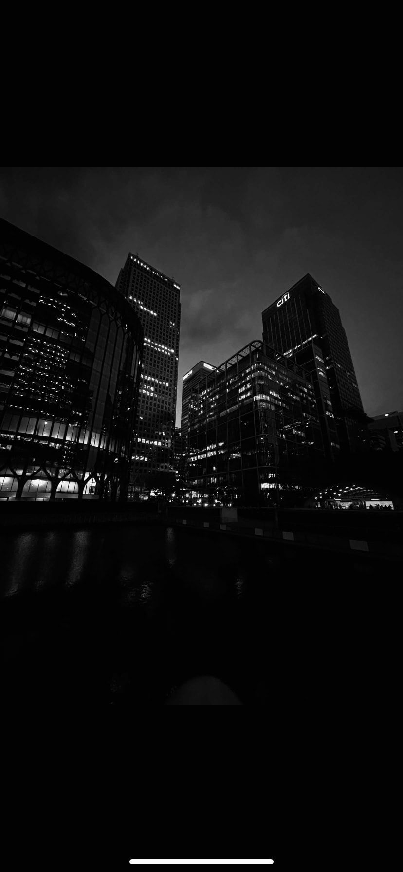
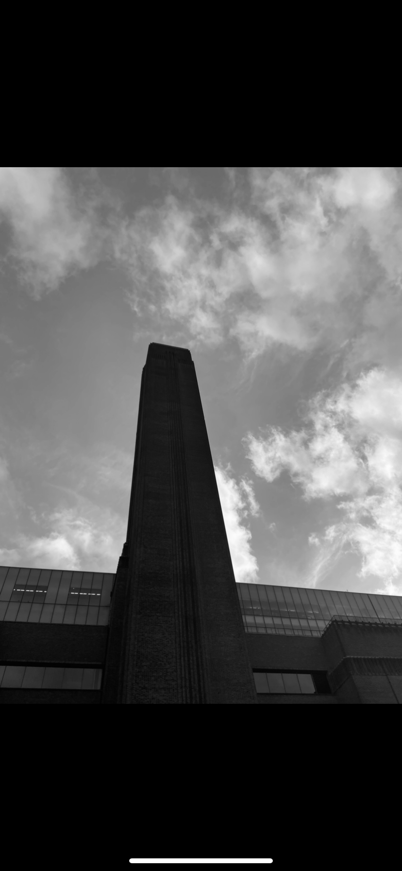
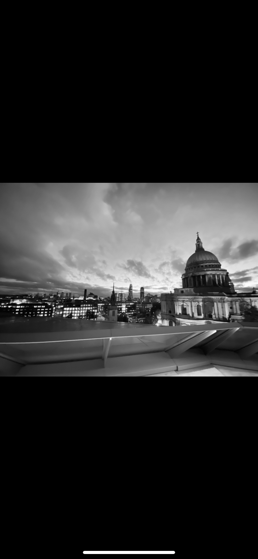
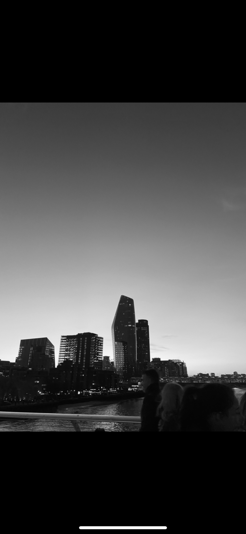
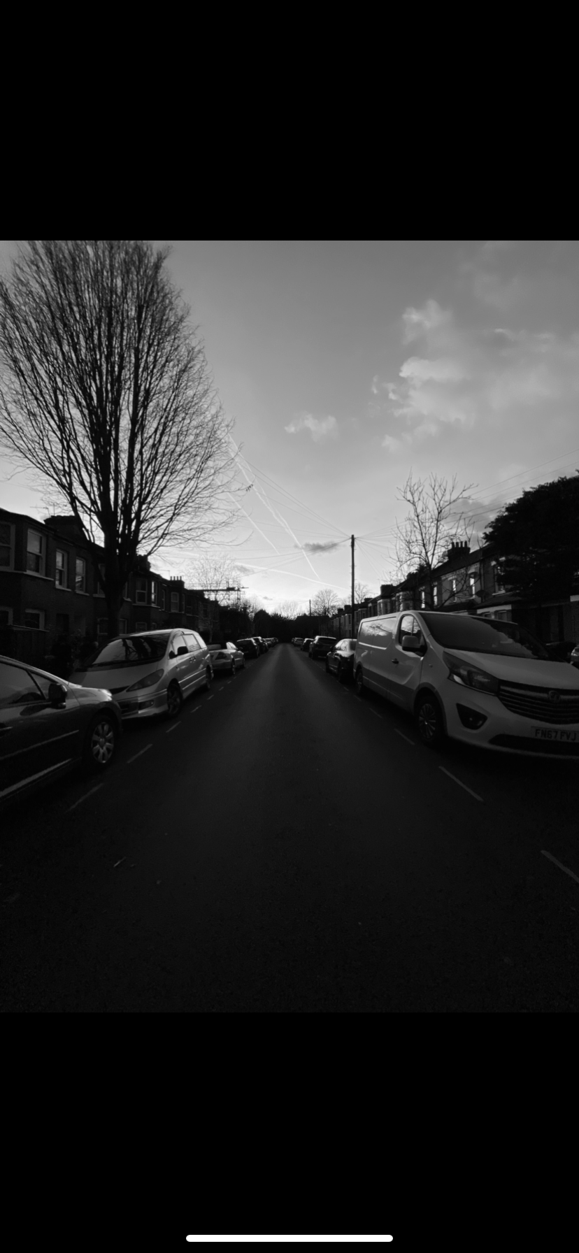
For my personal project i wanted to explore the theme of light pollution and its effect on nature, one of the key features of my personal project will be based around the disruption bright city lights have on the development of animals. I wanted to incorporate the neon lines of light cars leave behind like a trail in the long exposure photographs of motorways, and pair that with the peace of thick wilderness. I want to highlight the unnatural and often disruptive behaviour of overly bright unnecessary lights.
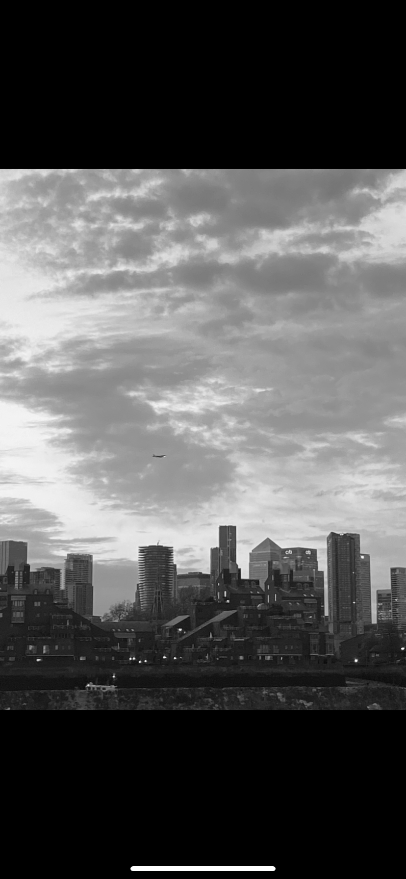
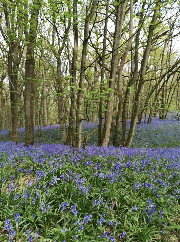
Additionally i wanted to explore the themes of the stars and the visibility at differing distances from densely populated cities, and how low visibility takes away from the beauty of nature. I want to photograph from the point of view of the disrupted animals and insects gazing across a seemingly unrecognisable land scape, too dark to be day, to bright to be night, this confusion creates a gothic liminal atmosphere which is translated through the animals fear and confusion.
For the central theme of humans effect on the environment , i wanted to take into account the trail of pollution and disruption humans seemingly leave behind wherever they go , vandalising the world with rubbish and graffiti, i want to translate this through bright strips of neon light scratching nature with it violence and obnoxiousness’s contrasting in differing ways throughout the day.
Noemie Goudal
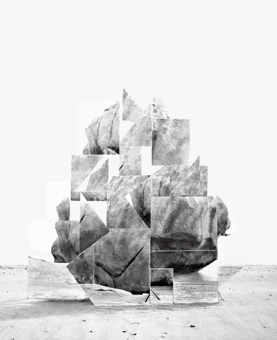
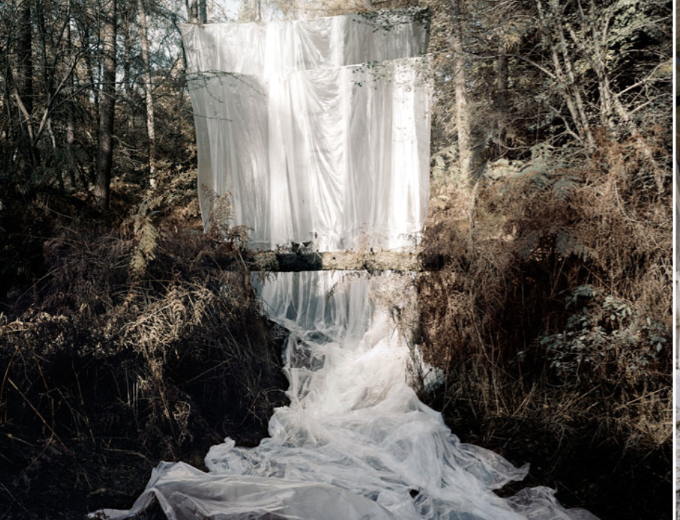
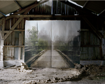
Noemie Goudal is an 35 year old Italian artist whose practice revolves around the negative impact of humans of the environment , her work involves adding unnatural interventions into what would have been a peaceful landscape photograph, cleverly executed through her film and Photography.Her aim is to immerse her audience, captivating them through her work, backed up by intense research and learning.Her work is acts as an intersection, linking common themes in ecology to the impacts if human society and culture; the behaviour of cities , the origin of languages and the culture of religion and the idolisation of material goods, against the tradition and unwavering attitude of nature and the goodness of honesty; not seeking for happiness through temporary , instead growing as an individual as you are.What i find so original about her is is her ability to create very harmonious and seamless photographs, her unique style and colour scheme is very eye catching to me. The consistent dark and grungy style is very effective in emphasising the unwanted nature of the foreign objects within her photographs, for example in the far right photograph the layered plastic is mimicking a waterfall scene and blends seamlessly into the surroundings that you almost don't notice its there. I think the way she framed the photograph highlights the culture of ignoring or denying the blatant destruction of the environment and accepting the saddening consequences as normal or in this case, natural.What i think is very consistent in her work is her ability to not only convey an important and moving message but also make the photographs beautiful and very cohesive. For example in the far right photograph, Goudal is communicating humans stripping the desirable features off of a nature(food form trees, fish form rivers), and leaving the dead and decaying scraps behind in a discombobulated , rearranged mutilated state. Additionally she has managed to make a thought-out and impressive photograph , with an eye-catching composition , featuring pale and contrasting colours, sharp lines that have elements of symmetry, with a unique and stark pattern.
For my personal project i would like to mimmic the beautiful elements of nature paired alongside the brutal realty of climate change and, in particular, the violent consequences that light and sound pollution has on the innocent surrounding wildlife.
For my personal project i would like to mimmic the beautiful elements of nature paired alongside the brutal realty of climate change and, in particular, the violent consequences that light and sound pollution has on the innocent surrounding wildlife.
|
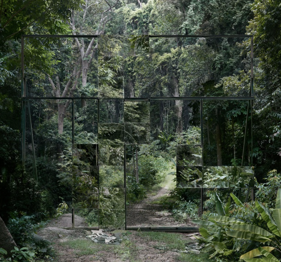
This is one of my favourite photos from Goudal, i think it perfectly encapsulates her style and atmosphere. Firstly the colour scheme being constantly gloomy and muted to a certain extent, is used here, secondly the contrasting settings and objects conjoined in one photograph is in almost all her photographs from this collection, and in this case ,is very beautiful and effectively communicates her message of abusing the environment until we and up living in regret of what. we once had. To me despite being similar to her other photographs , what makes this photo so special and unique to me is the clever use of framing the photo in such a way that the subject appear to be a separate photograph surrounded by a miserable frame of rubble and desolation. The faded and appearance of the photo reminds us that in the end the beauty and longevity of nature will triumph over the fabricated nonsense that humans spend their lives working to buy.
|
Corinne Vionnet
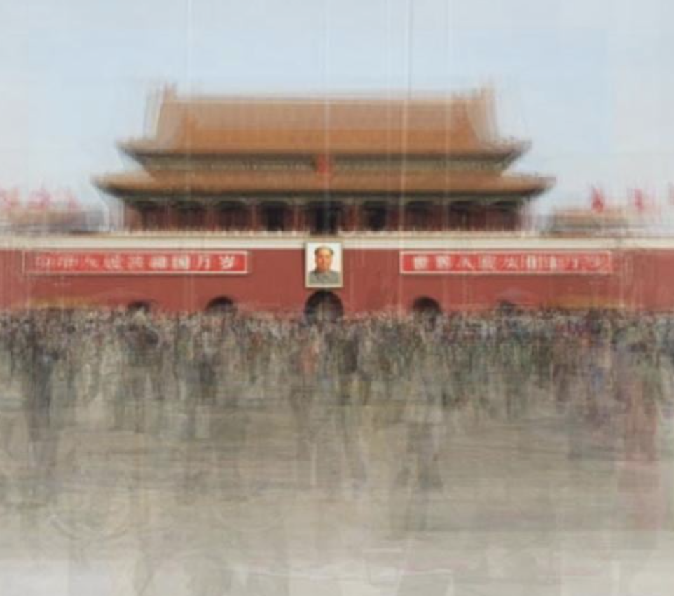
Corrine Vionnet is a French-Swiss artist who has pioneered the usage of web images in modern photography.Her work is revolutionary and has opened a door into a new form of Photography, her work aims to highlight the obsessive culture of tourism and in particular, the idolisation of tourist hotspots and the lack or originality of everyday Photography.
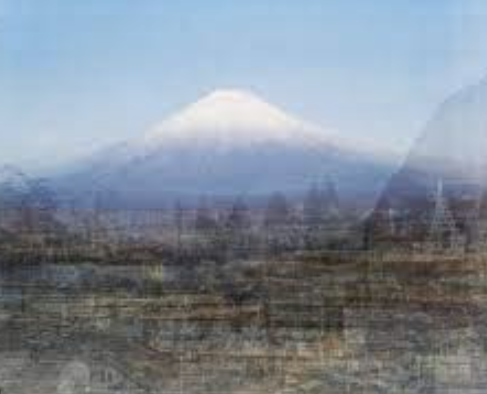
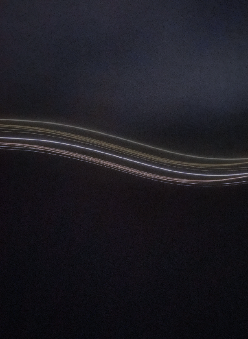
Vionnet layers jpegs found through the internet of the same thing/place and layers them on-to of each-other . In my opinion this is a vey unique and effective way to communicate the of photos that were taken for the sake of proving that you were there. This concept interests me as it evaluates the reason why people take photos the way that they do, for example on the far left, hundreds of people have stood in that spot to get the lines of the building in perfect symmetry to each-other , again in the middle photograph, people have shuffled a back and forth across the pavement to line the tip of the mountain up with the centre of the photograph. Vionnets photos capture the joy of travel and collective apperception of beautiful places ,and how people are trying to take some of that joy with them when they return home. The strange layering of the photos, blur out the crowds of tourists, allows the viewer to experience the captivating awe of seeing these places, so much so that the noise and constant movement of people fizzle away leaving you held firmly in the moment, an unexpected stillness found through the lens of the camera.
A consistent theme throughout her photographs is a fine sharp focal point , found somewhere in the subject , followed by a smooth merge into a blurry and more chaotic border , that leaves a painterly and messy effect. Additionally the use of layering allows the viewer to feel the noise and movement that often accompanies a crowded place.In 'Photo Opportunities” Corinne Vionnet theories our consumption of, and contribution to, these patterns in visual culture, providing a nuanced perspective that may provide inspiration for our own next photo opportunities.
So for my personal project i would like to incorporate the themes of layering, in my case i would like to use it to contrast the intensities of light pollution by layering photos of the same place, changing the time of day and also the proximity to a strong source of light pollution, such as a large city or blinding street lamps in relation the the dark stillness of deep nature , untouched and peaceful.
|
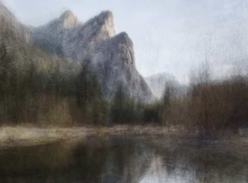
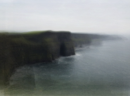
This photo by Vionnet stands out to me , i think is gloomy and more moody atmosphere contrasts with the other busy and vibrant photographs on her website. I find this photo very peaceful, and i think that because of the muted colour-scheme and, more importantly the lack of strong structure and Vionnets unique process of layering photos lining them up at a central focal point, however in this image the harsh central point of focus is unclear and blurry, leaving a beautiful murky stillness.
Additionally the use of light and shadow is a key feature in this photo, for example the strong darkness of the bottom left hand side where the cliff meets the water creates a mystery and simultaneously pulls your eyes to the soft light greens of the cliff edge and the glistening and crashing waves in the centre of the photo where there is a stronger clarity and the viewer can see the wrinkled texture of the sea. |
My response
I used photoshop to layer photographs on-top of each-other , creating a sense of movement and noise.After every layer i changed the occupancy and hue to mimic Vionett's process of curating different photographs from different sources and time of days.I also made sure to keep a rough focal point in the image, for example in the photograph of the building i tried to line up the photos with the light from the apartments.For the middle photos i wanted to copy Vionetts more soft focus photos so i decided to use the bright waves of light to my advantage, first i lowered the contrast of the picture then i added a soft purple hue and finally i decreased the occupancy and repeated this process , moving the photograph and experimenting with contrast until i liked the result.
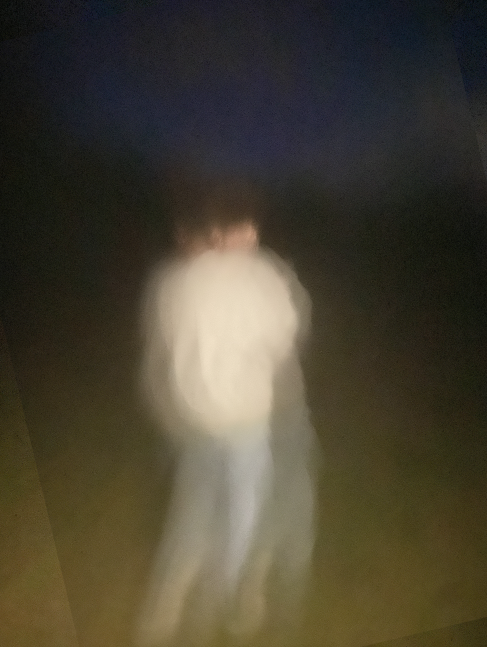
For the end photo i wanted to use Vionetts theme of making a person the focal point , and so i played around with the occupancy and angle but i made sure to keep the subject and a focal point consistently.
What i found was very challenging was actually choosing the photos and finding two photographs of the same object from different angles with the same focal point that was doable, so i decided to come up with a new technique ; instead of finding two different photos of the same thing i took one photo and made copy , altering each one in different ways, focusing on the position of the subject and the hue of the photo. For next time i would like to take very intentional photographs, premeditating what photos i want to take, keeping in mind the angles i will need to take them from. Additionally for next time, i will try and use my photoshop knowledge and isolate the landscape and altering that as opposed to changing the whole photo and looking shape and contrast.
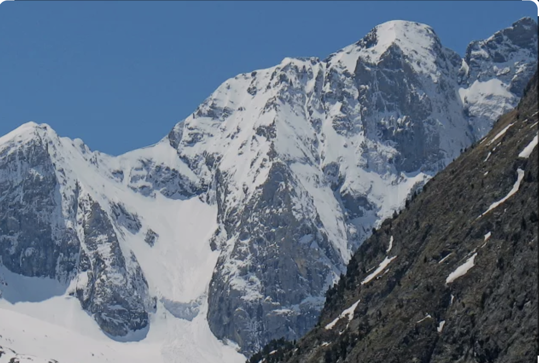
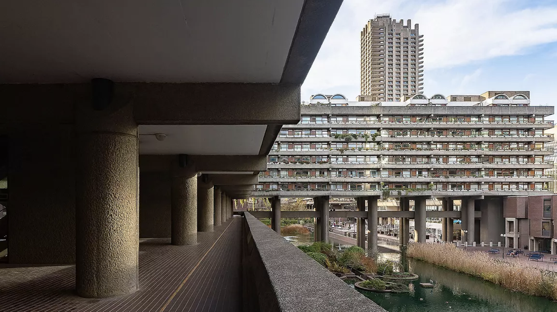
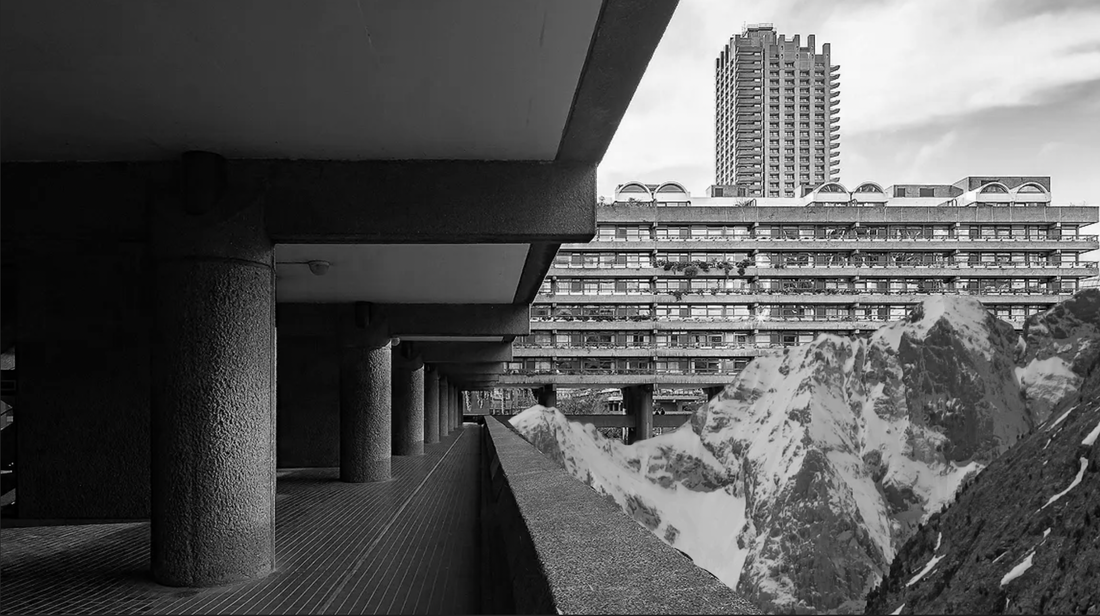
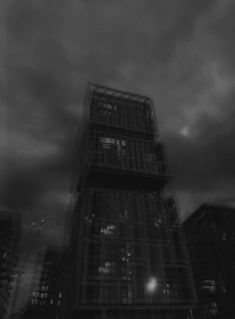
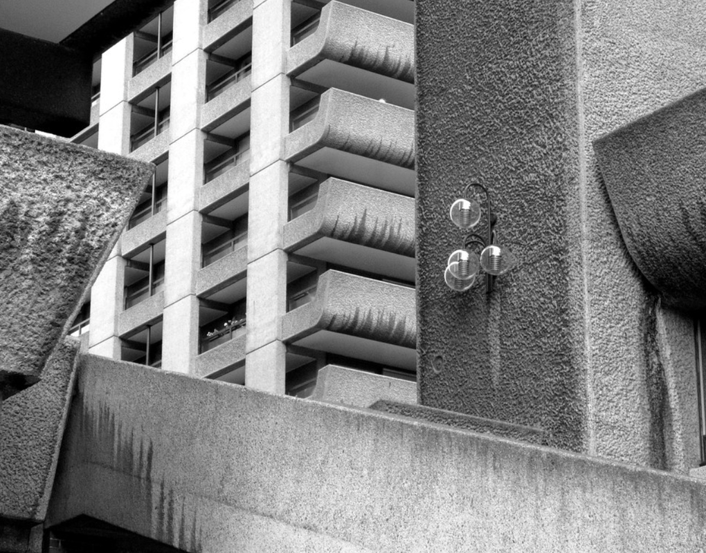
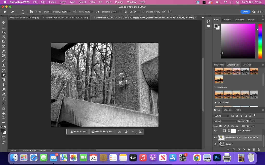
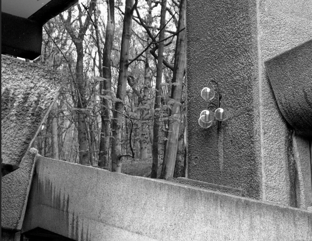
For my response on Goudal i taught myself how to layer on photoshop and how to isolate images and in how to make a background look seamless to its surroundings, so i chose to contrasting photos, one with a theme of buildings with clean harsh lines and one that showcased the beauty of nature, with organic and unique shapes. I think that the Barbican was a goon opportunity to do this effectively, the brutalist architecture and monochrome colours was the right choice, additionally the mountains i think in a strange way matches The Barbican well, as the common brutalism and deep contrasting shapes is a useful common denominator between both environments. Whilst using photoshop i was cautious in creating a shallow contours, i think if i was to add too much shadow then the clean lines would disappear , additionally i feel that photos spoke for themselves in a way, so i only wanted to enhance them and to avoid making the photo look too gothic and moody
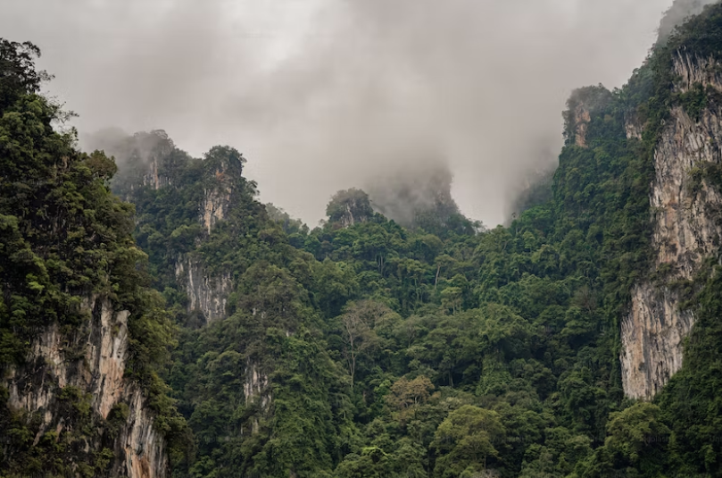
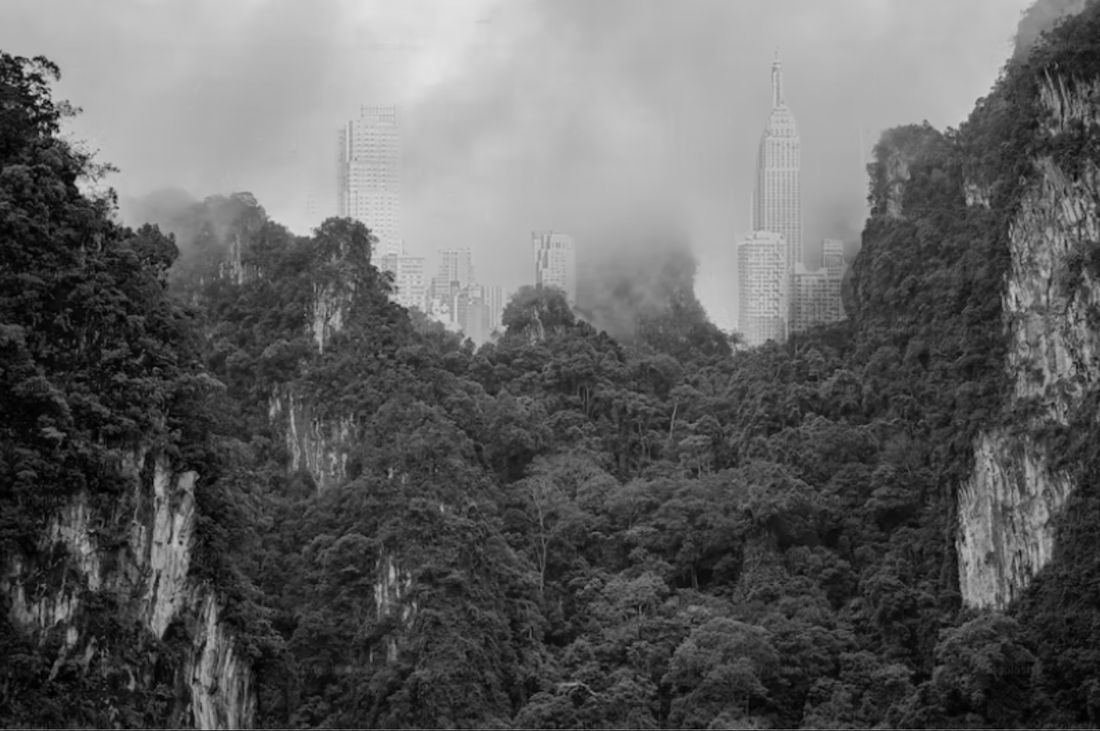
For my second response i kept the urban-nature theme i had last time , but i wanted to change the layering around, instead of adding a nature element to an urban setting i wanted to do the opposite and add a urban element such as building to a nature environment. I kept my my inspiration being Goudal in mind and kept with a monochrome colour-scheme, however for this response i fept the lines of the building faint and blurry. to keep the theme of organic lines and dominating shapes. I chose the jungle because i felt that is would be a good opportunity to create a high contrast photograph and experiment with a more clear bark versus light competition within the photographs
For my third photo i reattempted layering two contrasting environments and using the wonky lines to disrupt the perfection of the first photos clean ,concrete lines. So i again used photoshop to layer the photos and i taught myself how to colour mach and i used the sharp focus of the urban photo to my advantage when erasing the overlapping components. What i like about this photo sis how i managed to change the locations completely in a seamless way, and how the contrasting places were layered in such a way that the opposing locations put together make the new place see plausible to me. If i was to remake this picture i would use a photo with shadows that coming from a differing direction.
With all these pictures that i made i think that i have managed to successfully use my prompt in a creative way without copying Goudals art, however if i was to do this again with hindsight i would want to use light in a more inventive and unique way, additionally i would also want to experiment with Gouldals reoccurring use of mirrors and reflection. Additionally for next time i would like to experiment with colour , in my opinion colour is what i felt Goudals work was lacking, i think in adding colour i will have to face a new challenge ,although i feel if i manage to add colour successfully then the photo will look more cohesive and have elements of stronger, louder contrast. For my personal project i would like to add the photoshop elements to my work and also incorporate Goudals theme of humans effect on the environment.
With all these pictures that i made i think that i have managed to successfully use my prompt in a creative way without copying Goudals art, however if i was to do this again with hindsight i would want to use light in a more inventive and unique way, additionally i would also want to experiment with Gouldals reoccurring use of mirrors and reflection. Additionally for next time i would like to experiment with colour , in my opinion colour is what i felt Goudals work was lacking, i think in adding colour i will have to face a new challenge ,although i feel if i manage to add colour successfully then the photo will look more cohesive and have elements of stronger, louder contrast. For my personal project i would like to add the photoshop elements to my work and also incorporate Goudals theme of humans effect on the environment.
All my new ideas
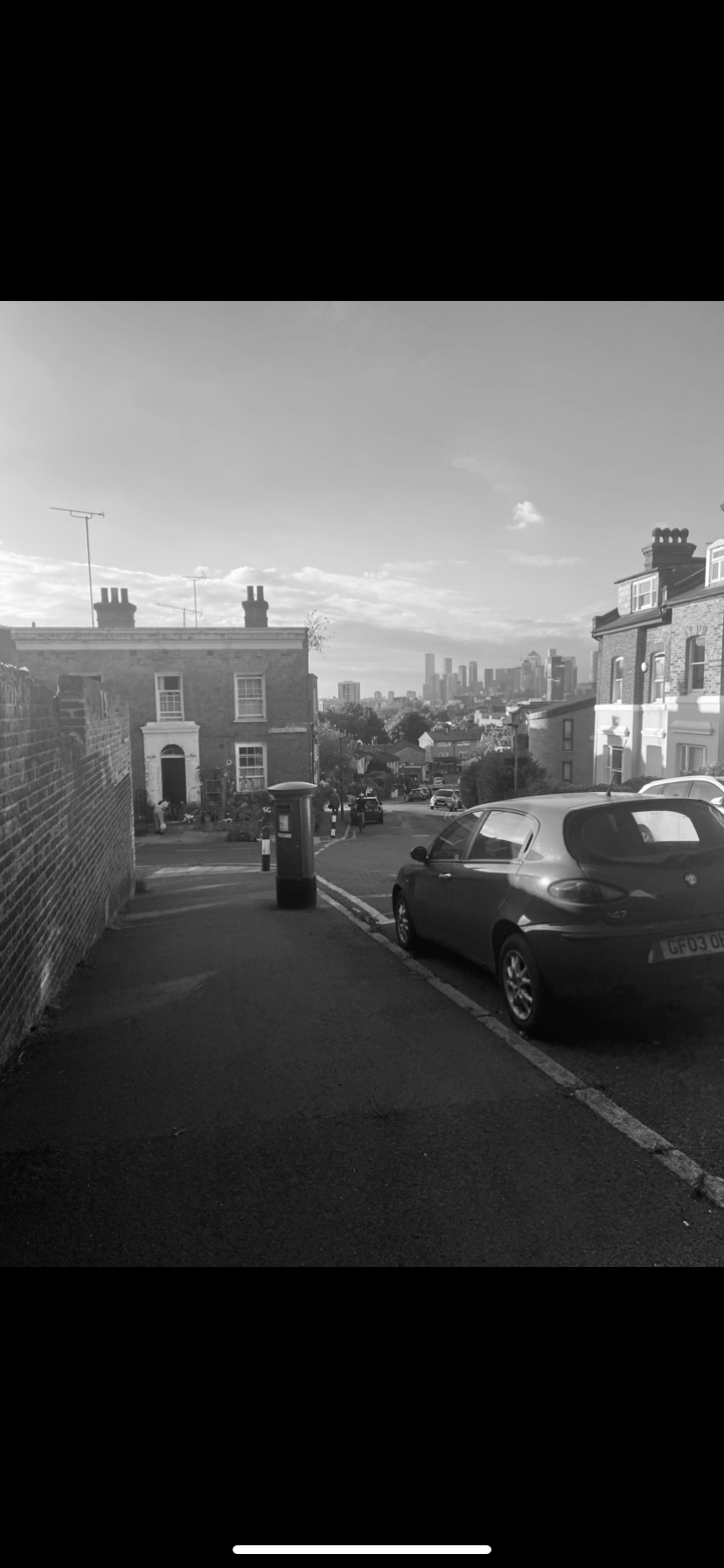
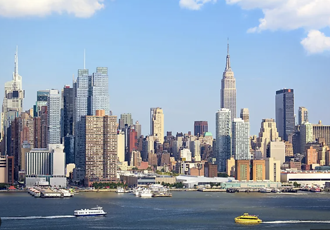
After looking through my evaluation, my idea has slightly evolved and taken a new direction. For example i have enjoyed the process of photoshop and adding urban elements into nature settings , as well as experimenting with the concept of contrast and monochrome. I think for my personal project i would preferably like a physical flap-book, like a photographs meaning changing as more is revealed in a seem-less panoramic way. I have been inspired by Christmas this year, in particular the chopping down of whole forests and habitats for the sake of having a tree that will be thrown away in January, along with this i have been considering the detrimental effect this will have on species such as foxes and squirrels, and the elements of confusion urban foxes would have when they see hundreds of dead trees in bins and on roads, i feel this will be very successful use of a panoramic flap-book . However i want to keep in mind my ideas surrounding light pollution and its effect on habitats, A couple nights ago i was looking at the night sky,trying to spot a shooting star or maybe a constellation i can recognise, nut i found that the minute i found a particularly bright star it ended up just being a plane, moment stuck with me and so throughout the week i counted how many planes i saw throughout the day, and i compared this to how may different bird species i could spot. And unfortunately i found that living in the city means that i see essentially hundreds of plains and only two different bird species. And so for my personal project i wanted to incorporate this idea of planes being there own invasive species whom dominate the night sky, leaving behind a toxic trail of carbon dioxide, contributing massively to global warming, so i am going to use the unwanted and unnatural elements of plain and the astronomical amount of room that they take up in the sky.
So moving forward i would like to practice my photoshop skills and try and develop a colour scheme that i like, keeping an eye out for the colour combinations that i feel successful images have. I was thinking about experimenting with the themes of belonging , in particular contrasting traditionally organic colours such as green and brown, with harsh urban colours such as white and grey.
I want to also play with the ideas of collage and layering, having breaks and inconsistencies in the photograph , to add a less refined and controlled element to my images, and a sense of freedom. I really wanted to experimeht with adding foreign elements and settings into a landscape.
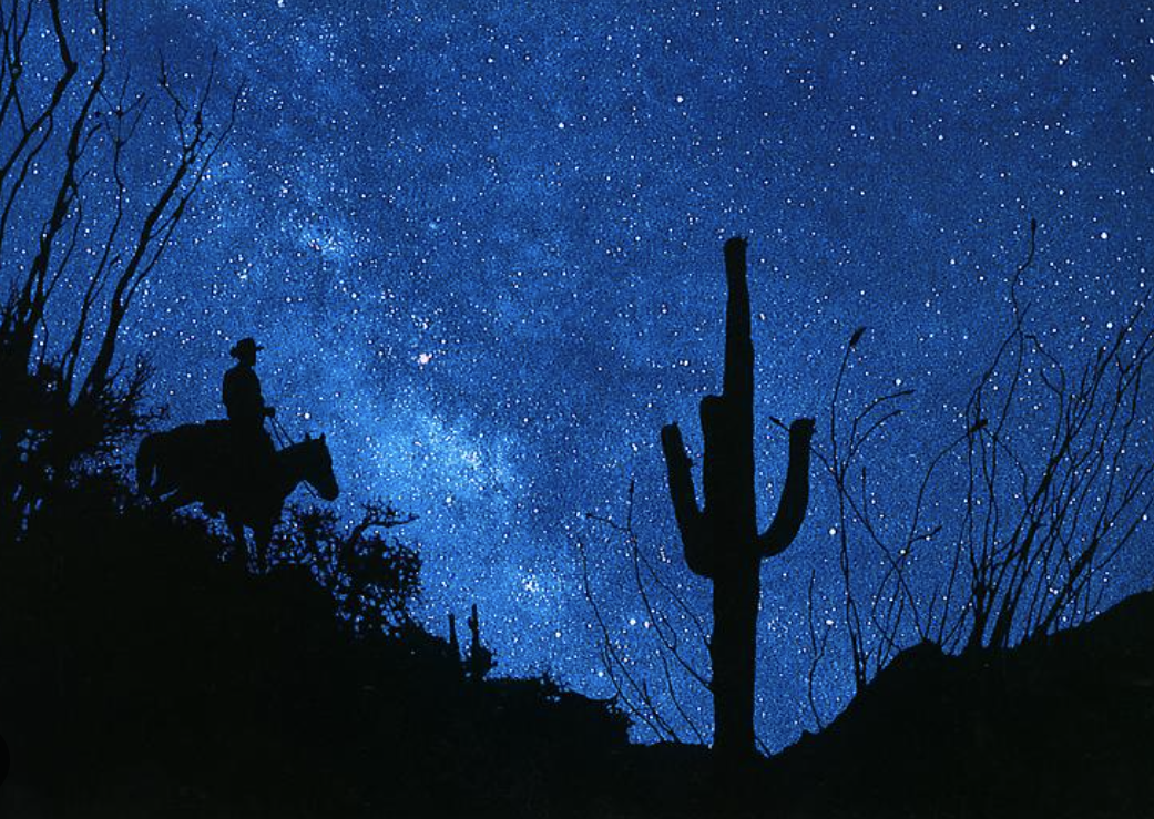
Richard Prince- landscapes
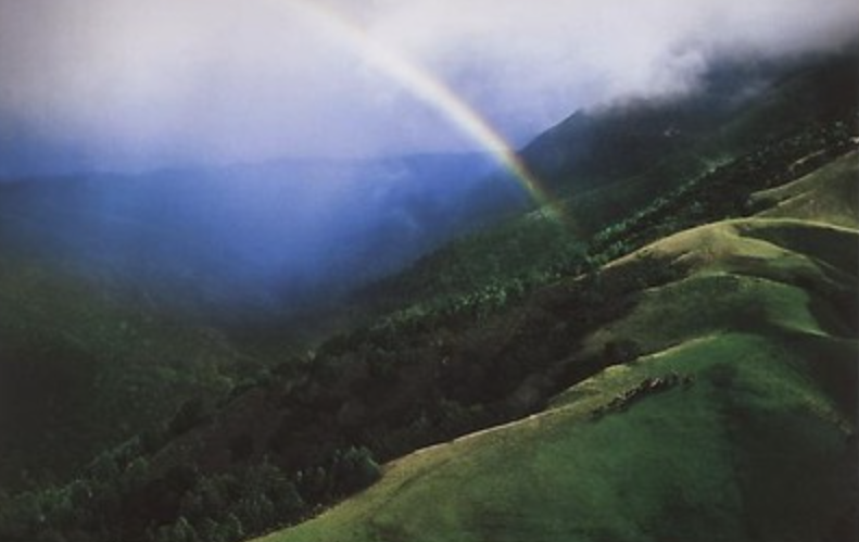
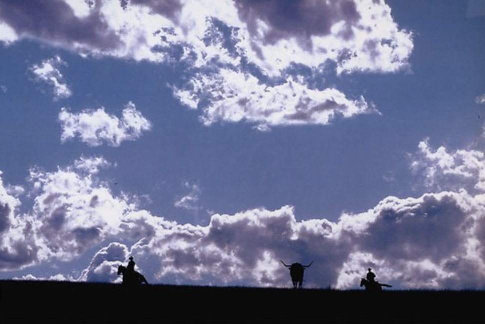
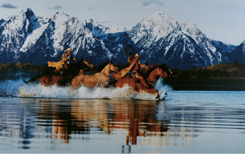
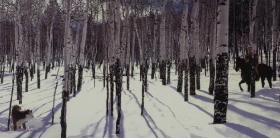
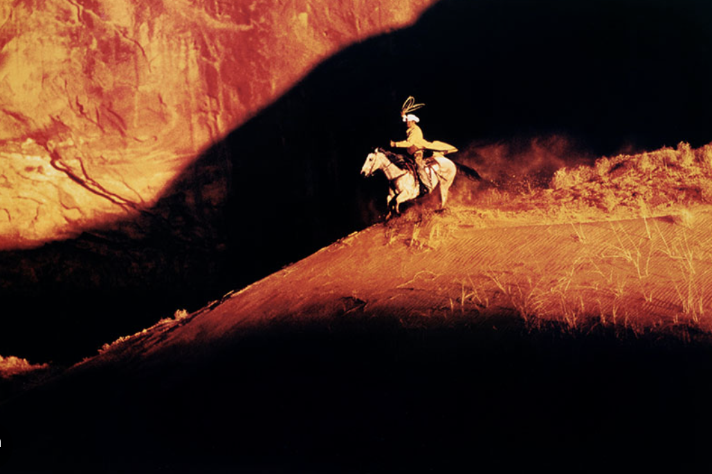
For my colouring i was inspired by Richard Princes "For Blue Cowboys' , i have found that despite all these photographs being very different, they are all very cohesive and recognisable. Princes use of light and reflections is very unique, for example in the first photograph Princes use of light through the rainbows , to me very inventive and adds and element of natural beauty to the image. Additionally the middle photograph in my opinion, is the best example of my point, the 2D element of the picture and how the silhouettes are not the subject, translates very well the beauty of nature in his work , and the bright white light creates a strong contrast, whilst still remaining an organised and clear photograph.Finally the last photograph, uses light and reflections very well, as the light casts a strong shine on the horses skin and bronzes the two men almost merging them into one strong, dramatic action, additionally the rippled reflection centres the subject and creates a sense of san order in the photograph.
And so for my Personal Project i would like to utilise Princes inventive use of light and strong colour schemes.
And so for my Personal Project i would like to utilise Princes inventive use of light and strong colour schemes.
Layering and ripping experiments
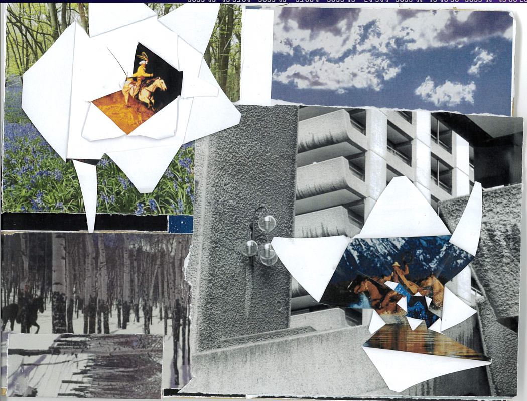
I printed out a mixture of my own and Richrard Princes images. I used cardboard as my base and stuck down four images ontop as a foundation.For a couple of the four images i wanted to do two layers on-top one of them being white , in order to be able to see three clear layers of photographs i used the scalpel to make intersecting slices and dividing the centre into flaps that afterwoods i fulled back and folded onto the previous image.I repeated this twice on each section into order to make the image apper to be ripping out from one another
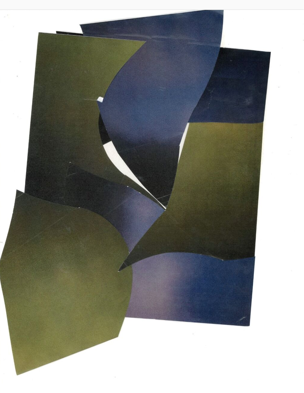
Playing with shapes and dimensionsWhen experimenting with shapes and dimensions , it was very important of me to have used the same photograph and edit them in two very different waysThis was the photograph i use, i chose it because i felt its very ambiguous and there are two very distinct colours for contrast..
Image 1 : For my first photograph i wanted to experiment with dimension and a strong transformation, i first cut the photographs into ling rectangular strips and then i layered them on-top of paper in a gradual circle, i think that being able to recognise some of the features like clouds in this image makes the image every interesting. If i was to recreate this image i think that i would have used more rectangular strips and made a complete circle and gone around a couple of times using translucent plastic paper so that you can see down into all the layers. 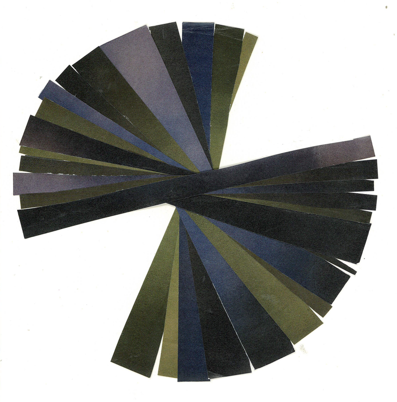
Image 2: For my second image i wanted to experiment with shapes and mainly contrast, i used my scalpel and made random cuts across the image, i tried to make the shapes have a sense of flow and organisation , so i layered them on-top of a piece of paper and stuck them down folding and sliding them on-top of each-other until i liked the result, i wanted to place contrasting images next or opposite each-other so that the shapes become very clear and distinct. If i was to remake this image i would make more shapes with more colours , additionally i would also use a form of see through paper with my images instead.
|
|