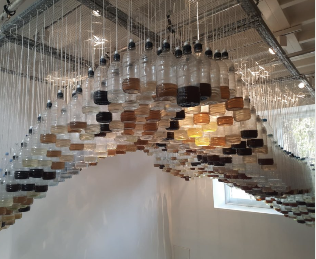
Tanja Deman
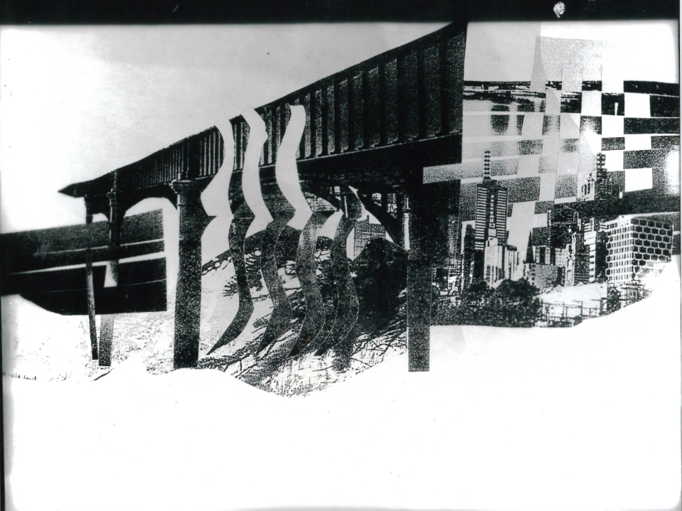
This is some of Tanja Demans signature work :incorporating photography, collage, film and public art focus on the topics of natural environment, ecology and climate crisis.Her work is often an evocative meditation on urban space and landscape.
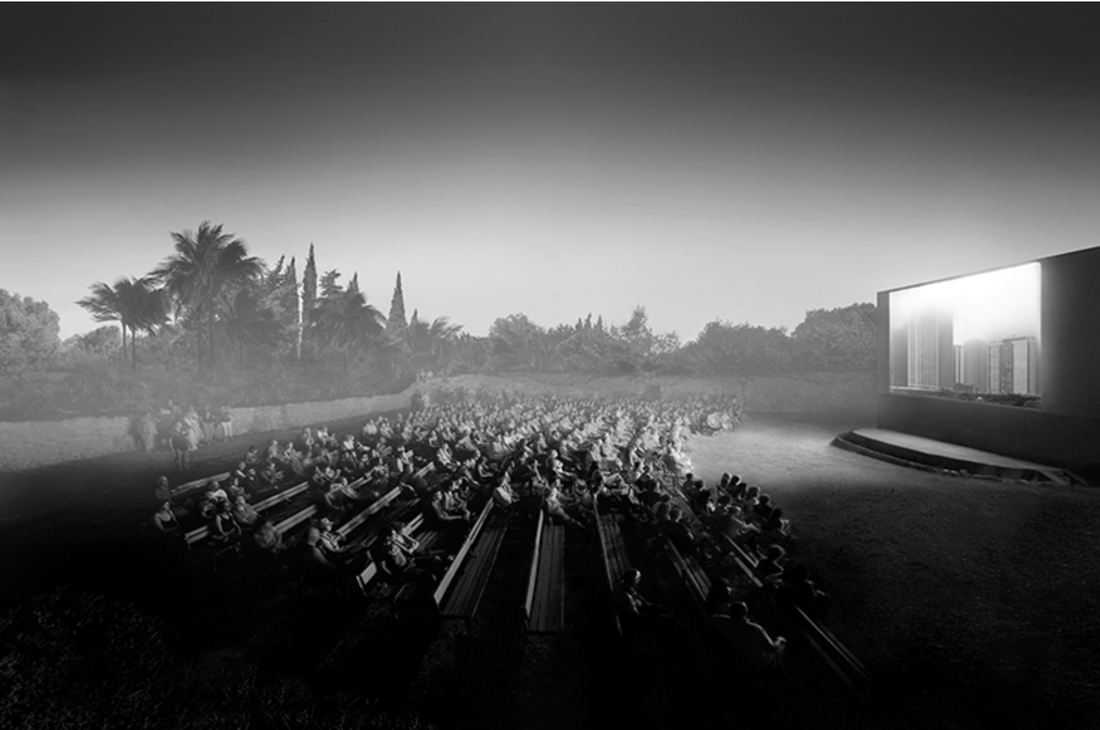
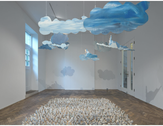
The first image is a very interesting sting mix of two very contrasting settings , the dessert background creating a desolate and barren atmosphere which comes in contrast with the joy found in going to the cinema .
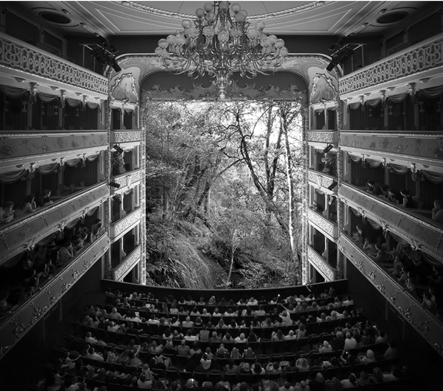
The second image is my favourite ,the sharp clean lines allow for the contrast to become more distinctive, additionally this one seems to stand our from the other two. The black and white in my opinion is very affective this is due to the strong difference brightness between the two environments. To me it is clear the the white elements in her photographs represtnt the a treasured object, in this case nature , which helps push the message that nature in not abundant and needs to be looked after , because if we do not halt the d
The first image is a very interesting sting mix of two very contrasting settings , the dessert background creating a desolate and barren atmosphere which comes in contrast with the joy found in going to the cinema .
The second image is my favourite ,the sharp clean lines allow for the contrast to become more distinctive, additionally this one seems to stand our from the other two. The black and white in my opinion is very affective this is due to the strong difference brightness between the two environments. To me it is clear the the white elements in her photographs represtnt the a treasured object, in this case nature , which helps push the message that nature in not abundant and needs to be looked after , because if we do not halt the d
These are my two favourite photographs from her, i think that the simplicity of, in particular the second photo is very effective in drawing attention to the message behind her work
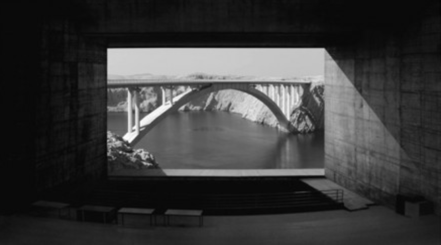
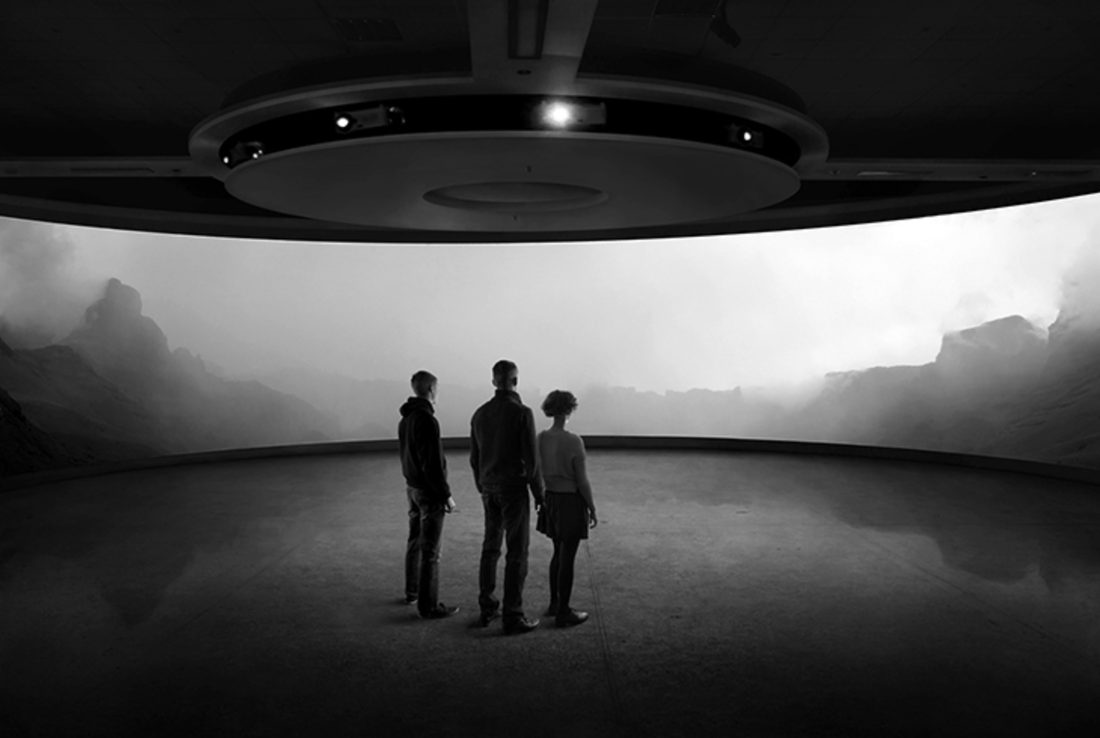
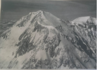
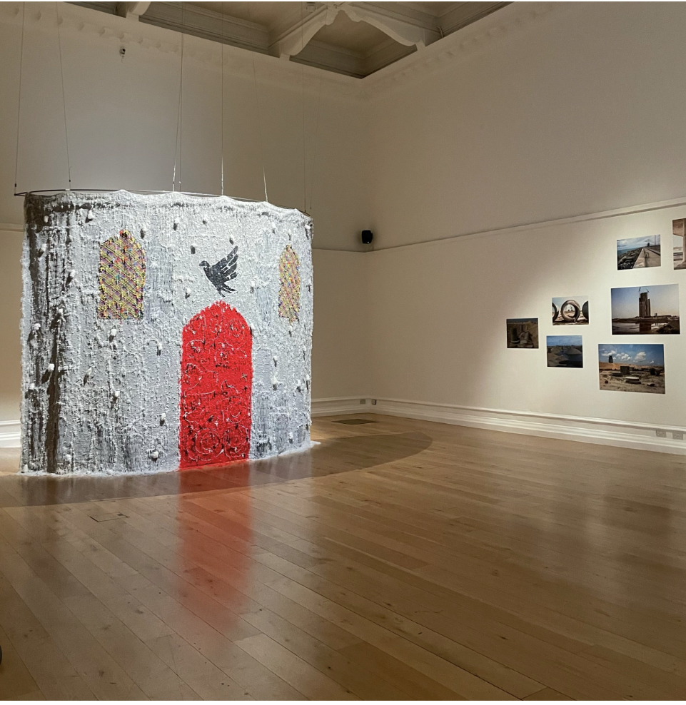
In the first photo the use of two main subjects fighting for your attention surrounded my fog creates a intriguing stark contrast, additionally the monochrome colour palette of these photographs seem to be a consistent theme throughout her work, which in my opinion helps her create a recognisable style.
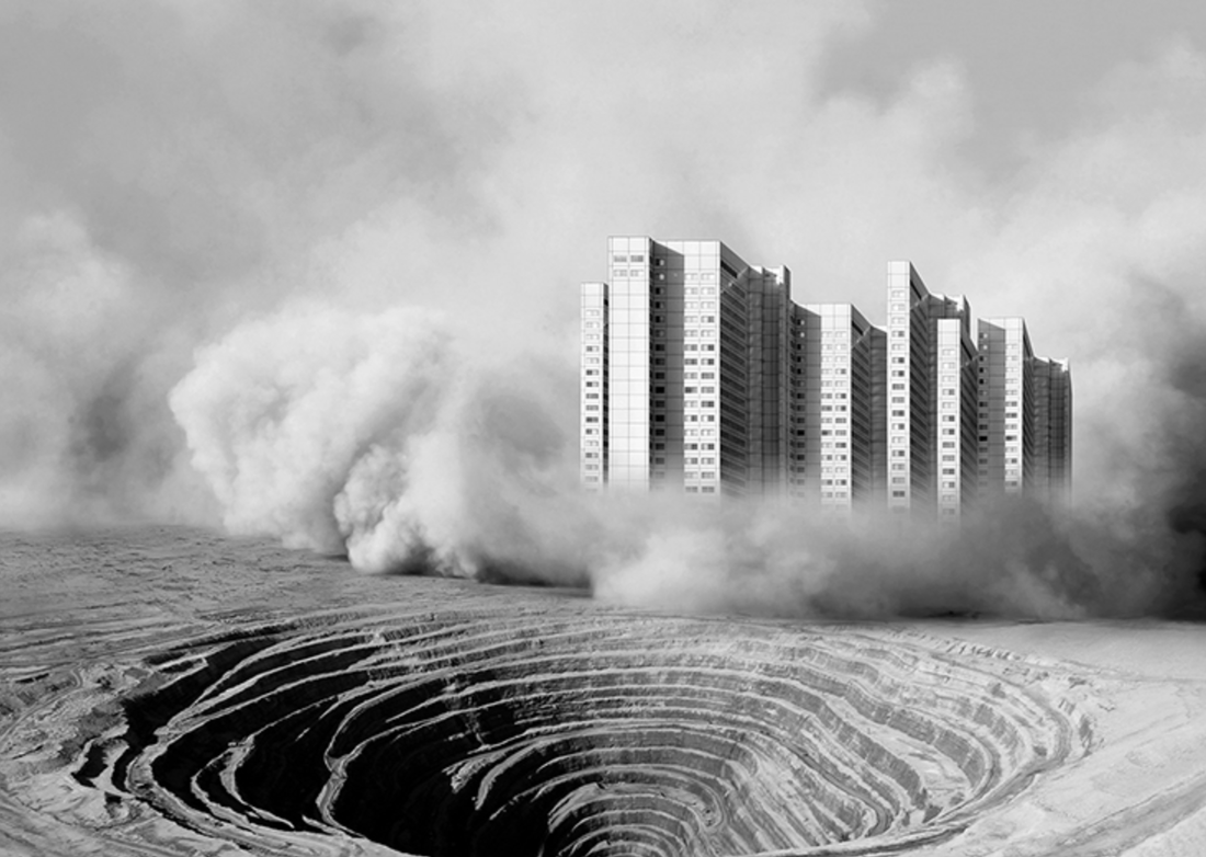
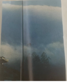
The second photograph is my favourite of the two, i like the combination of the three subjects standing in the foreground facing a background of blurry rock whilst light shines from above, onto their hidden faces.To me i feel that her art is very effective in highlighting the negative effect humans have on the environment, by contrasting urban features with the natural beauty on nature.To me this shows that as people slowly start to obsess over new material possessions , nature is pushed to the side as a afterthought, and in the process the consequences become terrible ,for example climate change and habitat loss.And once these material objects let us down we will finally realise the importance of nature, however by then it will be too late and the irresponsible damage will be irreversible , and instead it will be nature that we will try to imitate in a regretful attempt to get back what we destroyed.
In the first photo the use of two main subjects fighting for your attention surrounded my fog creates a intriguing stark contrast, additionally the monochrome colour palette of these photographs seem to be a consistent theme throughout her work, which in my opinion helps her create a recognisable style.
The second photograph is my favourite of the two, i like the combination of the three subjects standing in the foreground facing a background of blurry rock whilst light shines from above, onto their hidden faces.To me i feel that her art is very effective in highlighting the negative effect humans have on the environment, by contrasting urban features with the natural beauty on nature.To me this shows that as people slowly start to obsess over new material possessions , nature is pushed to the side as a afterthought, and in the process the consequences become terrible ,for example climate change and habitat loss.And once these material objects let us down we will finally realise the importance of nature, however by then it will be too late and the irresponsible damage will be irreversible , and instead it will be nature that we will try to imitate in a regretful attempt to get back what we destroyed.
Response
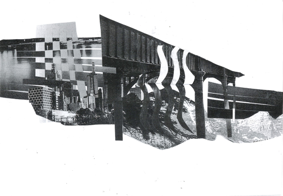
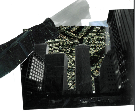
First we created our design, we used one landscape of nature and one of the city . I chose a weaving technique when merging the photographs , i did this by cutting thin strips from the photograph making sure to leave a small space at the top where the thin strips meet an intersecting margin. Then i weaved the strips through each-other making sure to alternate the overlapping strip on the bottom and the top , i was inspired by the work we did earlier this year with the photoshop as well as Artist Tintin Coopers work.I wanted to completely intertwine the two photographs to a point where they were completely indistinguishable of each-other. I think that i successfully murged the two ideas of the urabn and nature into one photograph , however i think that if i was to do this again i wold have made the image bigger so that the contrasting structures are more clearly seen, aditionally i would have incoorperated more images, not just two.
I then printed my photograph onto acetate by photocopying it. I like that the acetate made the contrast better, however i think that some of the finer details are lost in the image and the lines are slightly blurred.
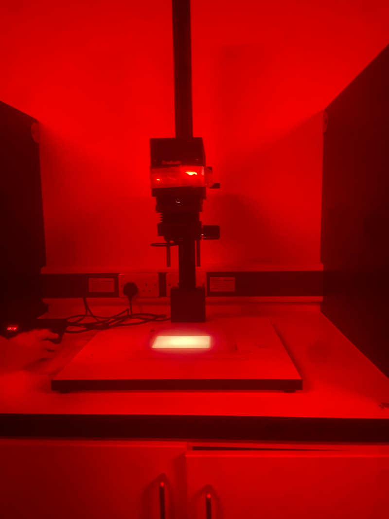
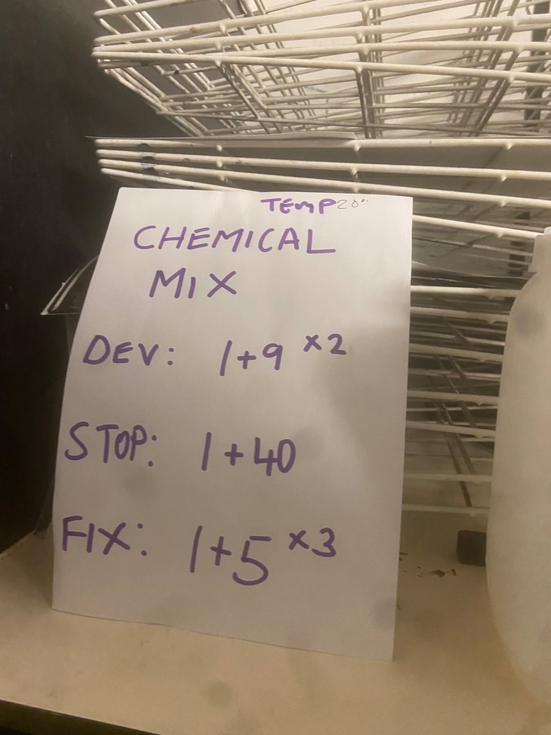
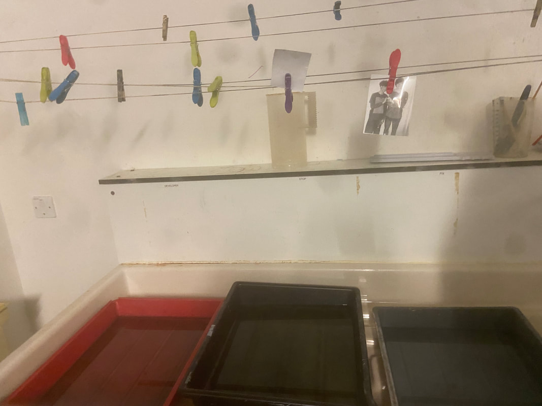
We then went into the dark room and made negatives of our photographs. We used a chemical mix at a temperature if 20 degrees , but first we used a light to print our acetate photographs onto the photographic paper . Putting my photograph through chemical mix consisted of submerging it in a DEV for 30 seconds to a minute then moving the photograph into some Stop for again,30 seconds to a minute .After that , it was moved into some Fix for the same amount of time, finally the photograph was put under water and hung up to dry.
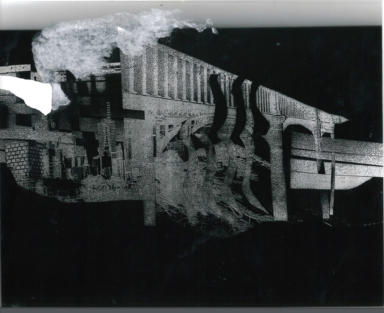
This is my negative.
We then created a positive using a negative and the light box, and repeating the chemical mix process, waiting for them to dry.
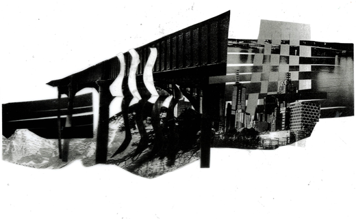
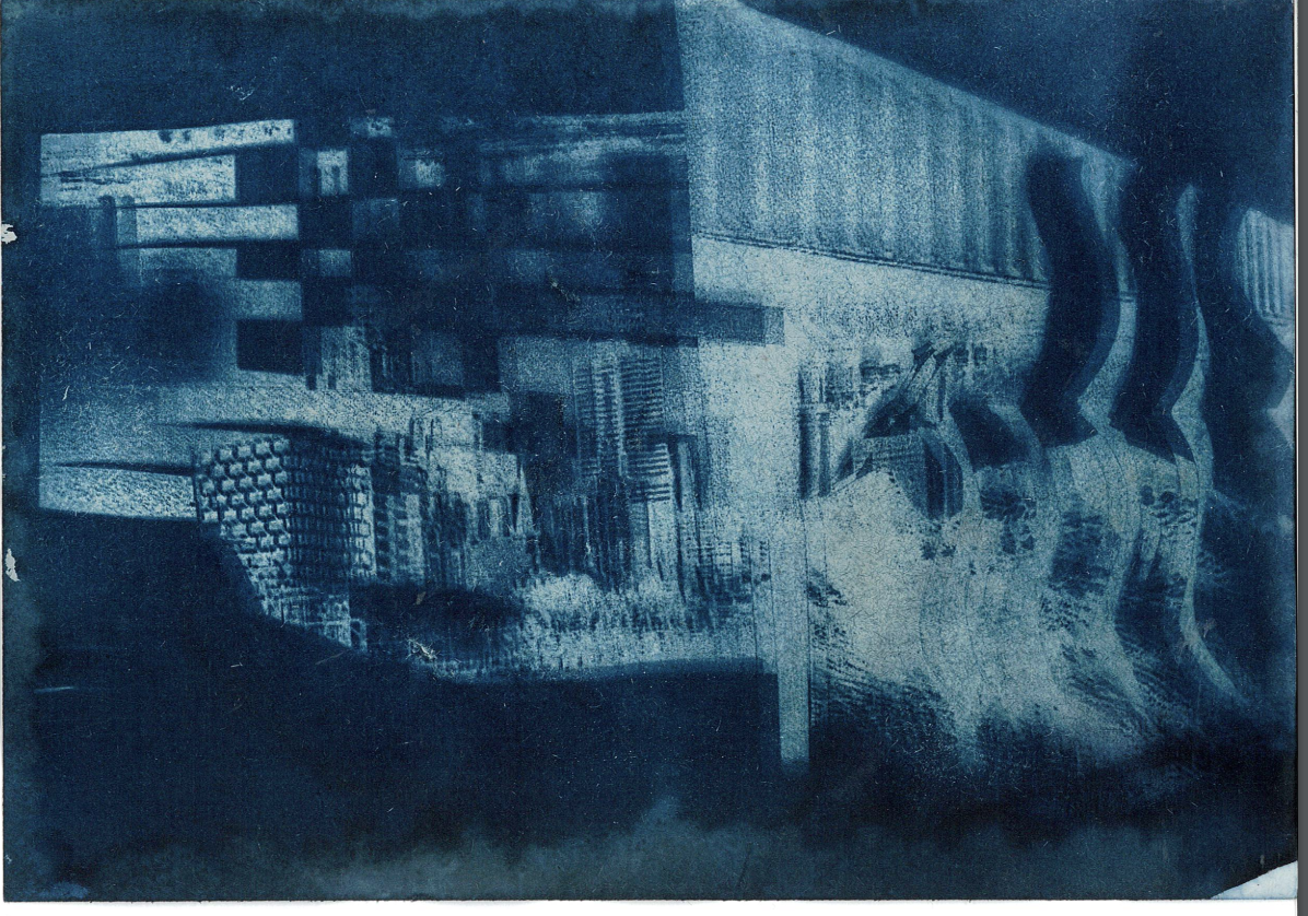
If i was to do this again i would want to cut the photographs to create more contrast because a-lot of the work i did in cutting the photographs is lost after turning it into a negative and i want the shapes from the image to be recognisable.However i think that theb darker background gives the image more texture and grain , the blue photogrpah in my opinion is better. This is because the lines blurred during the process and it gave the image a interesting effect.
If i was to do this again i would want to cut the photographs to create more contrast because a-lot of the work i did in cutting the photographs is lost after turning it into a negative and i want the shapes from the image to be recognisable.However i think that theb darker background gives the image more texture and grain , the blue photogrpah in my opinion is better. This is because the lines blurred during the process and it gave the image a interesting effect.
Then i made the positive out of the negative, I like the grainy and textured effect that occurs, however if i was to do this experiment again i would want the darker parts no be more visible, as they are lost is this image
Taking out of focus photographs
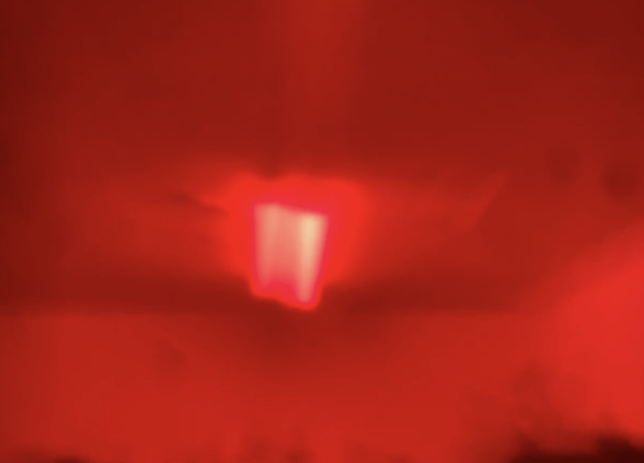
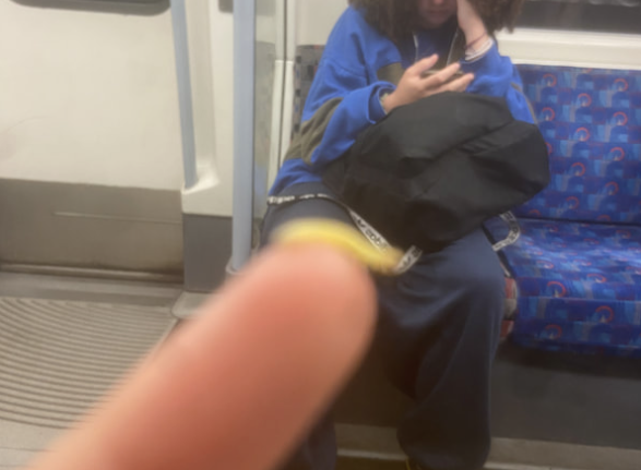
To take out of focus photographs by moving an object in front of the camera like a finger and tapping it to focus on it then moving it away from the camera to leave the blurred background . In some of these photos i chose to blur them in after effects to see the difference before and after, i found that the dominant colours such as the red in the third photograph become the most prominent thing.
Dionne Lee
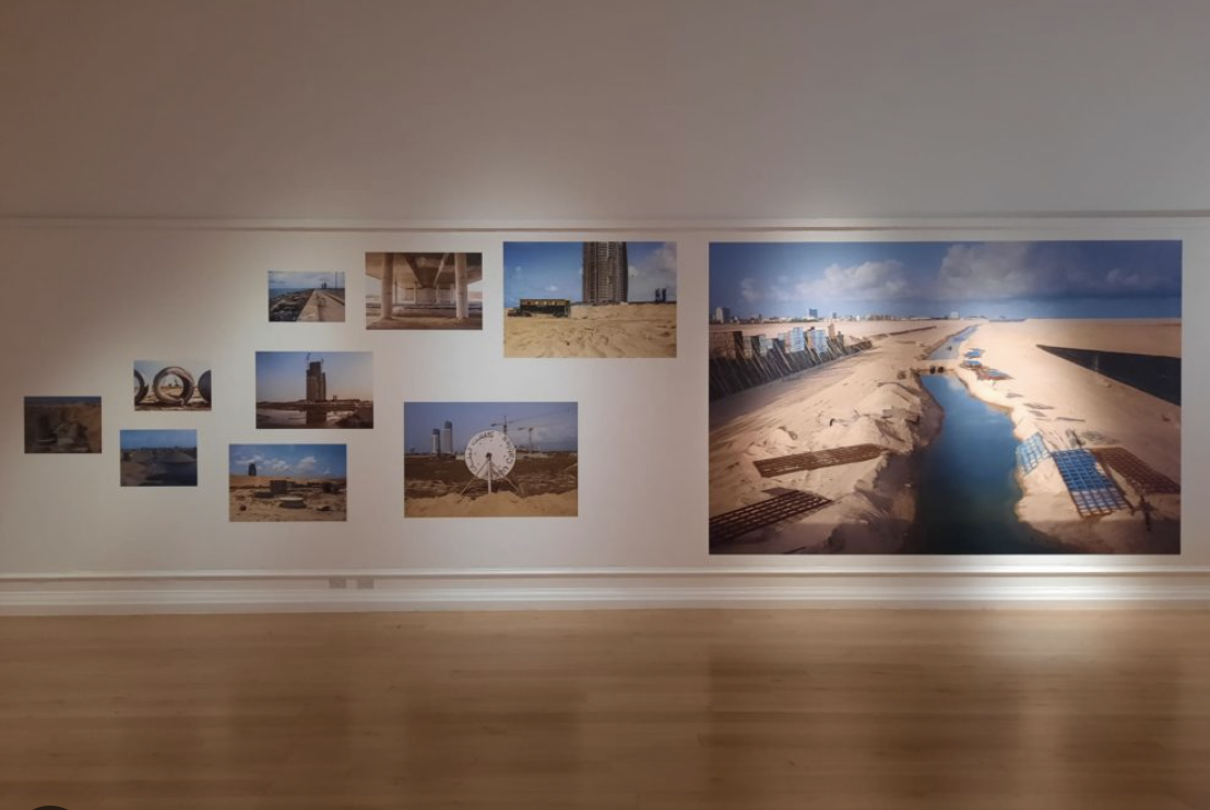
Oakland, California-based artist Dionne Lee employs video, collage, photography, and sculpture to explore American landscape and her place within its complex history. As an African American woman, she sees the natural world as both a place of refuge and tranquility, but also the location of racial violence, danger, and vulnerability. More broadly, her work acknowledges the terror of climate change, mass migration, and humanity’s ongoing drama of survival. Duality often surfaces in work where she notes that “two things can be true at once.”
Lee often manipulates found imagery in the darkroom in a process both organic and intuitive. The exhibition contains many fragments of photographs from her many wilderness survival manuals and vintage color magazines offering majestic views of “the great outdoors.” The survival manuals offer detailed, step-by-step directions on building a lean-to or foraging for food and water. Lee has become adept at these skills herself, thus reclaiming her connection to the earth and salvaging nearly-lost ancestral skills and knowledge. As the earth continues to shift beneath our feet, Lee asks what determines survival: not just who has what, but who knows how.
Lee’s darkroom practice has the same sense of intervention and disruption. With a forceful irreverence for the sacred silver gelatin printing process, she deconstructs photography itself. Lee draws with graphite directly on prints before and after she exposes them. She pulls negatives across the scanning bed to create painterly abstractions. She tears, crumples, solarizes, and double-exposes fragments of information, challenging both photography’s purpose and authorship along with any idealized and colonialist view of the earth.
Dionne Lee constructed landscapes
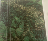
We worked with old national geographic magazines , selecting different landscapes , as well as using some of our own landscapes ; we were asked to select 6-10.We then photocopied them and used them for our drafts we then were able to experiment freely with our images and then photographed the images as we changed them, it was clear to me that the art itself didn’t come from the finished product but instead the process of getting there.
|
|
|
|
|
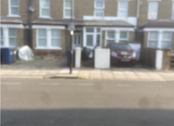
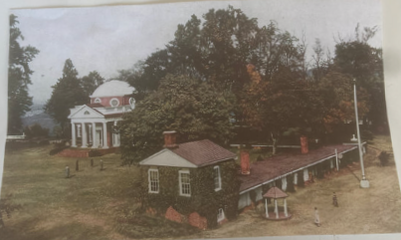
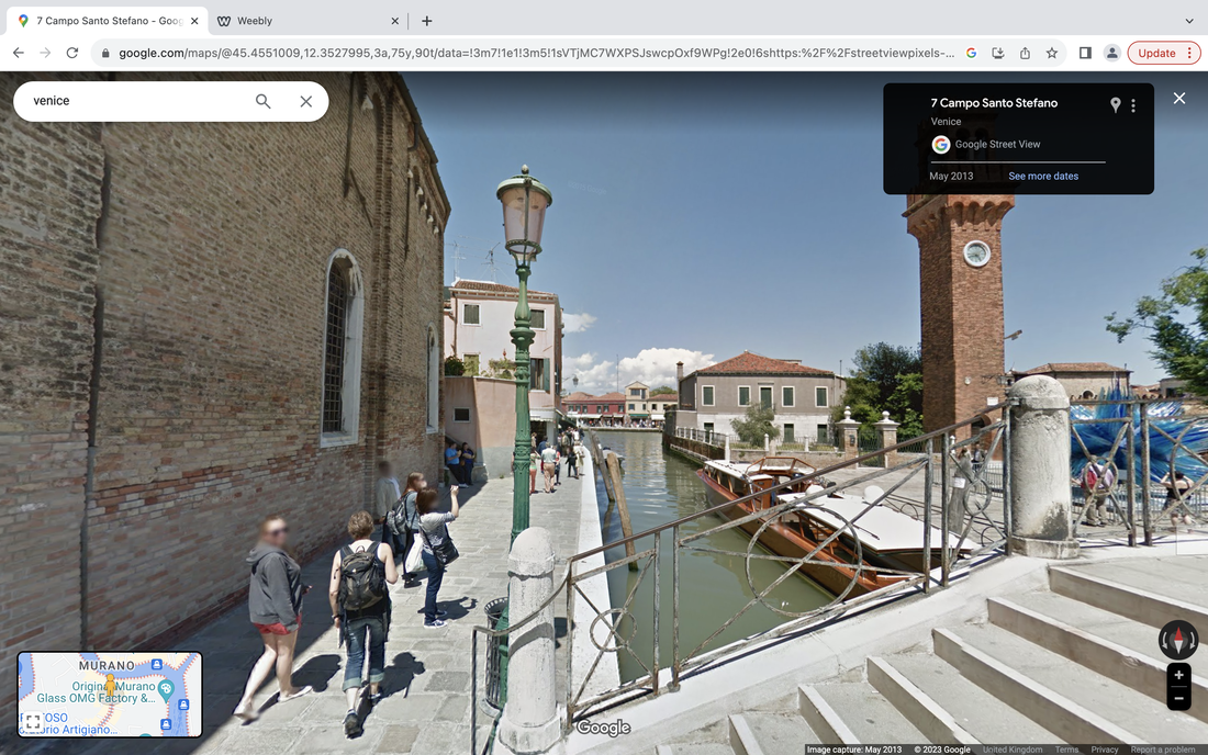
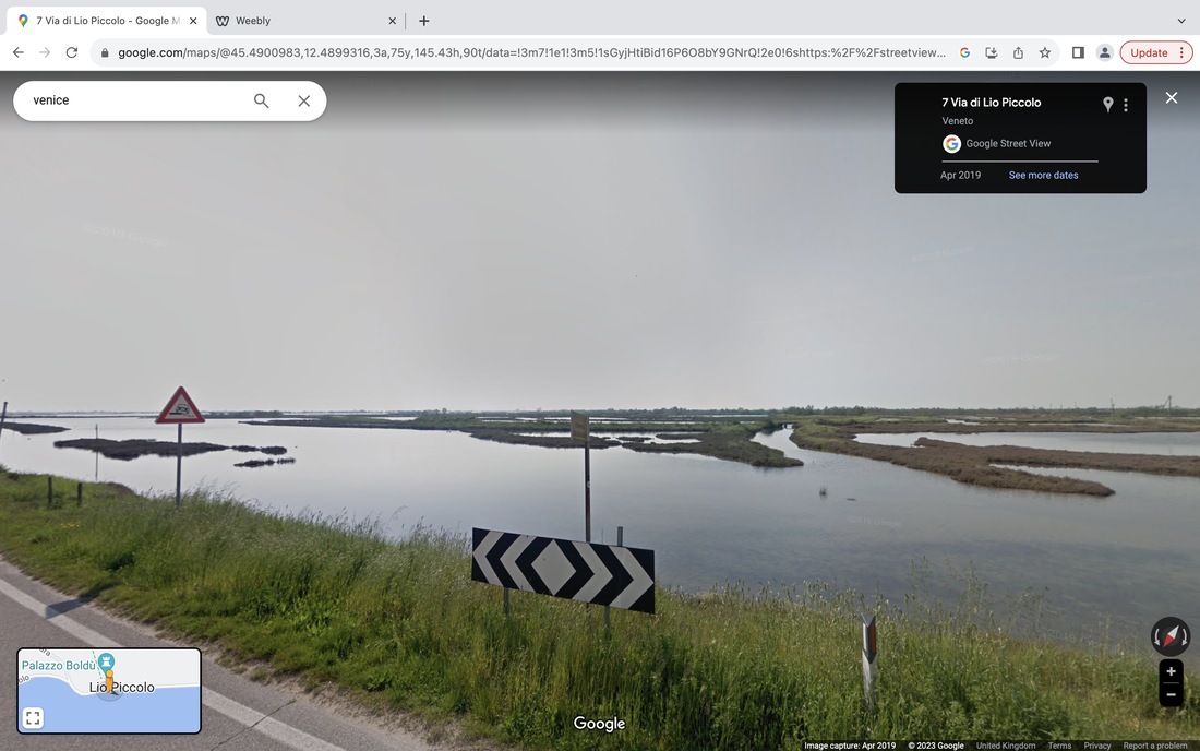
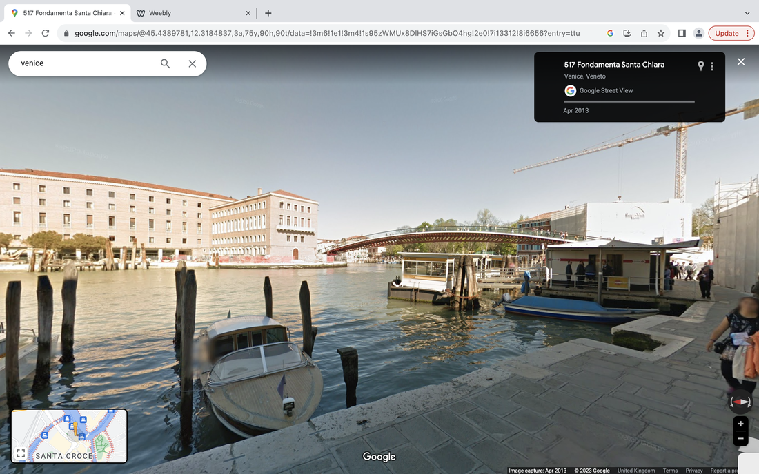
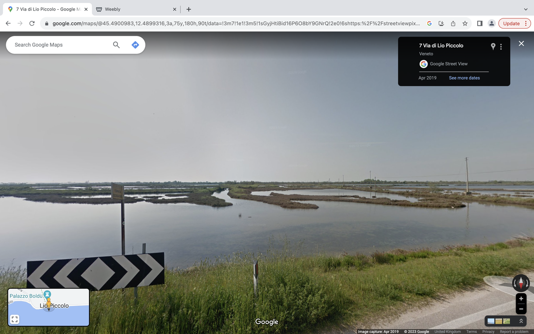
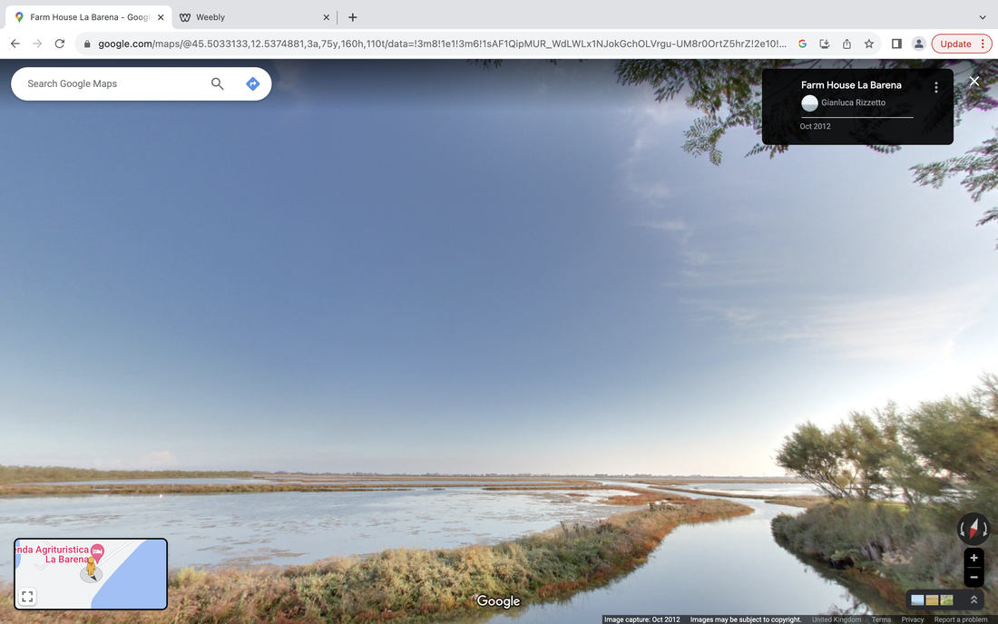
Google street view gallery
We used google maps street view to experiment with landscapes, the teacher picked the country randomly then, she picked and object or action that we had to find within the photograph.
we repeated this ten times changing the country and object each time.
we repeated this ten times changing the country and object each time.
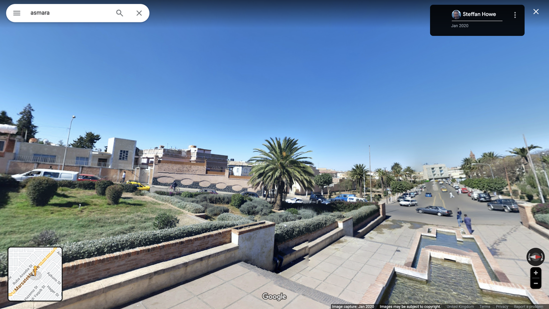
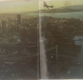
1,Asmara - Shadow of a tree
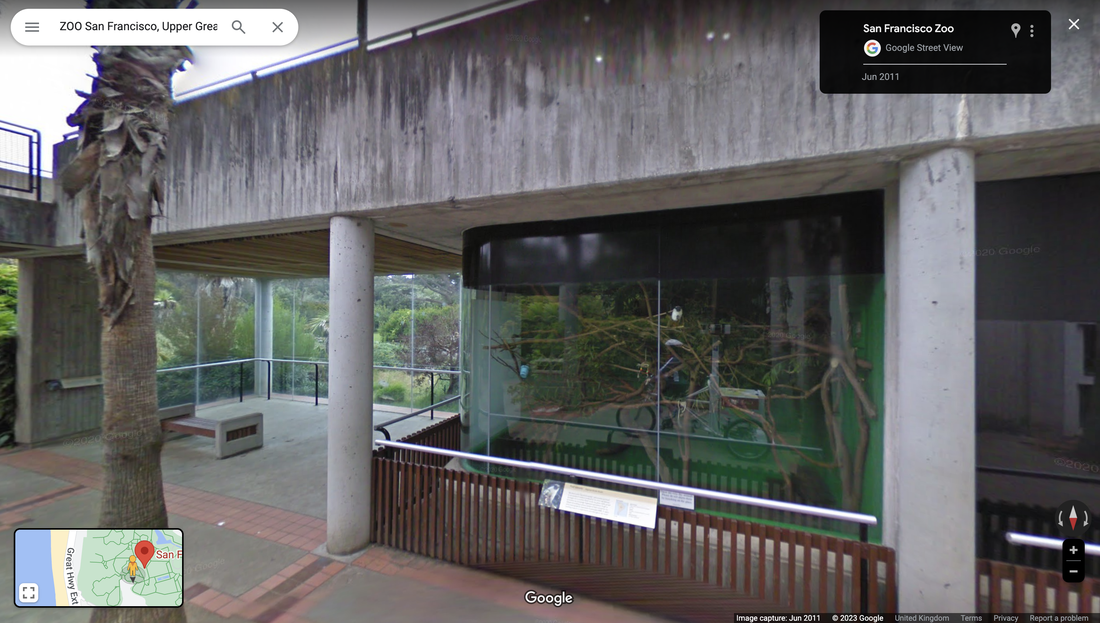
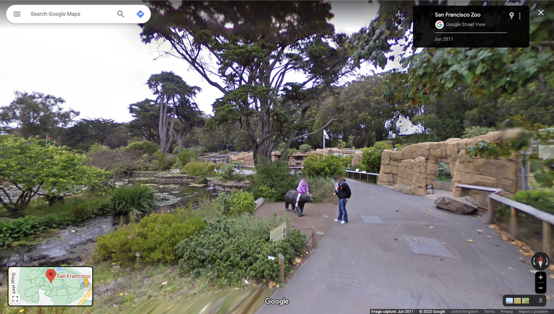
San Francisco - animal
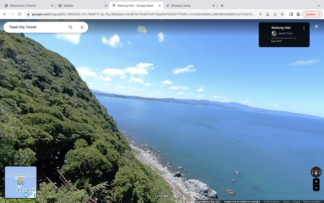
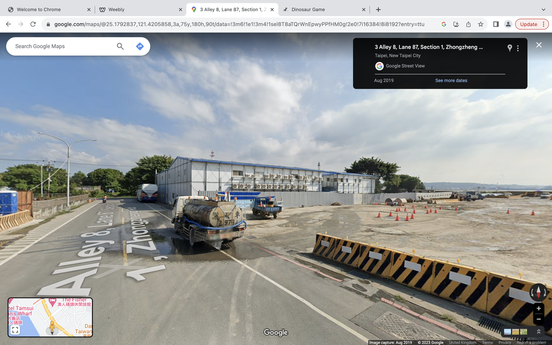
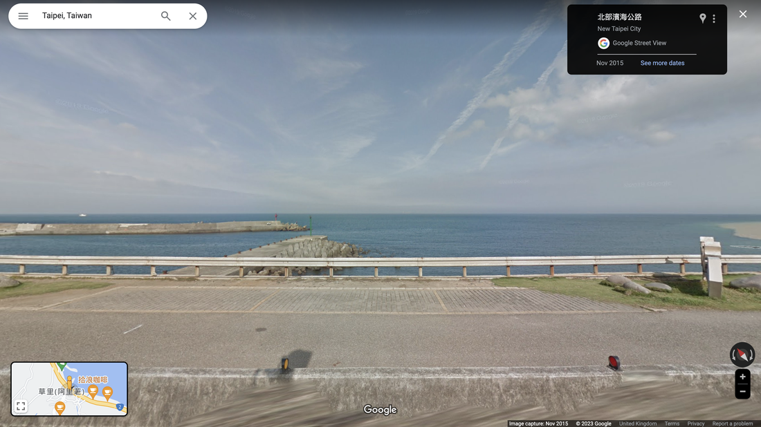
3,Taipei-water
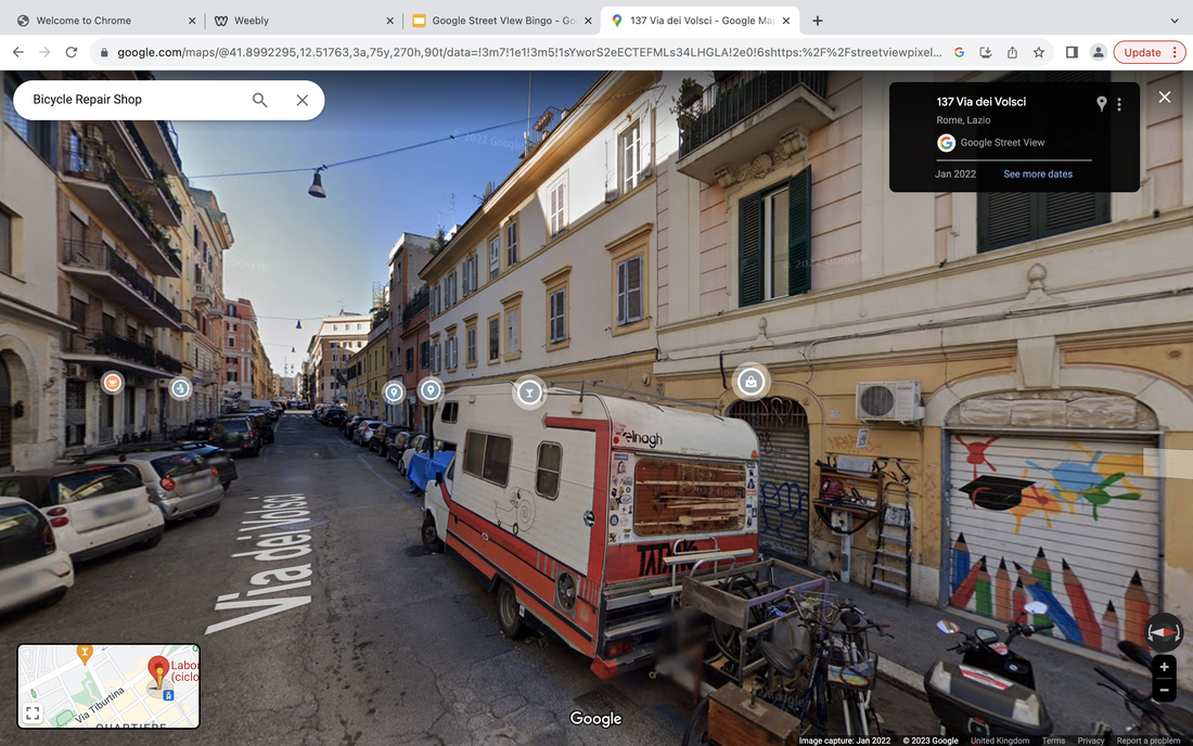
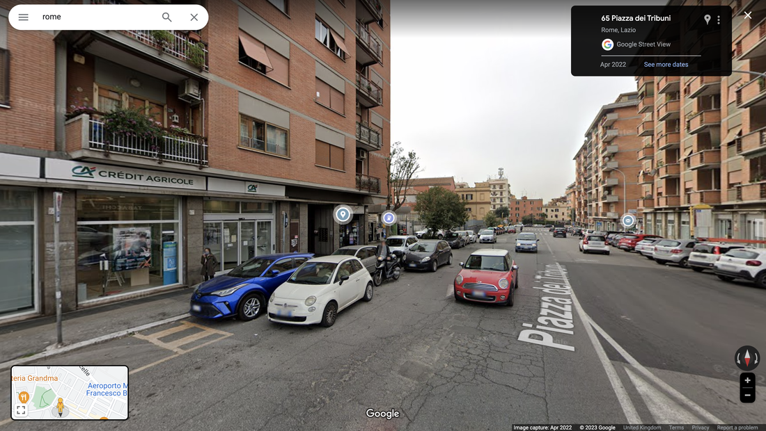
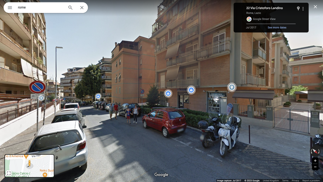
4,Rome-bicycle
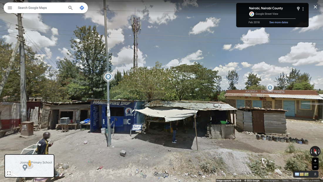
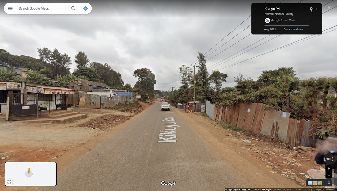
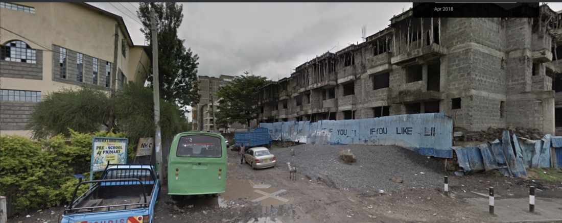
5,Nairobi - graffiti
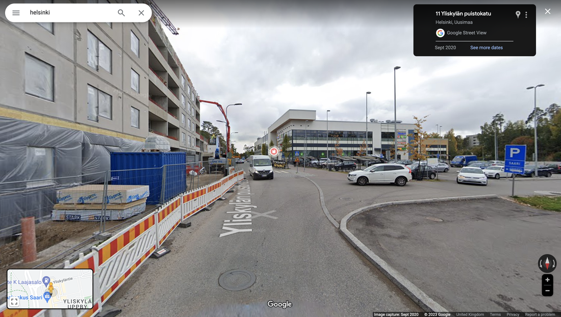
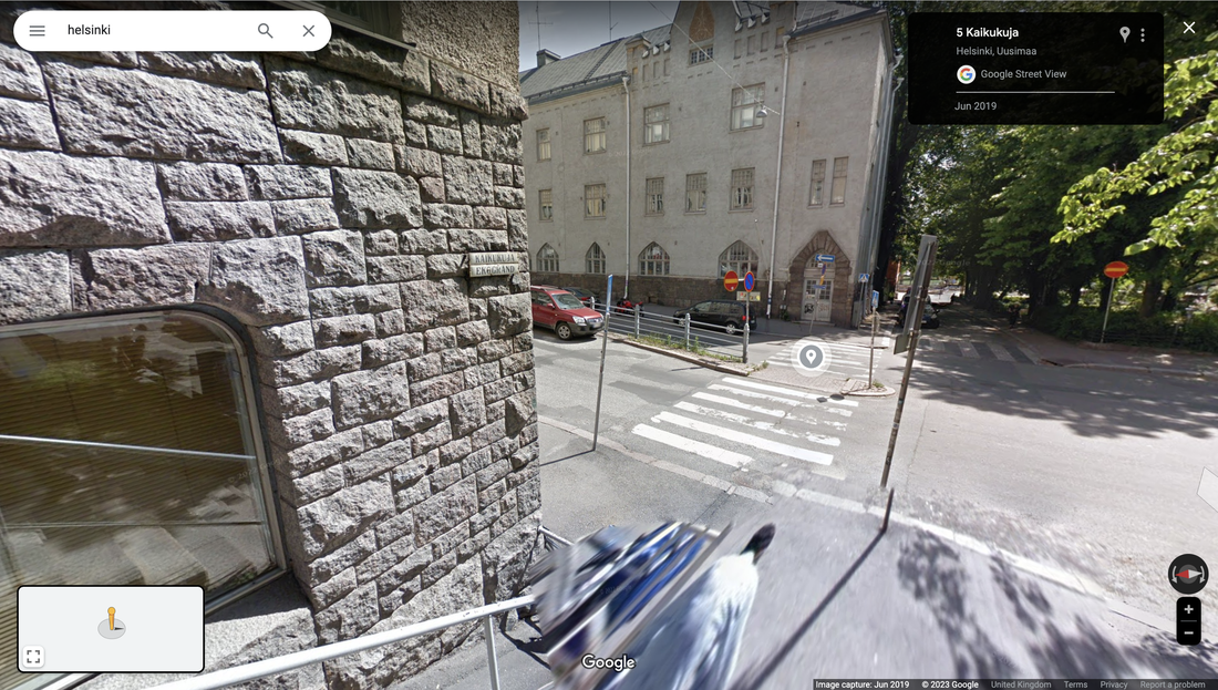
6. Helsinki – Google Glitch
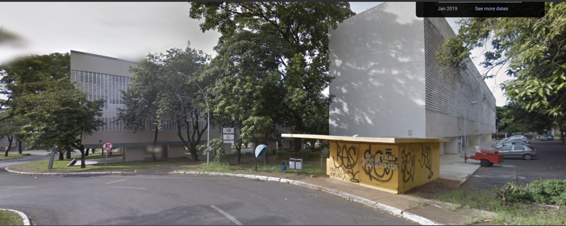
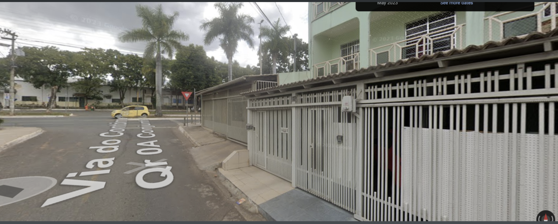
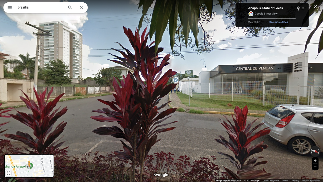
7. Brazilia – Tall Building
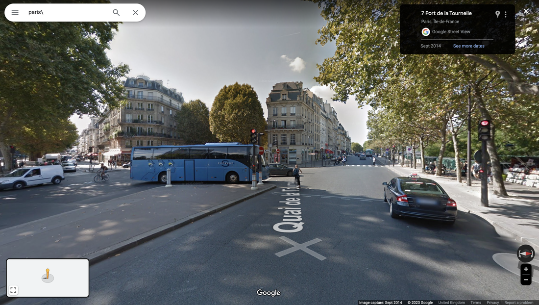
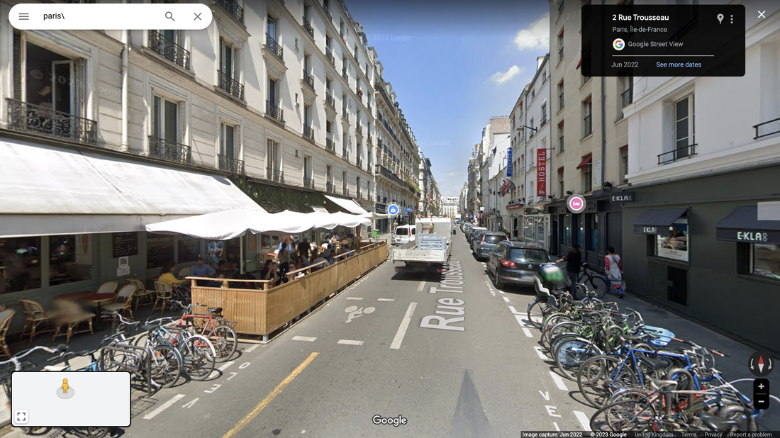
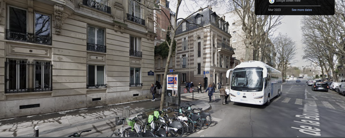
8. Paris – Bus or train
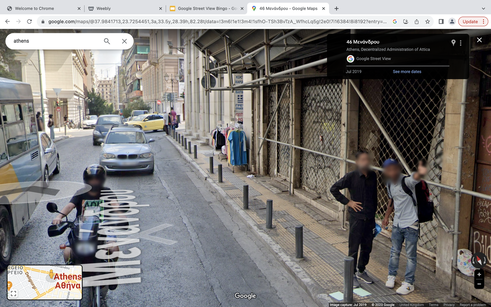
9. Athens – person pointing or google glitch and both
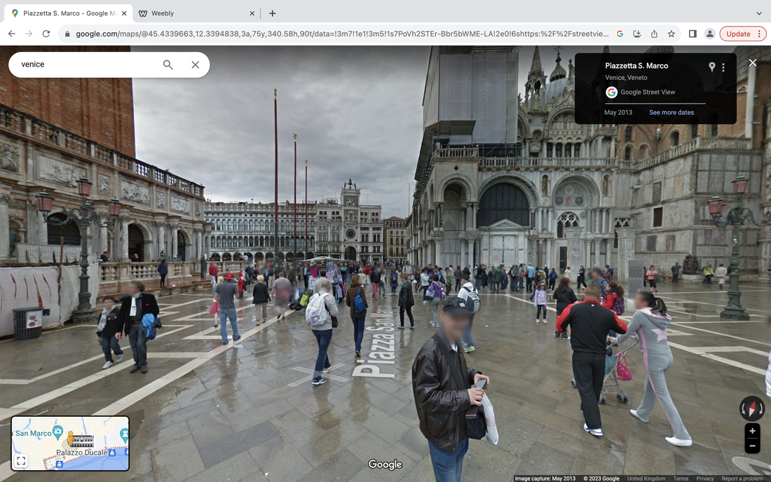
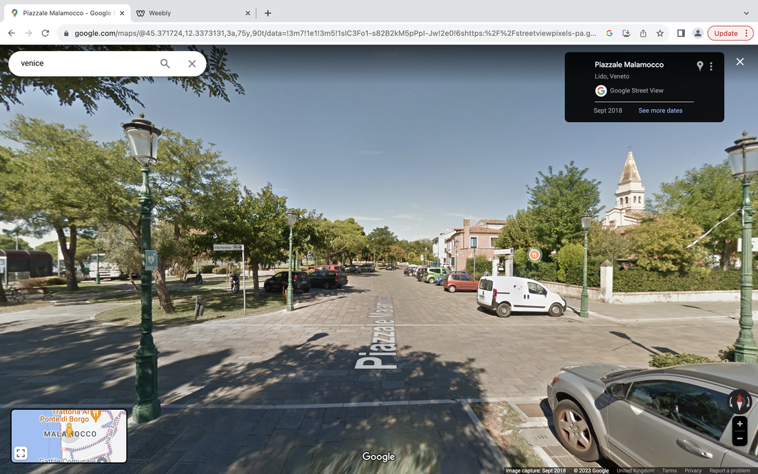
Venice street view photography
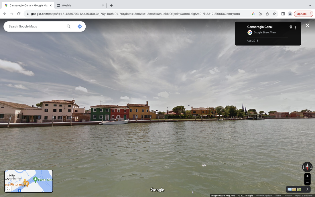
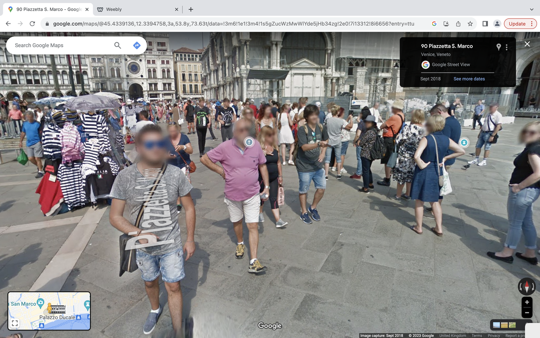
I think that this method is good at getting you to pick up on the finer detalis of images and it recognses where natural beauting is often missed, but if i was to do this again i would have
Peckham photo walk
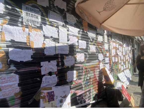
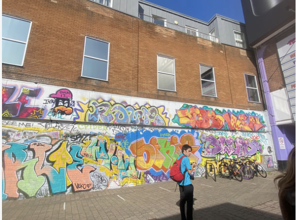
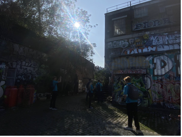
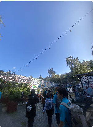
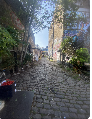
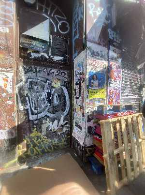
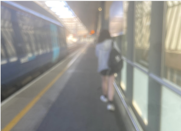
After visiting the gallery on the walk back to the station we took photos of Peckham. The exhibition was themes around the large Nigerian population in Peckham and i used what id learnt as an inspiration towards the type of things that i wanted to photograph.I think the vibrant cities of Nigeria have been translated into Peckham; from the colourful markets to the beautiful street art and buildings, i found that there was many things i found that i wanted to photograph. I had kept in mind a unique art piece i had seen earlier at the gallery which depicted the firm ways Lagos and Peckham were intertwined.
The photowalk was my favourite aspect of the trip because we were able to photograph anything that we wanted with a-lot of freedom, it was a very nice sunny day which helped my photographs co capture the beautiful and colourful street art clearly.
The photowalk was my favourite aspect of the trip because we were able to photograph anything that we wanted with a-lot of freedom, it was a very nice sunny day which helped my photographs co capture the beautiful and colourful street art clearly.
Lagos , Peckham repeat.
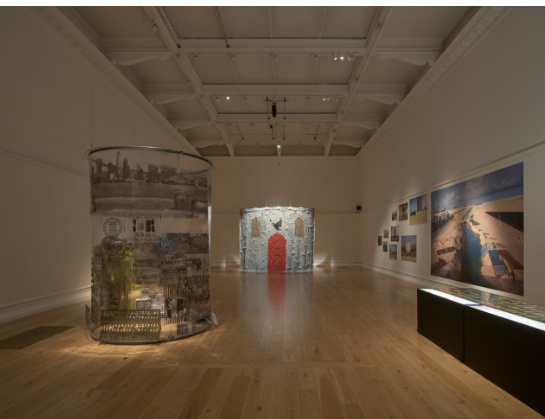
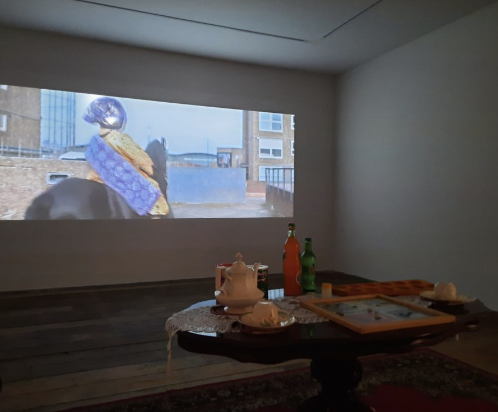
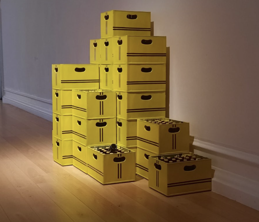
Lagos Peckham repeat was the gallery we visited in Peckham , it was aimed to highlight the cultural similarities between Peckham and Lagos and the influence this has had on the expression of art. In the gallery we walked around each art piece and read about what the artists message and inspirations.
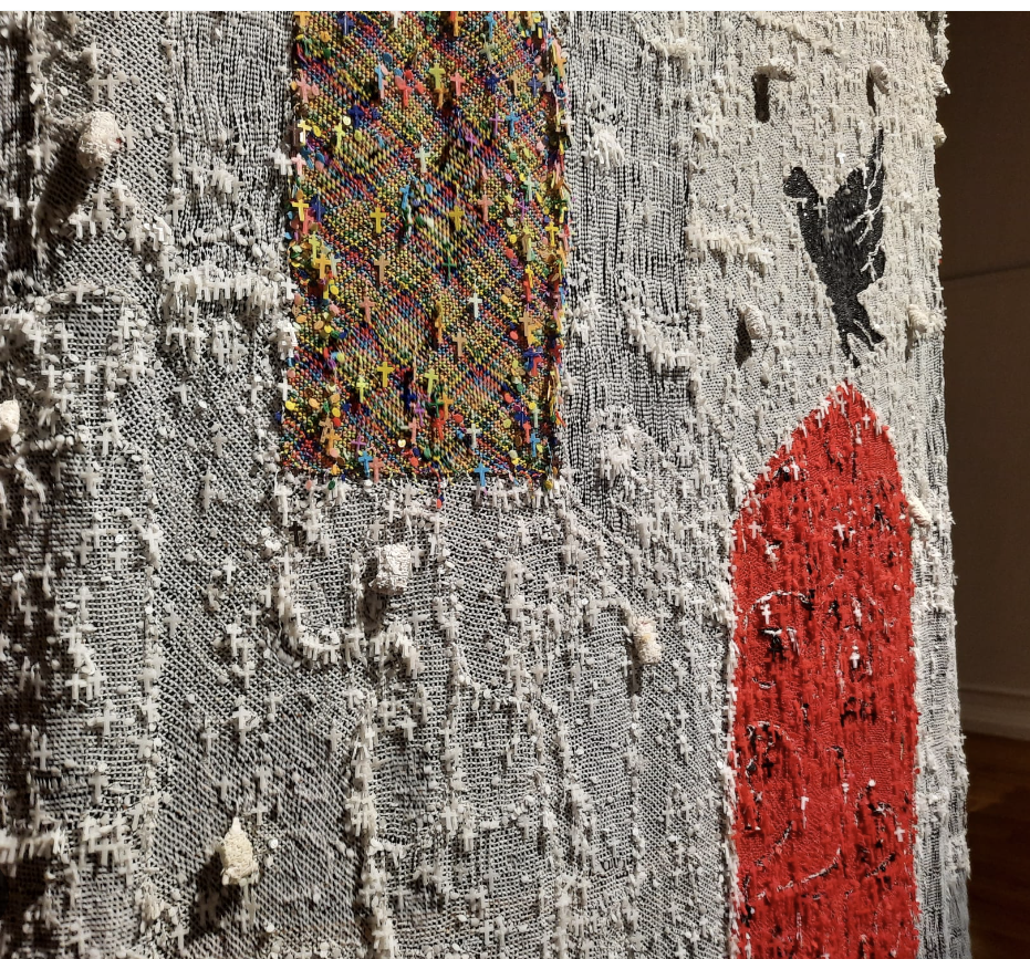
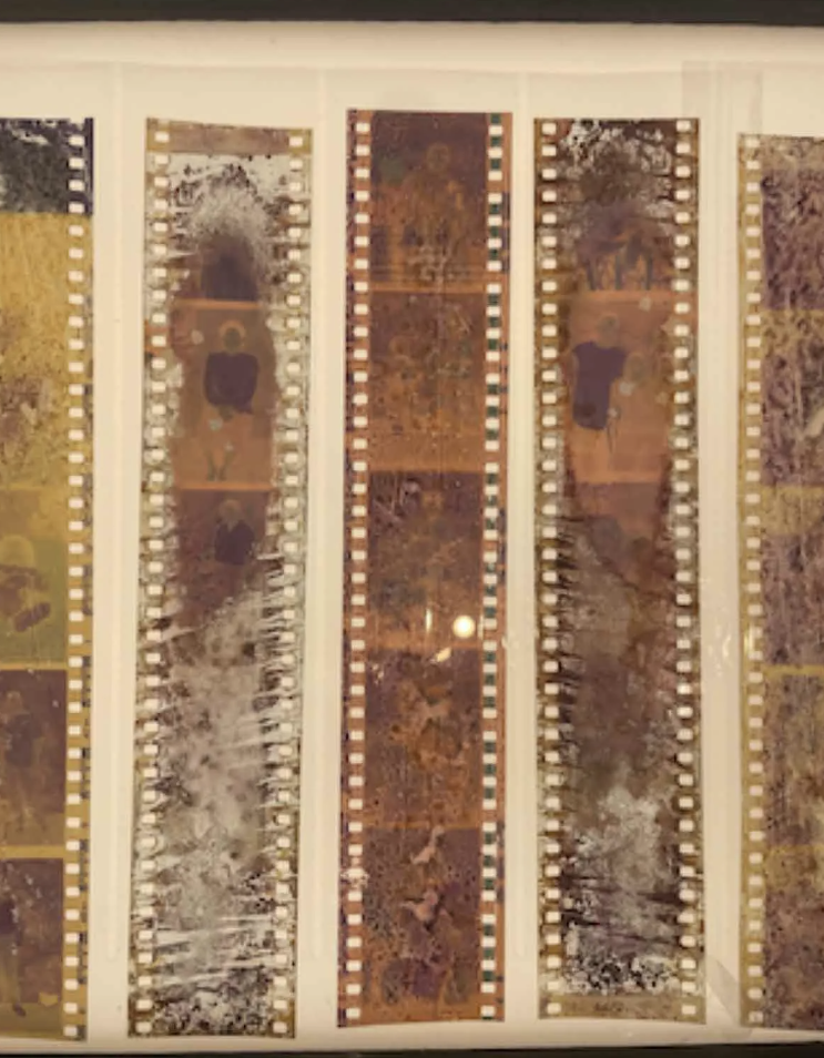
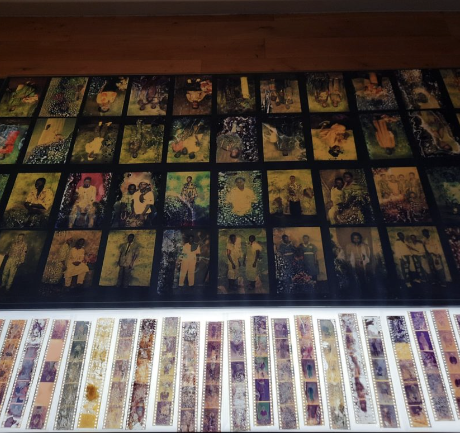
The aim of this exhibit was to showcase the hidden Nigerian culture within England as whole, and how significant Nigerian impact has had in London.This is shown clearly in one art piece where film was found in a bin showcasing hundreds of family photographs, treasured at the time but now forgotten and discarded.
The aim of this exhibit was to showcase the hidden Nigerian culture within England as whole, and how significant Nigerian impact has had in London.This is shown clearly in one art piece where film was found in a bin showcasing hundreds of family photographs, treasured at the time but now forgotten and discarded.
Photo-grams
The theme for out photograms was centred around the idea of human impacts on the environment , so in picking a handful of photographs to choose i selected the plainest, most empty landscapes that i had took, i did this to give myself an opportunity to have a-lot options in what i could do.
For at least one photograph, i wanted to draw on-top of the slide, a completely new scene and design preferably something industrial like a factory or smog, to fit the theme.
For another photograph i wanted to completely disfigure the original slide by cutting it into equal strips, and reordering them randomly, then afterwards drawing horizontal lines with a coloured biro across the reorganised shreds.
Since the slide would be shown by a bright light being shone from behind it onto a wall, it reminded me of stained glass art, so i wanted to incorporate some of those features, i started by slicing the slide creating conjoined shapes and patterns, making sure not to be too hard withe the scalpel as to not accidentally push the blade all the way through. After i had made the shapes i selected a few different biro colours and coloured in the slide alternating colours in-between shapes.
In my photograms i attempted to use many varying methods of curating a slide.I enjoyed having a sense of control over the image , and that there want any pressure to make a good looking slide.
Dafna Taimor
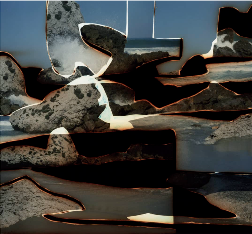
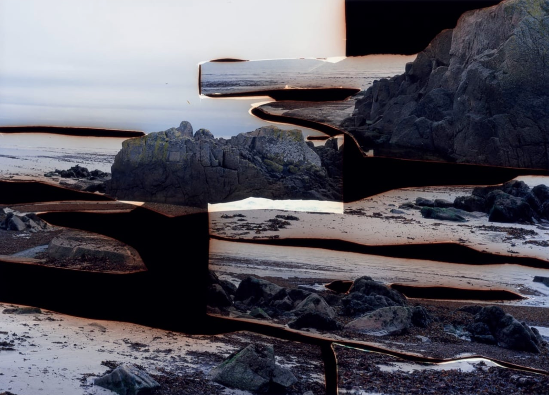
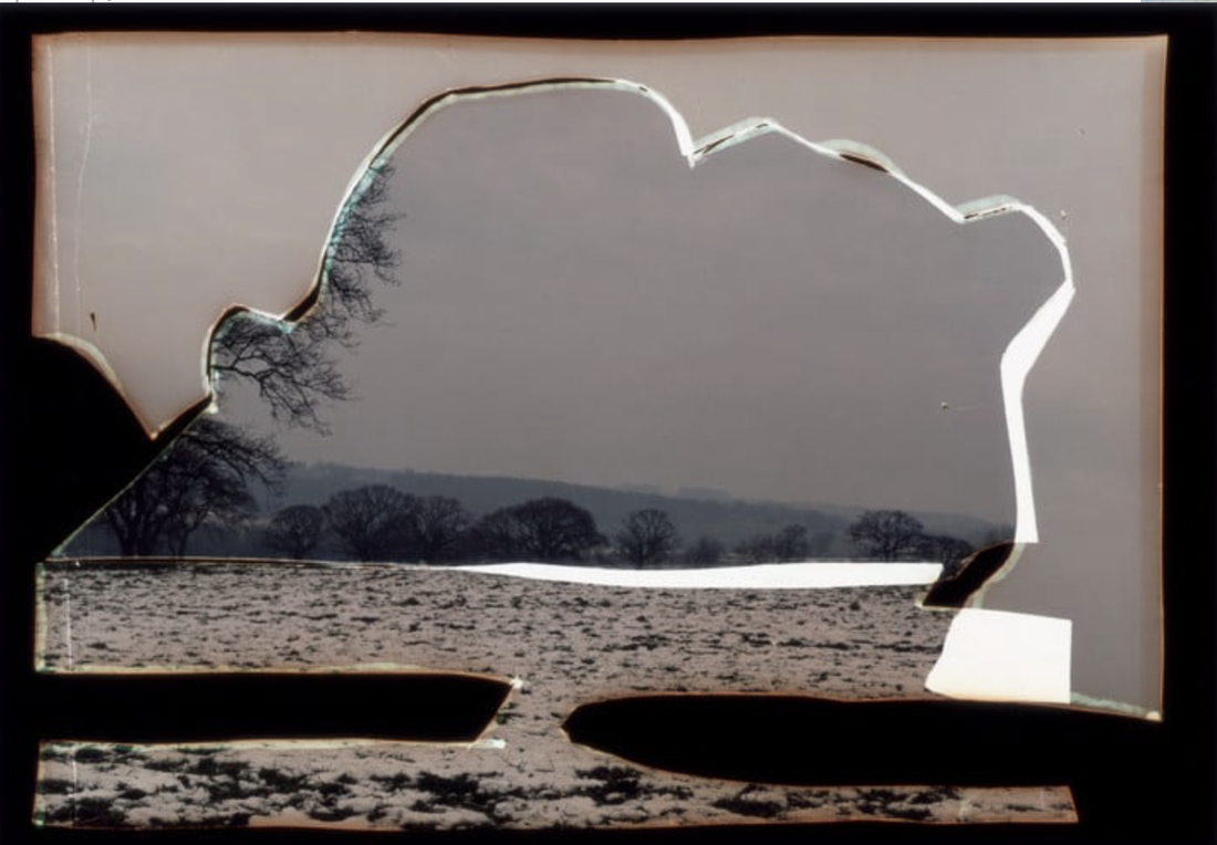
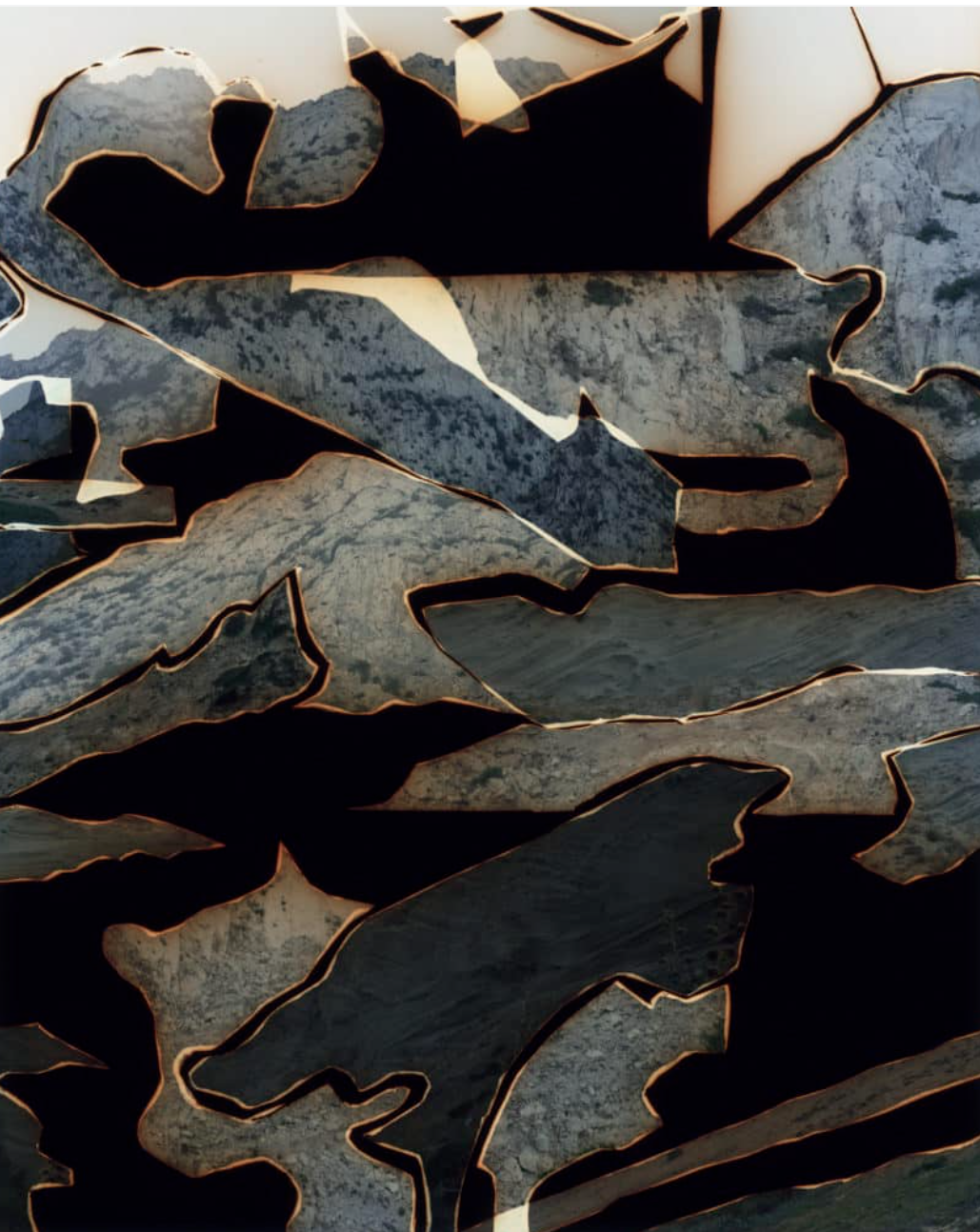
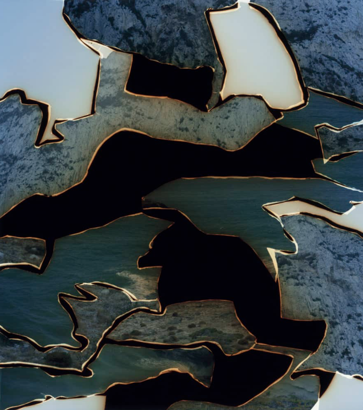
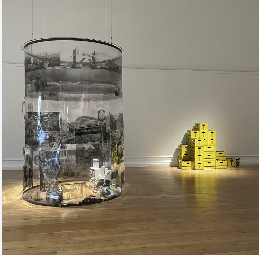
Dafna Taimors work Dafna Talmor is an artist and lecturer based in London whose practice encompasses photography, curation and collaborations. Her photographs are included in public collections such as Deutsche Bank, Hiscox and private collections internationally.Dafna Talmor is an artist and lecturer based in London whose practice encompasses photography, curation and collaborations. ,.Her work is a complicated process of photographing , burning , layering ,cutting an highlighting, this intricate method is what makes her work so unique and distinguishable form other peoples, From my point of view it seems that her art aims to highlight the human effect of the environment, in particular , the ransacking of recourse then the abandon of waste in landfills and deep sea.
The use of no central subject or and orderly framing creates a element of chaos and discombobulation, allows for a deep scene of interest and additionally means no tow of her photos run the risk of looking or operating similarly.
For our attempt i gathered five 35mm slides, pens , a scalpel ,and coloured transparent plastic in a variation of different colours.
